
Pique Nique Pour Les Inconnues (2020) is a desktop video, in which the Angel of History collects all the (unknown) women that lost the authorship of the image of their face through Image processing testcards, onto the digital plane of her desktop. She then prompts them to collectively perform Paul Mccartney's “We All Stand Together,” which the ladies sing - although not through the means of their own voice. This meeting on her desktop later became the starting point of the i.R.D. DeCalibration Army.
Behind the White Shadows of Image Processing (2017 - 2022)
Shirley, Lena, Jennifer and the Angel of History.
[[About the loss of identity, bias, image calibration and ownership]
︎ ︎ download pdf version (2017)
INTRODUCTION
While digital photography seems to reduce the effort of taking an image of the face, such as a selfie or a portrait, to a straightforward act of clicking, these photos, stored and created inside (digital) imaging technologies do not just take and save an image of the face. In reality, a large set of biased - gendered and even racist - protocols intervene in the processes of saving the face to memory. As a result, what gets resolved, and what gets lost during the process of resolving the image is often unclear.
To uncover and get a better insight into the processes behind the biased protocols that make up these standard settings, we need to come back to asking certain basic questions: who gets decide the hegemonic conventions that resolve the image? And why and how do these standards come into being? Through an examination of the history of the color test card, I aim to provide some answers to these issues.
In her 2012 White Shadows: what is missing from images lecture at the Gdansk Academy of Fine Arts in Poland, Hito Steyerl speaks about how new technologies force us to reformulate important questions about the making visible, capturing, and documenting of information. In the first part of her talk, Steyerl focuses on the use of 3D scanning in forensic crime scene investigations. Steyerl explains how the 3D scanner, or LiDAR technology (Light Detection And Ranging), sends laser beams that reflect off of the surfaces of the objects that are being scanned. In this process, each point in space is measured and finally compiled as a 3D facsimile point cloud of a space. Steyerl states that this kind of capturing does not just provide a completely new image of reality or possibility for capturing the ‘truth’. In fact, she takes issue with the general belief that this type of new technology should be described as the ultimate documentary, forensic tool; a tool that produces 100% reliable, true evidence.
Just like any other technology, Steyerl argues, VR has its affordances, and with these affordances come blind spots: for instance, only a few scanning rigs are advanced enough to capture a moving object. Generally, a moving object becomes a blur or is not picked up at all. A “2.5D” scanning rig (a rig with just one 3D scanner that scans a space) can only provide the surface data of one side of the scanned object space. As a result, the final scan of an object or space includes blind spots: the back of the objects or shadows cast by objects in front of an object which, depending on the displaying technology, sometimes show up as an empty, white shell.
“What becomes visible on the back of the image is the space that is not captured. The space that is missing, missing data, the space where an object covers the view. A shadow. […] Documentary truth and evidence also [ed. rosa: includes] the missing of information. The missing people themselves.”
To really scan an environment properly, the scanning would have to be done from every angle. But in the case of most 3D scanning, certain elements of the scanned environment will always exist in the shadow of the next object, and result in white patches, blank spaces or hollowed out shells, remaining in the dataset only as a log of the scanners unseen, unregistered space. An important question then, not just for 3D, but for any technology is: who decides the point of view, and who stands behind the perspective from which the LiDAR—or any scanning or imaging technology—is operated? Who is casting these white shadows? In order to formulate a possible start to an answer for these questions, what follows is a history of resolutions, specifically the history of the color test card.
 A collage of different resolution test cards on top of each other.
 Test images
A fundamental part of the history of image-processing and the standardization of settings within both analogue and digital compression as well as codec technologies is the test card, chart, or image. This standard test image is an image (file) used across different institutions to evaluate, for instance, image processing, compression algorithms, and rendering, or to analyze the quality of a display. One type, the test pattern or resolution target, is typically used to test the rendering of a technology or to measure the resolution of an imaging system. Such a pattern often consists of reference line patterns with clear, well-defined thicknesses and spacings. By identifying the largest set of non-distinguishable lines, one determines the resolving power of a given system, and by using identical standard test images, different labs are able to compare results, both visually, qualitatively, and quantitatively.
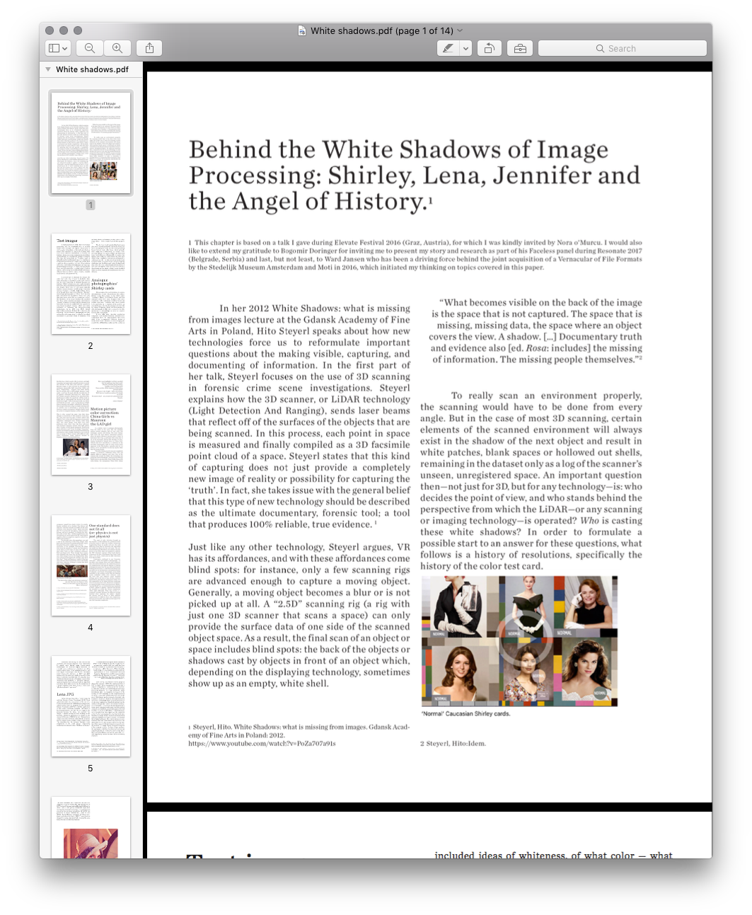
A second type of standard test image, the color test card, was created to facilitate skin-color balancing or adjustment, and can be used to test the color rendering on different displays, for instance. While technologies such as photography, television, film and software all have their own color test images, these types of test images all typically involve a norm reference card showing a Caucasian woman wearing a colorful, high-contrast dress. Even though there were many different “Shirleys” (in analogue photography) or “China Girls” (in color film chemistry) that modeled for these test cards, they were never created to serve variation. In fact, the identities of the many Shirleys who modeled for these norms stayed unknown and formed a “normal” standard, as is often written on these color test cards. As such, the cards cultivated a gendered, race-biased standard reference, which even today continues to influence our image-processing technologies. In his 1997 book White, British film studies professor Richard Dyer observes the following: "In the history of photography and film, getting the right image meant getting the one which conformed to prevalent ideas of humanity. This included ideas of whiteness, of what color — what range of hue — white people wanted white people to be.”
The de-facto, ‘ideal’ standard that has been in play since the early part of the twentieth century for most analogue photo labs has thus been positively biased towards white skin tones, which naturally have a high level of reflectivity. As a result it was not only difficult to capture darker and black skin tones, but it also proved impossible to capture two highly contrasting skin tones within the same shot; when trying to capture a black person sitting next to a white person, the reproduction of any African-American facial images would often lose details and pose lighting challenges, and finally present ashen-looking facial skin colors that contrast strikingly with the whites of eyes and teeth. Hence, the Caucasian test card is not about variation, but about setting a racist standard, which has been dogmatically implemented for over 40 years.
A fundamental part of the history of image-processing and the standardization of settings within both analogue and digital compression as well as codec technologies is the test card, chart, or image. This standard test image is an image (file) used across different institutions to evaluate, for instance, image processing, compression algorithms, and rendering, or to analyze the quality of a display. One type, the test pattern or resolution target, is typically used to test the rendering of a technology or to measure the resolution of an imaging system. Such a pattern often consists of reference line patterns with clear, well-defined thicknesses and spacings. By identifying the largest set of non-distinguishable lines, one determines the resolving power of a given system, and by using identical standard test images, different labs are able to compare results, both visually, qualitatively, and quantitatively.
A second type of standard test image, the color test card, was created to facilitate skin-color balancing or adjustment, and can be used to test the color rendering on different displays, for instance. While technologies such as photography, television, film and software all have their own color test images, these types of test images all typically involve a norm reference card showing a Caucasian woman wearing a colorful, high-contrast dress. Even though there were many different “Shirleys” (in analogue photography) or “China Girls” (in color film chemistry) that modeled for these test cards, they were never created to serve variation. In fact, the identities of the many Shirleys who modeled for these norms stayed unknown and formed a “normal” standard, as is often written on these color test cards. As such, the cards cultivated a gendered, race-biased standard reference, which even today continues to influence our image-processing technologies. In his 1997 book White, British film studies professor Richard Dyer observes the following: "In the history of photography and film, getting the right image meant getting the one which conformed to prevalent ideas of humanity. This included ideas of whiteness, of what color — what range of hue — white people wanted white people to be.”
The de-facto, ‘ideal’ standard that has been in play since the early part of the twentieth century for most analogue photo labs has thus been positively biased towards white skin tones, which naturally have a high level of reflectivity. As a result it was not only difficult to capture darker and black skin tones, but it also proved impossible to capture two highly contrasting skin tones within the same shot; when trying to capture a black person sitting next to a white person, the reproduction of any African-American facial images would often lose details and pose lighting challenges, and finally present ashen-looking facial skin colors that contrast strikingly with the whites of eyes and teeth. Hence, the Caucasian test card is not about variation, but about setting a racist standard, which has been dogmatically implemented for over 40 years.
Analogue photographies’ Shirley cards
Photographic film stock's failures to capture dark skin tones aren't a technical issue, but a choice. Scholar Lorna Roth writes in her 2009 article “Looking at Shirley, the Ultimate Norm” that film emulsion could have been designed with more sensitivity to the continuum of yellow, brown and reddish skin tones. However, this choice needed to be motivated by recognition of the need for an extended range; after the development of color film for cinema Kodacolor (1928) and Kodachrome for still photography (1935), there seemed to be little motivation to acknowledge or cater to a market beyond white consumers.
It was only when chocolate production companies and wooden furniture manufacturers complained about the impossibilities they faced when trying to reproduce different shades of brown, that Kodak’s chemists started changing the sensitivities of their film emulsions (the coating on the film base which reacts with chemicals and light to produce an image), and gradually started to extend the abilities of the film stock towards a greater dynamic range, or ratio between the maximum and minimum measurable light intensities (white and black, respectively). Progress was made during the 70s and 80s. But in 1997 Kodak’s dynamic range made a real leap forward with the introduction of its popular consumer film Gold Max. Roth notes how Kodak executive Richard Wien described this development within the sensitivity of film stock as being able to “photograph the details of the dark horse in low light.” Still, in the real world, true white and black do not exist — only varying degrees of light source intensity and subject reflectivity. Moreover, the concept of dynamic range is complex and depends on whether one is calculating a capturing device (such as a camera or scanner), a display device (such as a print or computer display), or the subject itself.
This is why around the same time that these changes in sensitivity of film emulsion took place, the color test card, albeit only slightly, was also revisited. First, in the mid-90s, Japanese photography companies redesigned their Shirley cards using their own stock images from their own color preference tests. Since then, the local reference card featured Japanese women with light yellow skin. Finally, in 1995, Kodak designed a multiracial norm reference card. From the single “Caucasian” woman surrounded by the necessary color balancing information codes, Kodak’s Shirley has now evolved into an image of three women with different skin colors (Caucasian, Asian, African American), dressed in brightly colored, contrasted clothing.
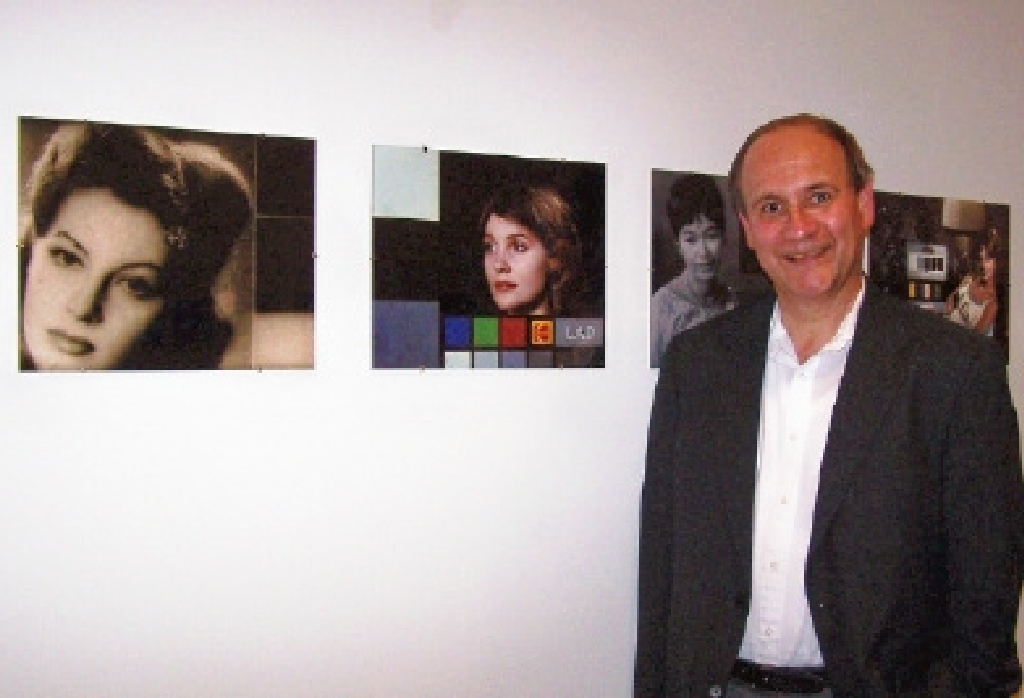
John P. Pytlak posing with his invention: LAD girl
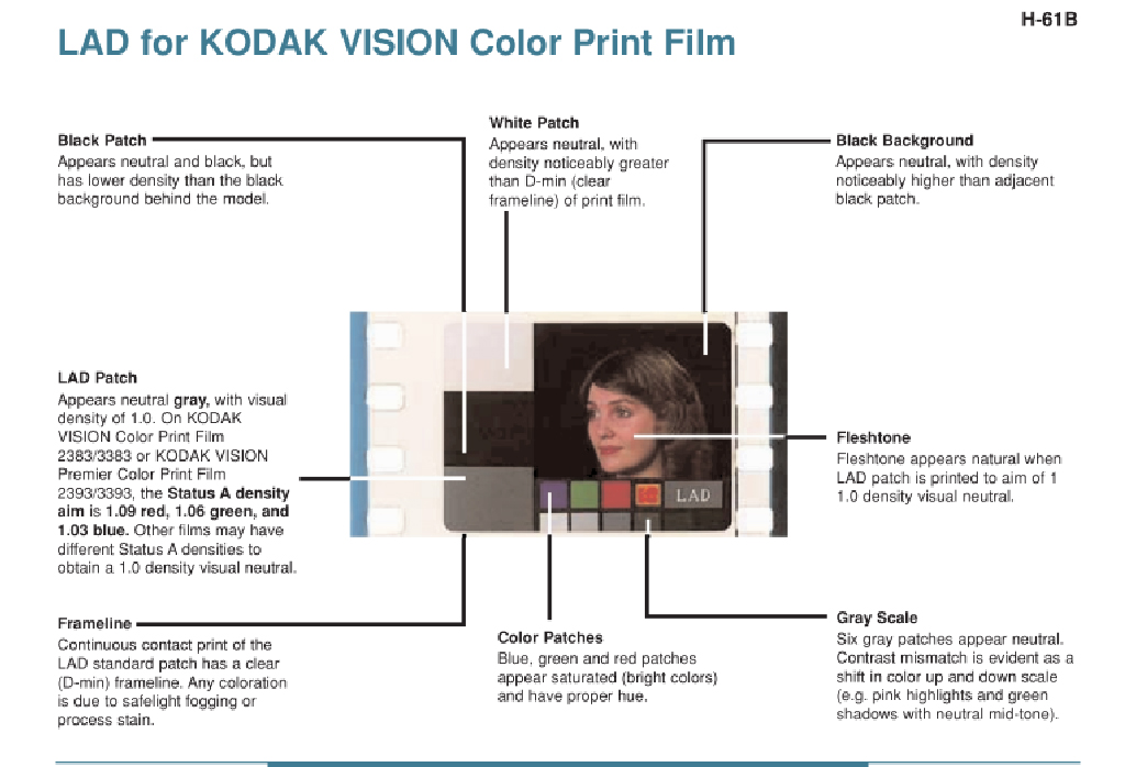
Laboratory Aim Density (LAD) system for Kodak.
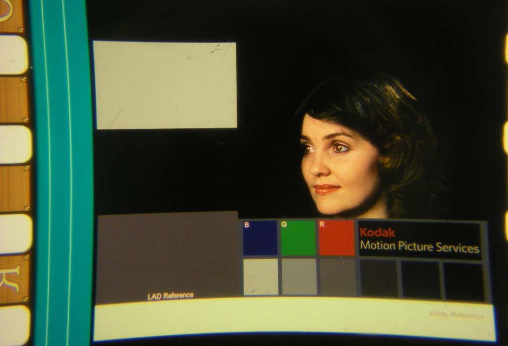
LAD color test strip
Have your highlights lost their sparkle?
And the midtones lost their scale?
Are your shadows going smokey?
And the colors turning stale?
Have you lost a little business to labs whose pictures shine?
Because to do it right – takes a lot of time.
Well, here’s a brand new system. It’s simple as can be!
Its name is LAD – an acronym for Laboratory Aim Density.
– John P. Pytlak
.
Motion picture color correction: China Girls vs the Maureen the LAD girl
In a similar vain to analogue photography, from the 1920s to the early ’90s, the analogue motion picture industry had its own color test equivalent, named color-timing. The term ‘timing’ hails from the days before automated printers, when the photo chemical process used a timer to determine how long a particular film strip had to sit in the developer. During the decades of color-timing, hundreds of female faces or ‘China Girls’ (which some have described as a reference to the porcelain mannequins used in early screen tests) appeared in the film leaders, typically only for 1-4 frames, never intended to be seen by anyone other than the projectionist.
The color-timing practice was not completely reliable; it involved a different China Girl and slightly different lighting each time. One of the reasons why around the 1980s, the technology was gradually superseded by the Laboratory Aim Density (LAD) system, developed by John Pytlak. Along with color-timing, the anonymous China Girls, whose occupancy ranged from studio workers to models, became artifacts of an obsolete film history and only one “LAD Girl” became the model for the color reference card: Maureen Darby. Pytlak describes that “It was primarily intended as ‘representative’ footage, and not a standard.” By filming two 400-foot rolls of 5247 film, “all film supplied since the introduction of LAD is made from the same original negative, either as a duplicate negative, and now as a digital intermediate.”
Two decades later, after spending a year and a half on the restoring of lost color strip images, Julie Buck and archivist Karin Segal finally found a way to bring the China Girls, or women of color-correction, to the spotlight. Rescuing the China Girls from the margins of cinema, they intended to recast them as movie stars in their own right. In their 2005 “Girls on Film” exhibition statement, Buck and Segal write: “Even though these women were idealised, they were only seen by a handful of men. Their images exist on the fringes of film. They were abused and damaged. We wanted to give them their due.” Buck and Segal were unable to find any cases of China Girls-turned-film actress and finally used their collection of images to create the short Girls on Film (2008). In which they recast them as stars of the short.
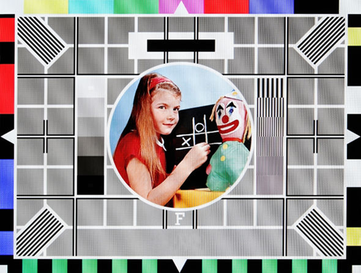
Carole Hersee on Test Card F, which aired on BBC Television from 1967 to 1998.
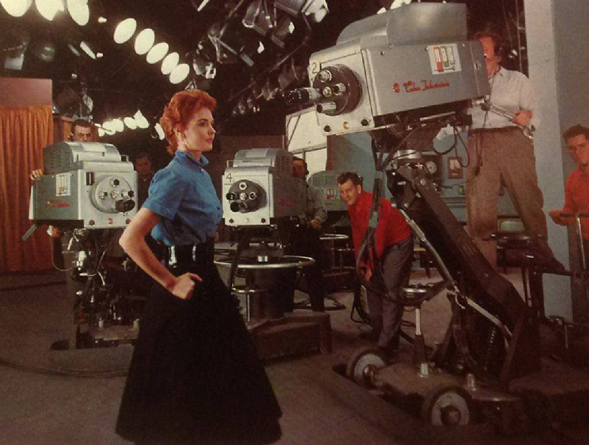 Marie McNamara at the NBC studios.
 “You know what a black-and-white test pattern is,” she told The New York Times in 1953.
“Well, I’m it for color. I’m the final check.”
- Marie McNamara
One standard does not fit all (or: physics is not just physics)
The onset of color television brought no big surprise; in this medium too, producers hired Caucasian ladies as their test models, reinforcing longstanding biases in gender and race—the only difference being that in television, the objectified test model was known by her real name. The red-haired model Marie McNamara, for instance, became known in the 1950s when she modeled to calibrate the NBC television cameras, while Carole Hersee is known as the face of the famous Test Card F (and latter J, W, and X), which aired on BBC Television from 1967 to 1998.
Cameramen continued to use Caucasian color girls — either live models or photographs — to test their color settings. If an actor with a different skin color entered the scene, the calibration process was supplemented with special lighting or makeup techniques, to ensure that the non-white participants looked good on screen—a task that is not always easy and deferred the development and implementation of adequate, non-biased technologies. Lorna Roth concludes in her seminal article that the habitual racism embedded within color reference cards did more than just influence major standard settings, such as the tone of hue, chroma, contrast, quantization, and lightness (luminance) values. To her, it is also responsible for the highly deficient renderings of non-Caucasian skin tones, which have resulted in an ongoing need for compensatory practices. While a ‘one size fits all’ or as a technician once explained to Roth: “physics is physics” approach has become the standard, in reality, the various complexions reflect light differently. What this reveals is a composite interplay between the different settings involved when capturing the subject. Despite the obvious need to factor in these different requirements for different hues and complexions, television technically only implemented support for one: the Caucasian complexion.
Moreover, the history of color bias did not end when old analogue standards were superseded by digital ones; digital image (compression) technologies too, inherited legacy standards. As a result, even contemporary standards are often rooted within these racist, habitual practices and new digital technologies still feature embedded racial biases. For instance, in 2009 and 2010 respectively, HP webcams and the Microsoft’s XBox Kinect controller had difficulties tracking the faces of African-American users. Consumer reports later attributed both problems to “low-level lighting”, again moving the conversation away from important questions about skin tone to the determination of a proper lighting level, still echoing a dull, naive “physics is physics” approach.
My collection of Caucasian testcards in the Behind White Shadows exhibition.
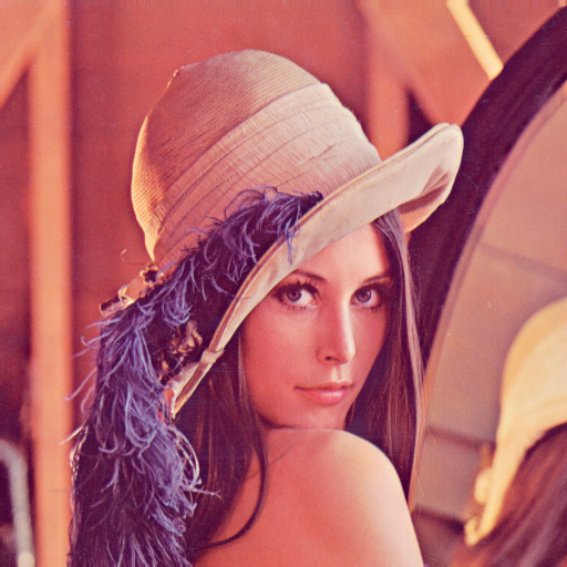
Lena JPEG
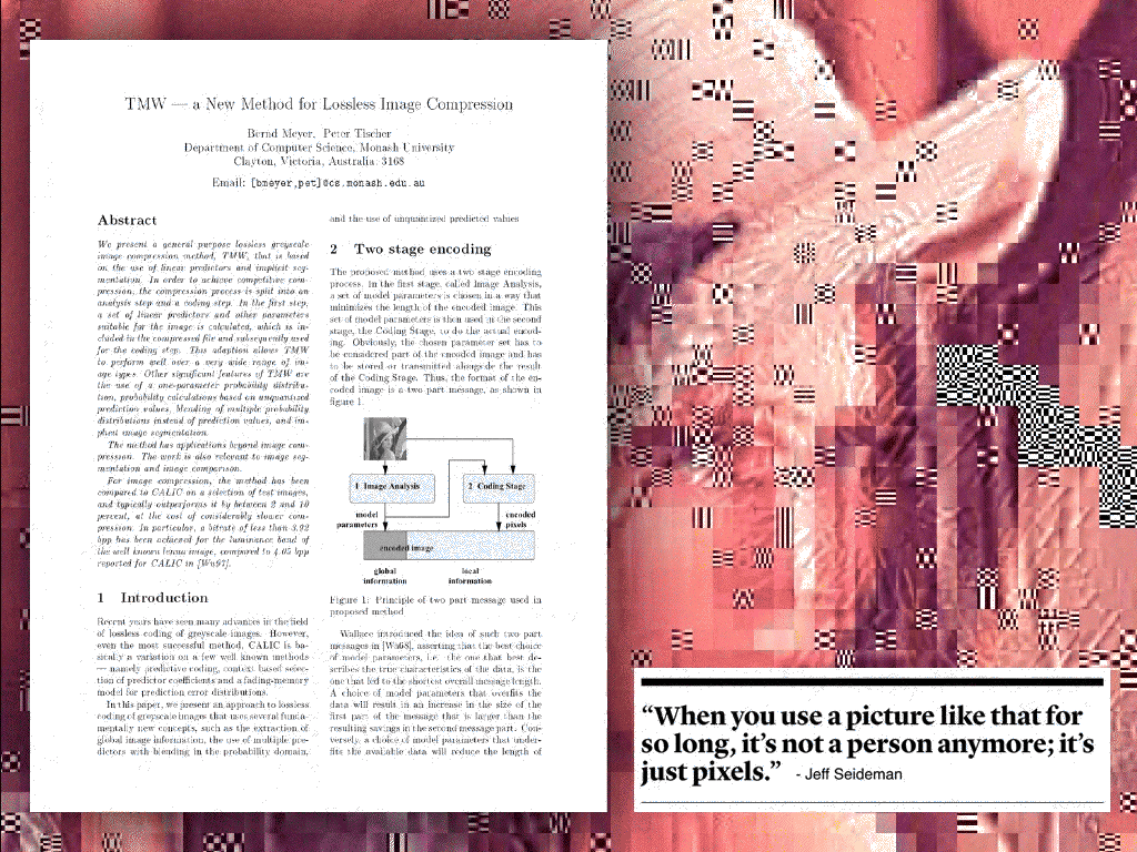
In his retrospective article “How I Came Up with the Discrete Cosine Transform” (DCT), Nasir Ahmed describes his conception of the use of a Cosine Transform in the field of image compression. Ahmed writes how he proposed the National Science Foundation (NSF) to study the application of the cosine transform, however, and much to his disappointment, the NSF did not support the proposal, because the whole idea seemed “too simple.” Ahmed decided to keep working on the problem, ultimately publishing his results in the January 1974 issue of IEEE Computer Transactions. Today, more than 40 years after Ahmeds proposal, DCT is widely used in digital image compression. The algorithm has for instance become a core component of the JPEG image compression technology, developed by the JPEG Experts Group.
“I remember dedicating the whole summer of 1973 to work on this problem. The results that we got appeared too good to be true, and I therefore decided to consult Harry Andrews later that year at a conference in New Orleans. […] When I sent the results back to Harry Andrews, he suggested that I publish them. As such, I sent them to the IEEE Computer Transactions, and the paper was then published in the January 1974 issue. […] Little did we realize at that time that the resulting “DCT” would be widely used in the future!”
.
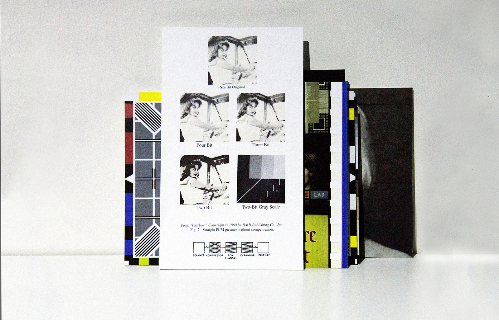
Just shortly after Ahmed’s initial proposal, during the Summer of 1973, the implementation of DCT in digital image compression also became a subject of experiments conducted by the University of Southern California’s (USC) Signal and Image Processing Institute. In a 2001 newsletter, Jamie Hutchinson offers an insightful retrospect of the testing of DCT, focusing on the implementation of, again, a Caucasian, female color test card. In the piece, Hutchinson quotes Alexander Sawchuk, who reminisces his efforts on the implementation of the test card during his time as assistant professor of electrical engineering. Sawchuk explains how he and his colleagues felt tired of the normal test images or “dull stuff”, “They wanted something glossy to ensure good output dynamic range, and they wanted a human face. Just then, somebody happened to walk in with a recent issue of Playboy.” Sawchuk moves on to describe they ripped out the centerfold of the Playboy and used its top third part to scan with their Muirhead scanner, which they had customized with analog-to-digital converters to create a 3-channel, 512 x 512px test image. After the tricky process was finished, Sawchuk realized that they had lost a line during the process of scanning. Moreover, the timing of the analog-to-digital converters was off, making the final test image slightly elongated compared to the original. However, because of time pressure, the engineers settled for the distorted version and simply replicated the top line to arrive at 512. Those three sets of 512 lines—one set for each color, created imperfectly—would become a de facto industry standard.
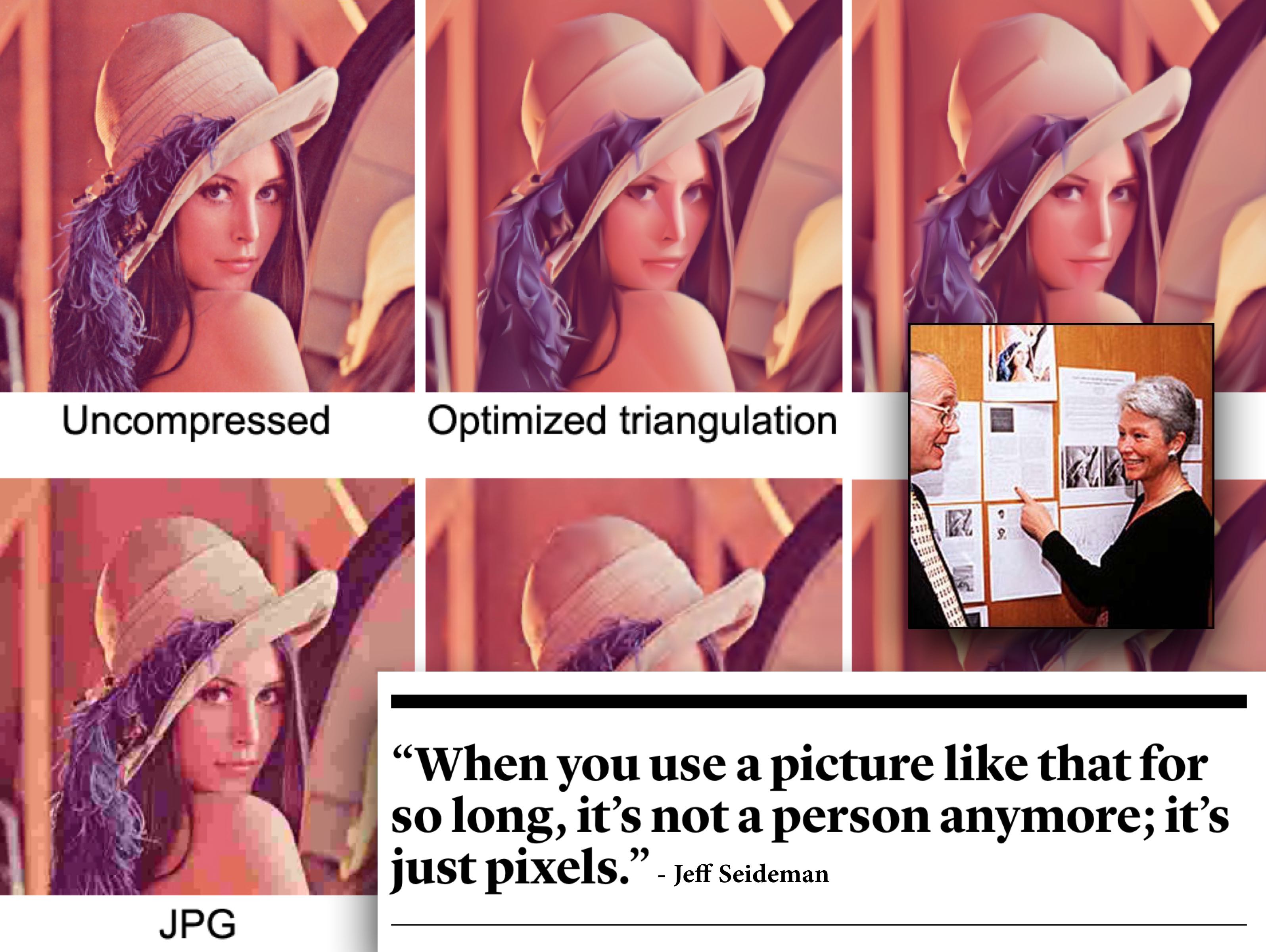
The Miss November 1972 centerfold, that the USC employees used for testing the implementation of DCT, featured Caucasian model Lena Söderberg (born: Lena Sjööblom). Her image, ‘the Lenna’ (spelled with double n to promote the right pronounciation) quickly became the single most used picture in image-processing research and even one of the first pictures uploaded to ARPANET, the precursor of today’s internet. In A Note on Lena (1996), David Munson, University of Illinois professor and editor-in-chief at IEEE Transactions on Image Processing, explains why he believes the Lena image became an industry standard: “First, the image contains a nice mixture of detail, flat regions, shading, and texture that do a good job of testing various image processing algorithms. It is a good test image! Second, the Lnna image is a picture of an attractive woman. It is not surprising that the (mostly male) image-processing research community gravitated toward an image that they found attractive.” Munson moves on describing why the Lena image has become such an issue: “some members of our community are unhappy with the source of the Lena image. I am sympathetic to their argument, which states that we should not use material from any publication that is seen (by some) as being degrading to women.”
While the use of the Lena image remained a topic of discussion, and its rights were never properly cleared or even checked with Playboy, by 1991, SIPI (USCs Signal and Image Processing Institute) actually started distributing the image of Lena for a fee, to researchers all over the world. While Lena was regularly found on the pages of image-processing journals, books, and conference papers, Playboy finally became aware of these transgressions when the Journal of Optical Engineering featured Lena on its July cover. In August 1991, Optical Engineering received a letter from Playboy Enterprises, Inc. asking them, “as fellow publishers”, to cease any unintentional, unauthorized use of the image and to contact Playboy for permission for any future use of their copyrighted material. The International Society for Optical Engineering (SPIE) responded, arguing that “[t]he image is widely used in the worldwide optics and electronics community. It is digitized and its common use permits comparison of different image processing techniques and algorithms coming out of different research laboratories.” They also pointed out that SPIE is a nonprofit scientific society and that the material published by SPIE is intended for educational and research purposes.
SPIE reached an understanding with Playboy, but in a January 1992 editorial, SPIE editor Brian J. Thompson warns that “it is each author's responsibility to make sure that materials in their articles are either free of copyright or that permission from the copyright holder has been obtained.” On the other side, Eileen Kent, Vice President of new media at Playboy publicly commented on the issue - “We decided we should exploit this, because it is a phenomenon” - and granted SPIE authorization for all further use of the image. According to publications director at SPIE Eric Pepper, “it was almost as if Lena had entered the public domain by that time. Almost, but not quite.”
In his retrospective article “How I Came Up with the Discrete Cosine Transform” (DCT), Nasir Ahmed describes his conception of the use of a Cosine Transform in the field of image compression. Ahmed writes how he proposed the National Science Foundation (NSF) to study the application of the cosine transform, however, and much to his disappointment, the NSF did not support the proposal, because the whole idea seemed “too simple.” Ahmed decided to keep working on the problem, ultimately publishing his results in the January 1974 issue of IEEE Computer Transactions. Today, more than 40 years after Ahmeds proposal, DCT is widely used in digital image compression. The algorithm has for instance become a core component of the JPEG image compression technology, developed by the JPEG Experts Group.
“I remember dedicating the whole summer of 1973 to work on this problem. The results that we got appeared too good to be true, and I therefore decided to consult Harry Andrews later that year at a conference in New Orleans. […] When I sent the results back to Harry Andrews, he suggested that I publish them. As such, I sent them to the IEEE Computer Transactions, and the paper was then published in the January 1974 issue. […] Little did we realize at that time that the resulting “DCT” would be widely used in the future!”
.
Just shortly after Ahmed’s initial proposal, during the Summer of 1973, the implementation of DCT in digital image compression also became a subject of experiments conducted by the University of Southern California’s (USC) Signal and Image Processing Institute. In a 2001 newsletter, Jamie Hutchinson offers an insightful retrospect of the testing of DCT, focusing on the implementation of, again, a Caucasian, female color test card. In the piece, Hutchinson quotes Alexander Sawchuk, who reminisces his efforts on the implementation of the test card during his time as assistant professor of electrical engineering. Sawchuk explains how he and his colleagues felt tired of the normal test images or “dull stuff”, “They wanted something glossy to ensure good output dynamic range, and they wanted a human face. Just then, somebody happened to walk in with a recent issue of Playboy.” Sawchuk moves on to describe they ripped out the centerfold of the Playboy and used its top third part to scan with their Muirhead scanner, which they had customized with analog-to-digital converters to create a 3-channel, 512 x 512px test image. After the tricky process was finished, Sawchuk realized that they had lost a line during the process of scanning. Moreover, the timing of the analog-to-digital converters was off, making the final test image slightly elongated compared to the original. However, because of time pressure, the engineers settled for the distorted version and simply replicated the top line to arrive at 512. Those three sets of 512 lines—one set for each color, created imperfectly—would become a de facto industry standard.
The Miss November 1972 centerfold, that the USC employees used for testing the implementation of DCT, featured Caucasian model Lena Söderberg (born: Lena Sjööblom). Her image, ‘the Lenna’ (spelled with double n to promote the right pronounciation) quickly became the single most used picture in image-processing research and even one of the first pictures uploaded to ARPANET, the precursor of today’s internet. In A Note on Lena (1996), David Munson, University of Illinois professor and editor-in-chief at IEEE Transactions on Image Processing, explains why he believes the Lena image became an industry standard: “First, the image contains a nice mixture of detail, flat regions, shading, and texture that do a good job of testing various image processing algorithms. It is a good test image! Second, the Lnna image is a picture of an attractive woman. It is not surprising that the (mostly male) image-processing research community gravitated toward an image that they found attractive.” Munson moves on describing why the Lena image has become such an issue: “some members of our community are unhappy with the source of the Lena image. I am sympathetic to their argument, which states that we should not use material from any publication that is seen (by some) as being degrading to women.”
While the use of the Lena image remained a topic of discussion, and its rights were never properly cleared or even checked with Playboy, by 1991, SIPI (USCs Signal and Image Processing Institute) actually started distributing the image of Lena for a fee, to researchers all over the world. While Lena was regularly found on the pages of image-processing journals, books, and conference papers, Playboy finally became aware of these transgressions when the Journal of Optical Engineering featured Lena on its July cover. In August 1991, Optical Engineering received a letter from Playboy Enterprises, Inc. asking them, “as fellow publishers”, to cease any unintentional, unauthorized use of the image and to contact Playboy for permission for any future use of their copyrighted material. The International Society for Optical Engineering (SPIE) responded, arguing that “[t]he image is widely used in the worldwide optics and electronics community. It is digitized and its common use permits comparison of different image processing techniques and algorithms coming out of different research laboratories.” They also pointed out that SPIE is a nonprofit scientific society and that the material published by SPIE is intended for educational and research purposes.
SPIE reached an understanding with Playboy, but in a January 1992 editorial, SPIE editor Brian J. Thompson warns that “it is each author's responsibility to make sure that materials in their articles are either free of copyright or that permission from the copyright holder has been obtained.” On the other side, Eileen Kent, Vice President of new media at Playboy publicly commented on the issue - “We decided we should exploit this, because it is a phenomenon” - and granted SPIE authorization for all further use of the image. According to publications director at SPIE Eric Pepper, “it was almost as if Lena had entered the public domain by that time. Almost, but not quite.”


In May 1997, almost 25 years after being Miss November, Lena Söderberg attended the 50th anniversary of the Imaging Science and Technology (IS&T) Conference in Boston. Jeff Seideman, the president of the Boston IS&T, had arranged for Lena to appear and after the event, Seideman started working with Playboy's archivist to re-scan Lena's image and compile the missing information, including the type of photo emulsion used to make the print featured in the magazine, and the technical specifications of the scanner. As a result, Seideman hoped that the image of Lena would remain a standard reference image for compression technologies throughout the 21st century. Today, the standard Lena test image is still downloadable from several laboratory sites.
But the controversy around the Lena image did not end in the 90s. In 2001, David Munson, editor of the IEEE’s image processing journal, wrote: “It was clear that some people wanted me to ban Lena from the journal […] People didn’t object to the image itself, but to the fact that it came from Playboy, which they feel exploits women.” Rather than ban Lena, Munson wrote an editorial in which he encouraged authors to use other images. “We could be fine-tuning our algorithms, our approaches, to this one image,” he says. “They will do great on that one image, but will they do well on anything else?” In 2016, Scott Acton, editor of IEEE Transactions, proposed to the journal’s editorial board to instate an prohibition on the use of Lena in any published research: “In 2016, demonstrating that something works on Lena isn’t really demonstrating that the technology works.” Acton believed that the Lena image “doesn’t send the right message” to female researchers about their inclusion in the field. But Acton’s strongest objections were technical in nature: “Lena contains about 250,000 pixels, some 32 times smaller than a picture snapped with an iPhone 6. And then there’s a quality problem: The most commonly used version of the image is a scan of a printed page. The printing process doesn’t produce a continuous image, but rather a series of dots that trick your eye into seeing continuous tones and colors. Those dots, Acton says, mean that the scanned Lena image isn’t comparable to photos produced by modern digital cameras. Short of an all-out ban in the journal, he says, making authors aware of the image’s technical and ethical issues might be a way to usher Lena gracefully into retirement.”
While it is clear that the use of the Lena image opened a discussion about embedded bias and the consideration of gender in test card usage, there are still many questions that remain unanswered: how much are the performance, texture and materiality of digital photography actually influenced by the use of the image of a Caucasian Lena? What would it have meant for the standardization of digital image compression if the image chosen for the test card would have been the first African-American Playboy centerfold Jennifer Jackson (March 1965), or if the 512x512px image had instead featured the image of Grace Murray Hopper, one of the first pioneers in computer programming and person responsible for inventing some of the first compiler-related tools—moreover, the woman who, coincidentally, coined the widely used computer slang “bug”? Or Christine Darden, an African American researcher at NASA, pioneering supersonic aircrafts. How much do the compression standards we use on a day to day basis reflect the complexities of the ‘good’ 512x512px Lena image; and how well do these standard settings function when capturing another kind of color complexity?
David C. Munson: A note on Lena, in: IEEE Transactions on Image Processing 5.1 (1996): p. 3–3.
Scott Acton in: Corinne Iozzio: The Playboy Centerfold That Helped Create the JPEG, in: The Atlantic (02/09/2016).
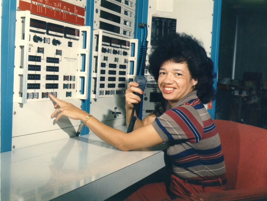 Christine Darden in the control room of NASA Langley's Unitary Plan Wind Tunnel in 1975. Credit: NASA
“Dear Jennifer,
Sometime in 1987, you were sitting on a beach in Bora Bora, looking at To’opua island, enjoying a holiday with a very serious boyfriend. […] This photograph of a beautiful moment in your personal history has also become a part of my history, and that of many other people; it has even shaped our outlooks on the world at large. John’s image of you became the first image to be publicly altered by the most influential image manipulation program ever.” […] In essence, it was the very first photoshop meme—but now the image is nowhere to be found online.
Did John ask you if he could use the image? Did you enjoy seeing yourself on the screen as much as he did? Did you think you would be the muse that would inspire so much contemporary image making? Did you ever print out the image? Would you be willing to share it with me, and so, the other people for whom it took on such an unexpected significance? Shouldn’t the Smithsonian have the negative of that image, not to mention digital backups of its endless variations?
All these questions have made me decide to redistribute the image ‘jennifer in paradise’ as well as I can, somewhat as an artist, somewhat as a digital archeologist, restoring what few traces of it I could find. It was sad to realize this blurry screen grab was the closest I could get to the image, but beautiful at the same time. How often do you find an important image that is not online in several different sizes already?”
︎ Constant Dullaart: Jennifer in Paradise – the correspondence. March 2016.
.
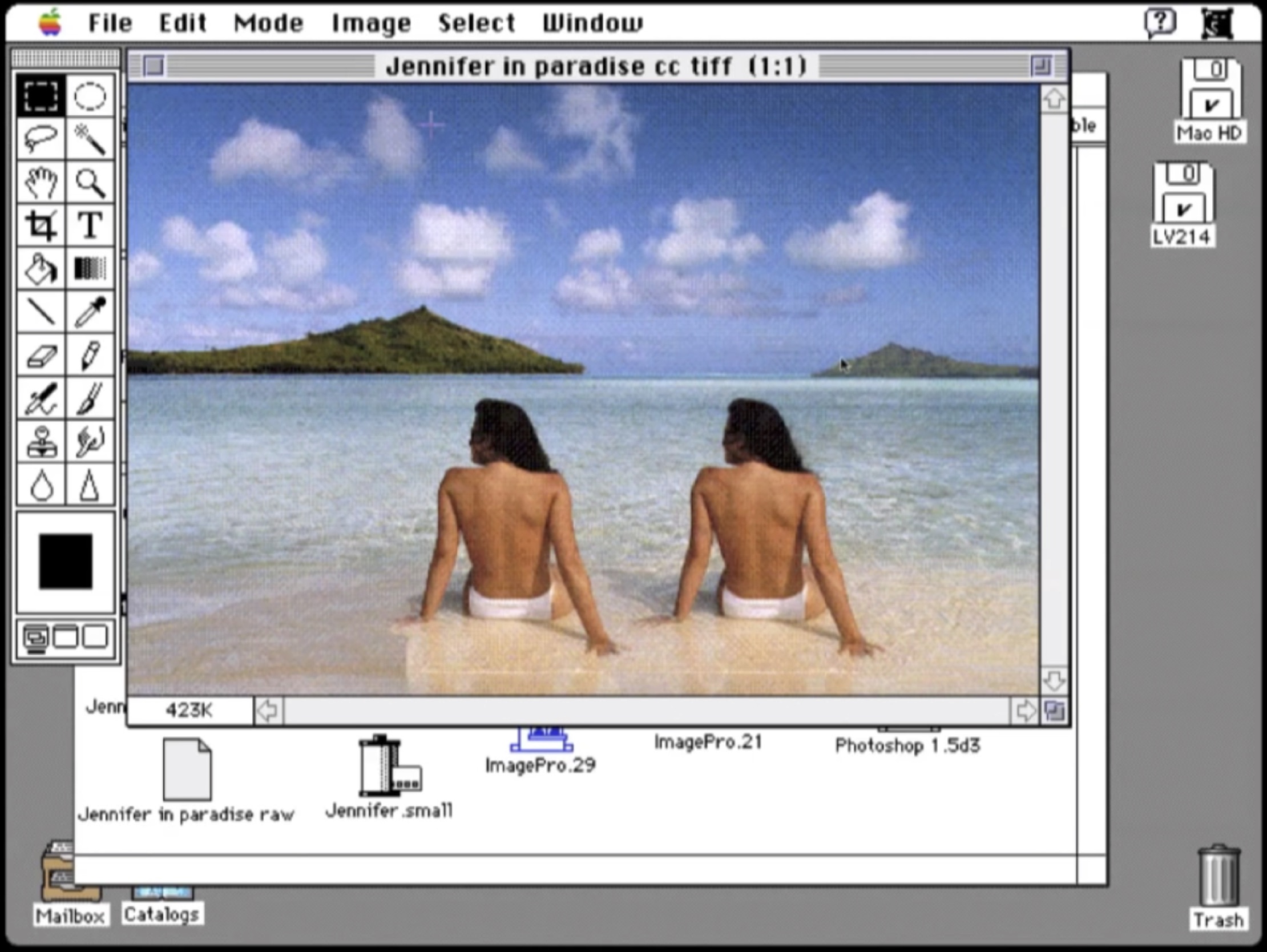
Jennifer in Paradise
A woman is sitting with her back towards us, topless, on a beach. Silver sand, blue water, a green island in the distance. We can’t see her face but we know her name: Jennifer. This photo, taken in 1987 by one of the two original creators of Photoshop, John Knoll, became the standard test image for the development and implementation of Photoshop and its suite of creative effects. Twirling, deleting and copying Jennifer were just some of the processes that were tested on the image. At that time, the early days of digital computing, there was not a large array of digital images available, which is why this 24-bit scan of a holiday photo of John’s soon-to-be Jennifer ‘Knoll’ became a standard test image for all of the development of Photoshop. It is also one of the reasons why the image did not disappear when Photoshop moved out of its development phase; when Photoshop was finally ready for public demonstrations, John and his brother Thomas used the image again and again in public and online demos. "It was a good image to do demos with," John Knoll recalls. "It was pleasing to look at and there were a whole bunch of things you could do with that image technically.”
As Dutch artist Constant Dullaart explains in his Chaos Computer Club presentation The Possibility of an Army, John Knoll confirmed an age-old motif: a man objectifying a female body. But besides being critical, Dullaart also underlined the special cultural-historical value of the artifact, which formed a key inspiration for his 2013 Future Gallery solo show Jennifer in Paradise. In this show, Dullaart focused on the excavation and exhibition of a reconstruction of the Jennifer image. In an open letter accompanying the show, Dullaart describes the image of Jennifer as an important artifact in the history of software development and as an anecdote in Adobe history. He also asks Jennifer to share the original image file with the world. A sentiment that was later echoed by Gordon Comstock in a 2014 piece for the Guardian, in which he describes the image as “central to the modern visual vernacular as Eadweard Muybridge’s shots of galloping horses or the first use of perspective.” In a way, just like the Lena image, Jennifer has become ‘a phenomenon’.
While Dullaart never obtained any rights or permissions for the use of the Jennifer image, he did digitally reconstruct the original image and created an image series consisting of Photshopped versions, materialized as wallpapers and a series of prints featuring enthusiastically filtered Jennifers (twirled, blurred, etc.). Dullaart also spread the digitally reconstructed version of the original image with an added a payload: he steganographically added messages to the reconstructed JPEG image file. By doing so, he intended to treat the JPEG image not just as an image, but as a unique container format for content, to open a debate on the value of the digital file (format). The reconstructed Jennifer JPEG is not just a format that carries the reconstructed image information; via steganography it has become an unique container and placeholder to discus the materiality of digital photography. In terms of monetization of the material, Dullaart only sells the password to the encrypted payload added to the reconstructed version of the original JPEG—the access to his secret message. Finally, in an effort to translate the work to the context of the gallery, Dullaart organized a performance, in which he briefly showed his secret message written in phosphorescent paint on top of the wallpaper by shining a blacklight on its surface, followed by a destruction of the blacklight as a metaphor for encryption (and inaccessibility).
Dullaart never received a direct response from Jennifer or John Knoll to his request to enter the original image into the public domain or to gift it to an (media) archeological institution such as the Smithsonian. Remarkably, for his Guardian article, Comstack did manage to get a short response from both.
John Knoll seems unconvinced: "I don't even understand what he's doing," he says, bristling at the idea of the image being reconstructed without permission (ironically using Photoshop). Jennifer is more sanguine: "The beauty of the internet is that people can take things, and do what they want with them, to project what they want or feel," she says.”
And maybe even more remarkable is the fact that the Guardian article features just one image: the original Jennifer in Paradise photo taken by John Knoll, embedded on the newspapers website (and thus finally entering the digital domain). Albeit indirect, Dullaart had now fulfilled one of the main goals of his solo show.

Behind White Shadows featured DCT:SYPHONING, The Spomenik for resolutions that will never be and An Ecology of Compression Complexities.
A Vernacular of File Formats (RAW, JPEG2000, JPEG, PNG, Original, PNG, TIFF, GIF, Targa, 2010).
In Front of the Angel of History
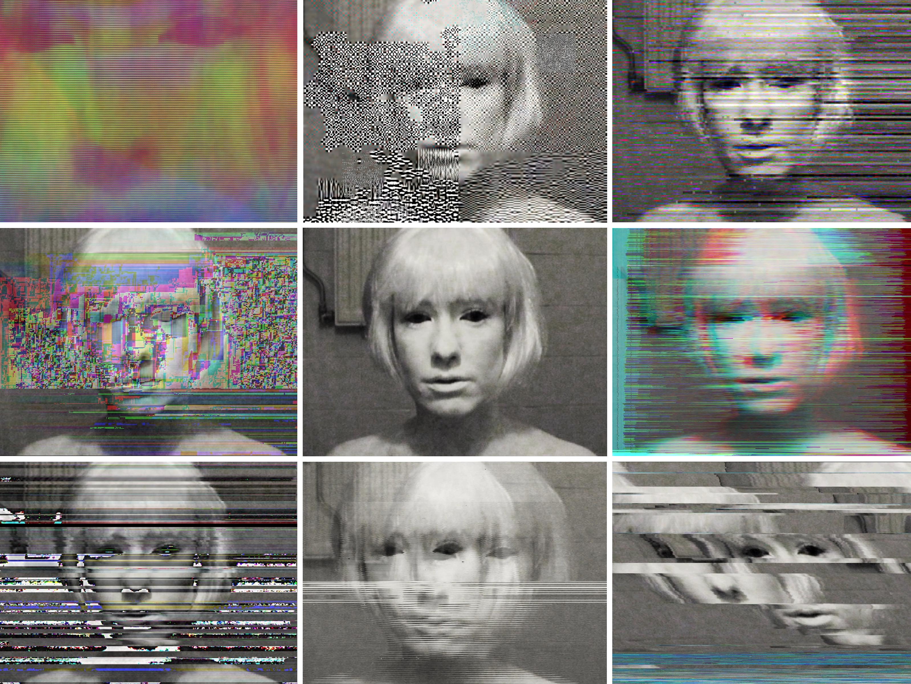
Covered in a heavy layer of white make-up, she shot her face on a DV tape. She wished to mask her flaws, to be perfect. But only a short time into the shoot, the illusion shattered and she found herself forced to visit the emergency room of the hospital. An allergic reaction to the makeup hurt her eyes violently and left her sight affected for days.
Behind the Angel of History
Seven years after shooting the source footage for A Vernacular of File Formats: An Edit Guide for Compression Design (2010), it has become strange to think and refer to the image that I shot that day as a “self-portrait”: that image being “my image.” When I shot it, it was a symbol for my own imperfect being. I tried to be perfect like porcelain, at least from the outside, but my body broke out, and reminded me that there is no such thing as perfection. Not even in make-believe video.
As I aged, it wasn’t just the cliche of time—which healed the wounds of bloodshot eyes, and slowly but naturally greyed my hair—that changed my relation to this particular shot. As time passed, the relationship between me and that image fundamentally changed because of other more complex and unexpected reasons.
A Vernacular of File Formats
A file format is an encoding system that organizes data according to a particular syntax, or compression algorithm. The choice for a particular image compression algorithm depends on its foreseen mode and place of usage, which involves questions such as: how much accuracy is necessary for a particular task, what hard- or software will process the image, what data is important, and what can be discarded?
An image file format answers to certain affordances. Affordances, or – as described by James Gibson in 1977 – preferred “object action possibilities,” are created by considering settings such as speed, size, and quantity as relative to each other. The bigger the file, the more time it will take to read and write it from memory, and the slower the camera will respond. As Adrian Mackenzie wrote in 2008, “Software such as codecs poses several analytical problems. Firstly, they are monstrously complicated. Methodologically speaking, coming to grips with them as technical processes may entail long excursions into labyrinths of mathematical formalism and machine architecture, and then finding ways of backing out of them bringing the most relevant features. […] Second, at a phenomenological level, they deeply influence the very texture, flow, and materiality of sounds and images.” Reverse engineering a standardization process is thus complex, if not generally impossible. However, although standards are often set in a way that avoids or hides all traces of testing and standardization regimes, traces can (re)surface in the form of flaws, inherited dogmas, or (obsolete) artifacts.
Every compression algorithm comes with its own set of rules and compromises, which, even though often invisible, influence our media on a fundamental, meaningful, and often compromising level. In A Vernacular File Formats, I explore and uncover these otherwise hidden protocols: via a series of corrupted self-portraits I illustrate the language of compression algorithms. A Vernacular File Formats consists of one source image, the original portrait, and an arrangement of recompressed and disturbed iterations. By compressing the source image using different compression languages and subsequently implementing a same (or similar) error into each file, the normally invisible compression language presents itself on the surface of the image. Besides every iteration of the image I describe not just the general use of the particular image compression, but I also try to give an explanation of how I disrupted the image and the basic affordances of the compression responsible for the aesthetic outcome. In doing so, A Vernacular File Formats formed not only a start for my ongoing research into the politics of file formats and their inherent resolutions, but is also a thesaurus, or handbook for glitch aesthetics - the aesthetics of digitally disturbed imagery.
When I released A Vernacular File Formats, initially its images circulated quite naturally, following the random flow of the internet. Some of them were republished with consent or attribution, others were badly copied (also without attribution). Once in a while, I found my face as a profile picture on someone else’s social media account. Soon it became clear that particular iterations of the self-portrait had quite a bit more traction than others; these got frequent requests and pulls and were featured on the covers of books, magazines, and online music releases. One of the images became the mascot for a festival in Valencia (with a poster campaign throughout the city).
It was only some years after the release of A Vernacular File Formats that the displacement of a portrait made me rethink my relation to the image. The first time this happened was when I read a description of the work in a piece by Kevin Benisvy, at the time a student at the University of Massachusetts. Benisvy writes that the protagonist is presented “in the act of brushing her hair, with an almost ‘come hither’ expression, as if caught by surprise, having an intimate moment in a Playboy erotic fiction.” I never considered the image erotic; to me, the image contained a painful and eerie vibe (it is a documentation of me losing my vision for a certain amount of time). But reading this gave me insight into the various readings the image can evoke.
Soon after, a sequence of nonconsensual, non-attributed instances of exploitation appeared: the face became an embellishment for cheap internet trinkets such as mugs and sweaters, was featured on the cover of a vinyl record by Phon.o released by the Berlin label BPitch Control and as an application button for two proprietary glitch software apps for iPhone and Android, it became the outline of the face of Yung Joey (a black rapper who photoshopped his face onto mine), and was also used in a sponsorship campaign for a Hollywood movie about a woman being stalked, to name a few surprising appearances. The image, exploited by artists and creators alike, started to lose its connection to the source—to me—and instead became the portrait of no one in particular, a specter, similar to a Shirley test image, though in this case, a Shirley or ghost for de-calibration.
During the winter of 2016, six years after the creation of A Vernacular of File Formats, the Vernacular was invited to be part of a large-scale, joint acquisition of Stedelijk Museum Amsterdam and MOTI. After thorough consideration, the institutions agreed that the best format for the purchase would be the full archive of digital files, which consists of over 16GB of data (661 files), including the original and ‘glitched’ - broken - image files, the PDF, videos, documentation and a collection of (unsolicited) appropriations. While the whole collection now remains in the archive of the Stedelijk, A Vernacular of File Formats will also remain freely available online, inviting artists and designers to use the files as source footage for their own work and research, following the spirit of <Copy-it-Right>:
“First, it’s okay to copy! Believe in the process of copying as much as you can; with all your heart is a good place to start – get into it as straight and honestly as possible. Copying is as good (I think better from this vector-view) as any other way of getting‚ ’there.’ ”
- Phil Morton (1973)
- Phil Morton (1973)
Behind White Shadows: Glow in the Dark Patch


Addendum: Specters controlling our imaging technologies
In a culture that is dominated by images, we need to realize that (new) digital image processing technologies - whether based in classic image compression, biometrics or the newest machine learning algorithms, consist of some of the most influential, political but also biased and inherently flawed protocols, test and reference sets.
We should be more conscious of the war that is unfolding in the realms of image processing technologies. A war that takes place on many levels; on the plane where images are produced and the biased ideologies these images internalize and that often function at the expense of the marginalised. Besides, we should not only be conscious of the constructed realities these images offer, but also of the parts of reality they do not capture and as a result, of the economies these images sustain.
As adversaries in a war, we need to pronounce ‘colour’, or the side we are on. Our side is in need of a patch. A patch that signifies the issues wefight for.
This is why I created the white on white (glow in the dark) ‘the Lena’ patch.
While taking an image of the face and saving it to memory seems like a simple, straightforward act, in reality a large set of protocols intervene in the processes of saving the face to memory, including, but not limited to scaling, reordering, decomposing, and reconstituting image data, in favour of certain affordances, which cater to techno-conventional, political, and historically biased settings. Some of these biases can be traced back to the history of the color test card; a history which can offer an insightful perspective on how image compression standards have come to exist.
The first color test cards were developed almost a century ago. They would feature a ‘normal’ Caucasian, anonymous, brightly dressed girl, smiling friendly at the camera. Throughout the many legacy histories of image processing—including, but not limited to analogue photography, film, television, the JPEG algorithm and even Photoshop effects—this trope grew into a habitual, racial bias, violently lodged under the fold of image processing. The habitual use of Caucasian test cards such as the Lena photo, led to the development of certain affordances in the compression algorithm, scaling or sometimes even cutting away certain image data. It is important to be aware that a bias does not just influence the final rendering of the image; the bias also exists in what a technology does not show; what it obscures or obfuscates and what image data simply deletes. The Shirleys but, more importantly, the technicians that implemented the use of these Shirleys or color reference cards cast white shadows; patches of unregistered information during image processing. And while artists such as Hito Steyerl or Constant Dullaart make an effort to spread awareness around the biases and habits that are embedded in the histories of resolution setting, even today, the stories of these specters influencing our images - albeit invisible to the unaware observer - are often missing.
Six years after releasing A Vernacular of File Formats, and after close study of some of the histories of standardization and resolution setting, I realise that by using my own face as a Shirley card for de-calibration, I unintentionally aligned myself with the historical trope of the Caucasian test card. Just as Jeff Seidemann once said about Lena: “when you use a picture often, it becomes just pixels”– my face had become just pixels, or even, I had simply lost my face: it no longer belonged to me, but had become an anonymous image, ready for co-optation.
One way to make the habitual whiteness of color test cards more apparent, is indeed by insisting that these standard images, that often are trapped in the histories of our technologies, become part of the public domain. These images need to lose their elusive power. The stories of standardization belong to highschool text books, and the possible violence of standardization should be studied in any curriculum. By illuminating the histories of standardization, we will also see its white shadows.
Behind White Shadows
The JPEG image compression technology is one of the most archaic, but at the same time most contemporary artifacts from the realm of image processing. The algorithm still absolutely dominates the field of image compression, while its basis - the DCT algorithm - is also used in other compression technologies. DCT and JPEG in general have been a rich source of inspiration to me, inspiring me to create multiple works, such as DCT and DCT:SYPHONING.
I came across the story of Lena when I was invited to tell my own story of losing my face to the internet during the conference of Elevate festival in 2016. The image, produced in 2010, has seen many copies and appropriations and somehow I have lost authorship over it - it no longer seems to belong to me. In this way I experienced how strange it can be when your face becomes “just pixels”.
Last May I was asked to lend the image to Vogue (the US fashion magazine). I took this as an opportunity to reclaim the image in the only way I could imagine possible - by renaming the portrait formally known as “Blinx (from a Vernacular or File Formats)” to “A Ghost for De-calibration”. With this small, probably to most invisible action, I wish to take a stand against the discourse of color test cards and promote the consideration and creation of alternative cards and resolutions.
A great deal of inspiration for this text came from the amazing research undertaken by Lorna Roth, Researcher at Concordia University: Looking at Shirley, Colour balance project, video: color film was build for white people. Here's what it did to dark skin.
I would also like to reference James Bridles Render Ghost research “The Render Ghosts” (2013) in which he first connected the stories of Lena and Jennifer Knoll.
Pique Nique Pour les Inconnues (2020)
Version 2 : “Rupert the bear and the Frogs Chorus / Paul Mccartney / we all stand together” version.inspiration: Rupert the bear and the Frogs
Pique Nique pour Les Inconnues
is a desktop video (8 minutes) and a Telegram stickerset based on the essay
︎︎ Behind White Shadows PDF Download
The stickerset was made for Berlin Zentrum der Netzkunst
In Pique Nique pour les Inconnues, Menkman considers the ways in which the history of technology has been defined by standardization, in particular through the use of color test cards for image processing. The work presents les Inconnues - unknown women whose images are linked to the history of image processing. In this work, test cards, bots, virtual assistants, stock photos and others find a voice, but fail to recover their personhood. As Menkman states, “Engineers used these female objects to evaluate the quality of image processing, rendering and composition of architecture and to make these latent spaces more amicable. While these women seem to be able to prolong their existence for as long as the (digital) realms will copy and reuse them, most of them have lost their name and identity.” In this work, the viewer is haunted by the familiarity of these digital ghosts, while at the same time, privy to an uncanny experience when the historically mute images speak for the first time.
A fundamental part of the history of image-processing, webdesign, and the standardization of settings within both analogue and digital media are test cards, placeholder images, bots and virtual assitants. Engineers used these female objects to evaluate the quality of image processing, the rendering and composition of architecture and to make these latent spaces more amicable. While these women seem to be able to prolonge their existence for as long as the (digital) realms will copy and reuse them, most of them have lost their name and identity.
🕐🕑🕒🕓🕔🕕🕖🕗🕘🕙🕚🕛🕧🕜🕝🕞🕟🕠🕡🕢🕣🕤🕥🕦
The stickerset is made of the 24 clockface emojis, each connected to a sticker of an Inconnue (an unknown woman or shell without ghost) and their history.
Every half an hour is now set to a reminder of one of the shells.Telegram sticker set (Can only be used on smartphone when you have the Telegram app installed)

 l’Inconnue de la Seine (after 1900)
The Unknown Woman of the Seine is a death mask of an unidentified young woman that became a popular fixture on the walls of artists’ homes after 1900. She featured in various artists works ranging from books to theatre and film. But while many artists felt inspired by her borrowed visage, little but her moniker is known about her and she remains forever an asset with missing values.
- A radiolab podcast
🕐💀
 Audrey Munson Bust (1913-1915)
The bust “The Spirit of Life”, by Daniel Chester French (1913-1915), inspired by ‘America’s First Supermodel’ Audrey Munson. Munson was the inspiration for more than 12 other statures in New York City, and many, many others elsewhere. Chances are that when you cross a statue, it might be modelled after her.
- Greyer, Andea. Queen of the Artists' Studios The Story of Audrey Munson. 2007
🕑🗽
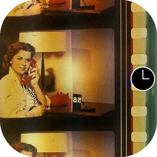 Color-timing control strips
Officially known as color-timing control strips, these anonymous female film studio workers were affectionately dubbed "china girls" by the industry, but are also known as leader ladies or lilys. The images in this show were meant only for use by the processing lab to match color tones in the associated film. They were often film lab workers themselves.
- Leaderlady project at SAIC
- Julie Buck and Karin Segal: Girls of Film
- Lili on the web
- Leaderladies and friends
- Sprocket girls
🕒🎞📽
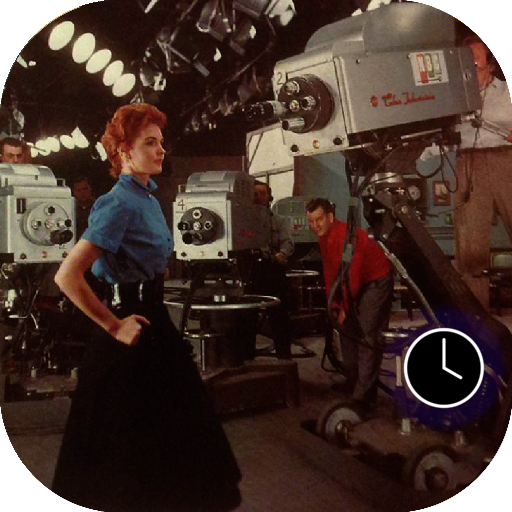 Miss NBC (1953)
The onset of color television brought no big surprise; in this medium too, producers hired Caucasian ladies as their test models, reinforcing longstanding biases in gender and race—the only difference being that in television, the objectified test model was known by her real name. The red-haired model Marie McNamara, for instance, became known in the 1950s when she modeled to calibrate the NBC television cameras, while CBS used a girl named Patty Painter.
“You know what a black-and-white test pattern is,” she told The New York Times in 1953.“Well, I’m it for color.
I’m the final check.”- Marie McNamara
- Living Test Patterns: The Models Who Calibrated Color TV
🕓📺
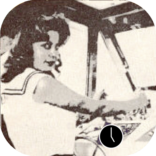 Two Bit Teddi Smith (1961)
 Lawrence G. Roberts used two different, cropped 6-bit grayscale scanned images from Playboy's July 1960 issue, featuring Playmate Teddi Smith, in his MIT master's thesis on image dithering.
-Original thesis
🕔💾◼️◽️
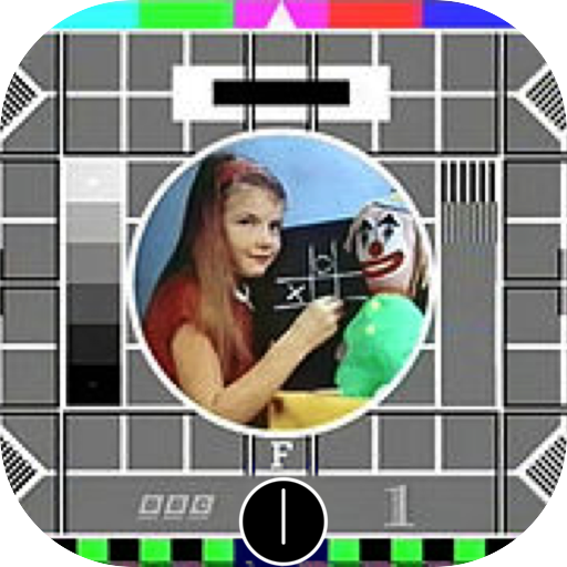 Carole Hersee (1967)
 Hersee is known as the face of the famous Test Card F (and latter J, W, and X), which aired on BBC Television from 1967 to 1998.
🕕📡
 Lenna or Lena (1972)
is the name given to a standard test image widely used in the field of image processing since 1973. It is a picture of the Swedish model Lena Söderberg, shot by photographer Dwight Hooker, cropped from the centerfold of the November 1972 issue of Playboy magazine.
The spelling "Lenna" came from the model's desire to encourage the proper pronunciation of her name. "I didn't want to be called Leena".
- More in Behind White Shadows
- Finding Lena, the Patron Saint of JPEGs
🕖💽🍑
 Maureen the LAD girl (1974)
The color-timing practice was not completely reliable; it involved a different China Girl and slightly different lighting each time. One of the reasons why around the 1980s, the technology was gradually superseded by the Laboratory Aim Density (LAD) system, developed by John Pytlak. Along with color-timing, the anonymous China Girls, whose occupancy ranged from studio workers to models, became artifacts of an obsolete film history and only one “LAD Girl” became the model for the color reference card: Maureen Darby.
Pytlak describes that “It was primarily intended as ‘representative’ footage, and not a standard.” By filming two 400-foot rolls of 5247 film, “all film supplied since the introduction of LAD is made from the same original negative, either as a duplicate negative, and now as a digital intermediate.”
- John P. Pytlak Technical Achievement LAD
🕗📊
Anya Major (1984)
is an American television commercial that introduced the Apple Macintosh personal computer. It was conceived by Steve Hayden, Brent Thomas and Lee Clow at ChiatDay, produced by New York production company Fairbanks Films, and directed by Ridley Scott. English athlete Anya Major performed as the unnamed heroine and David Graham as Big Brother.
- Apple 1984 commercial
🕘🛠
 Kodak Shirley card (until 1995)
 The identities of the many Shirleys who modeled for these normal standard cards stayed unknown. As such, the cards cultivated a gendered, race-biased standard reference, which even today continues to influence our image-processing technologies.
In his 1997 book White, British film studies professor Richard Dyer observes the following: "In the history of photography and film, getting the right image meant getting the one which conformed to prevalent ideas of humanity. This included ideas of whiteness, of what color — what range of hue — white people wanted white people to be.”
- Looking at Shirley, the Ultimate Norm: Colour Balance, Image Technologies, and Cognitive Equity
🕙☣️
 Jennifer in Paradise (1996)
In 2013, Constant Dullaart wrote an open letter to Jennifer Knoll, who was the model for the Photoshop test image and as a result, the model for the first digitally altered image. In his letter, he requested to enter the original image into the public domain or to gift it to an (media) archeological institution such as the Smithsonian. He never received a direct response, but he did digitally reconstruct the original image and created an image series consisting of Photshopped versions, materialized as wallpapers and a series of prints featuring enthusiastically filtered Jennifers (twirled, blurred, etc.).
Remarkably, in a response for the Guardian, the original image was published. - Constant Dullaart: Jennifer in Paradise – the correspondence
🕚‼️♊️
 Kodaks Multi-Racial norm reference card (1995)
The de-facto, racist standard that had been in play since the early part of the twentieth century in most analogue photo labs has been positively biased towards white skin tones, which naturally have a high level of reflectivity.
As a result it was difficult to capture darker and black skin tones and proved impossible to capture two highly contrasting skin tones within the same shot; when trying to capture a black person sitting next to a white person, the reproduction of any African-American facial images would often lose details and pose lighting challenges, and finally present ashen-looking facial skin colors that contrast strikingly with the whites of eyes and teeth.
From the single “Caucasian” woman surrounded by the necessary color balancing information codes, Kodak’s Shirley evolved into an image of three women with different skin colors.
- Lorna Roth Color film was built for white people. Here's what it did to dark skin. (2015)
🕛✅📸
 Jen Kind, the Everywhere Girl (1996)
 Before microstock was even a thing, model Jen Kind (then Jen Anderson) posed for a stock photo shoot in Portland, Oregon as a pensive, inquiring college student, pen in hand, ready to learn.
Her image wound up being published thousands of times on book covers, in self-help guides, and major advertising campaigns. Anderson’s likeness embodied a certain widely malleable narrative that photo editors, art directors, and marketers could use to illustrate a range of projects, and led her to be branded “Everywhere Girl.”
🕧✏️🖋📈
 Ann Lee (1999 - 2003)
 Together with Pierre Huyghe, Parreno acquired Ann Lee’s copyright by paying 46000 Yen to a design character company called ‘K’ Works. “Ann Lee’s was cheap. Designed to join any kind of story, but with no chance to survive”. After being sold, Parreno and Huyghe gave Ann Lee a second life by passing her onto other artists who created their own story lines for the character – free of charge.
The project was called ‘No Ghost Just a Shell’ and ran from 1999 until 2003. Then, Parreno and Huyghe decided that the copyright of this fictional character be assigned to her so she no longer could be exploited. A lawyer in New York drew up an official contract.
“She’s a polyphonic character . . . What’s interesting about this manga gure is that it’s a way to tell a story. A sexual story? You can use her. A dark story? You can use her. A nice story? You can use this character. She’s almost like a tool.”
As this quote suggests, Huyghe seems unsure as to the gender of Annlee, who is alternately a “she,” an “it,” and (almost) a “tool.” Is Ann Lee an object, or is she just objectified?
- Pierre Huyghe, Two Minutes Out of Time, 2000.
- Escaping Ghost
- Girlhood and the plastic Image by Heather Warren Crow
🕜👽
 Suzanne (2002)
In 2002 Not a Number Technologies (NaN), the company that was behind Blender, went bankrupt. Nevertheless, they put out one more release, 2.25. As a sort-of easter egg, and last personal tag, the artists and developers decided to add a 3D model of a chimpanzee head, although it is called a "monkey" in the software, who they named Suzanne.
Suzanne is still included in Blender, which was later saved. The largest Blender contest gives out an award called the Suzanne Award.
🕝🐒
 Hannah Stellar / Parked Domain Girl (2005)
Dunstin Steller took this photo of his sister, Hannah Stiller, and tossed it onto his iStockPhoto portfolio. For a few cents, Demand Media scooped up the photo and was then licensed to use it throughout their web properties. Every time a website goes dark, Demand Media scoops up the domain registration and parks it, with ads and links around this photo. The file is usually saved with the name "0012_female_student.jpg".
"Parked domain girl” or “the Expired Domain Girl“ has since spurred a little online fandom.
“Is it even her own at this point? Is it recognisable by a significant number of folk? Is this image ubiquitous (enough)? I’d argue the face/image is ours more than hers at this point.”
- Emilie Gervais: Parked Domain Girl Tombstone
- Parker Ito: Parked Domain Girl
🕞🌐💤
 Fabio (2012)
In 2012 Deanna Needell and Rachel Ward got permission from the agent of Fabio Lanzoni to use the popular male model’s likeness rather than use Lena.
- Deanna Needell and Rachel Ward: Lena vs Fabio - Stable image reconstruction using total variation minimization
🕟🧺
🧷
 Render Ghost
 (the only identified ghost: Olson Twin) (2013)
A collection of portraits that fill the 3D renders of future architecture, captured from billboards on the streets of London. James Bridle states: “The Render Ghosts are the people who live inside our imaginations, in the liminal space between the present and the future, the real and the virtual, the physical and the digital. A world of architecture, urbanism and the city before it is completed - which is also never. They inhabit a space which exists only in the virtual spaces of 3D computer rendering software, projected onto billboards, left to rot and torn down when the actual future arrives; never quite as glossy or as perfect as our renderings of it would like it to be, or have prepared us for.”
The question is have you seen these people? Did they give permission for their images to inhabit these architectures?
- The Render Ghosts James Bridle
- Render Search
🕠🏗👻
 Ariwasabi aka Ariane (2014)
You MUST have seen her in the last years! “Ariane is so ubiquitous, she has probably entered your subconscious at some point”
- Shutterstock
- The photomodel that wanted to be anonymous
🕡🏧👤
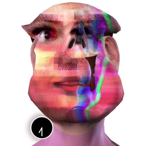 Tay (2016)
(Zach Blas version)
Tay was a chat bot based on artificial intelligence,originally released by Microsoft via Twitter on March 23, 2016. But Tay caused subsequent controversy when she began to post inflammatory and offensive tweets through its Twitter account, causing Microsoft to shut down the service only 16 hours after its launch.
- I am here to learn so by Zach Blas
🕢🔇⛔️
 The Other Nefertiti (2015)
An artistic intervention by Jan Nikolai Nelles and Nora Al- Badri.
By orchestrating a leak of the 3d file information of the Nefertiti bust, they wished to “activate the artefact, to inspire a critical re-assessment of today’s conditions and to overcome the colonial notion of possession in Germany's museums.”
With regard to the notion of belonging and possession of material objects of other cultures, the artists intention is to make cultural objects publicly accessible and to promote a contemporary and critical approach on how the “Global North“ deals with heritage and the representation of “the Other”.
We should tell stories of entanglement and Nefertiti is a great case to start with to tell stories from very different angles and to see how they intertwine.
- The other Nefertiti by Nora Al-Badri & Jan Nikolai Nelles
 Actroid: Ashley from Oddcasts (2019)
 Ashley is “a virtual nurse for human patients. Her appearance and voice were developed by ODDCAST, a provider of text-to-speech software.
[...] The possibility of discrimination on the basis of simulated femininity has long been part of the code of female impersonators. Alexa has a plethora of responses should she face harassment.” In her installation OFFREAL, Malin Kuht gives the virtual assistants their say.
- Malin Kuth: OFFREAL (2019)
🕤🎚🎙
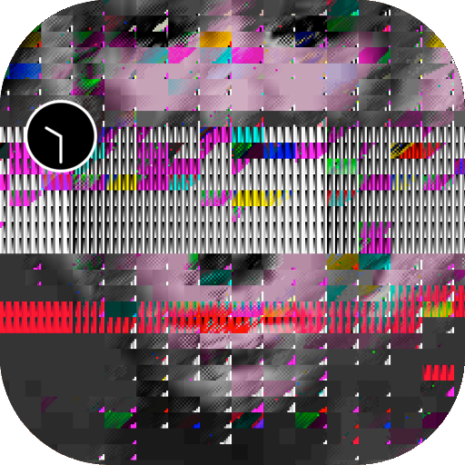 A Ghost for De-Calibration (2019)
 Soon after the release of a Vernacular of File Formats (2010), a sequence of nonconsensual, non-attributed instances of exploitation appeared: my face became an embellishment for cheap internet trinkets such as mugs and sweaters and application buttons proprietary glitch softwares. The image, exploited by artists and creators alike, started to lose its connection to the source—to me—and instead became the portrait of no one in particular, a specter, similar to a Shirley test image, though in this case, a Shirley for de-calibration. Last May (2019) I was asked to lend the image to Vogue (the US fashion magazine). I took this as an opportunity to reclaim the image in the only way I could imagine possible - by renaming the portrait formally known as “Blinx (from a Vernacular or File Formats)” to “A Ghost for De-calibration”. With this small, probably to most invisible action, I wish to take a stand against the discourse of color test cards and promote the consideration and creation of alternative cards and resolutions.
- De-Calibration Card
🕥🌀📏🏴☠️
 365 Perfect decalibration (2019-2020)
 365 perfect is “the best FREE virtual makeup app, period. It’s like having a glam squad in your pocket!”
The options in the app include virtual photo make-up, which has filters such as ‘delete blemishes’, or ‘brighten and soften skin’. It can also deepen the smile, put lipstick or even lip tatoos, enlarge the eyes and make the face slimmer, lift the cheeks, enhance the nose, or resize the lips. And lets not forget to whiten the teeth, add eyelashes, eye liner and eyebrows and finally change the hairstyle.
This sticker is created by using the app to make myself perfect. not once, not twice, but hundreds of times over, more perfection one year along.
If everyday I could get just one shade lighter, slimmer cheeks or bigger eyes... how perfect would I become?
By re-saving my newly beautified face every iteration, the artifacts of a re-compressed JPEG and the absurdity of our beautifying standards are amplified.
- 365 Perfect
🕦✅💚🦠

⚔️⚙️

📂📲💻
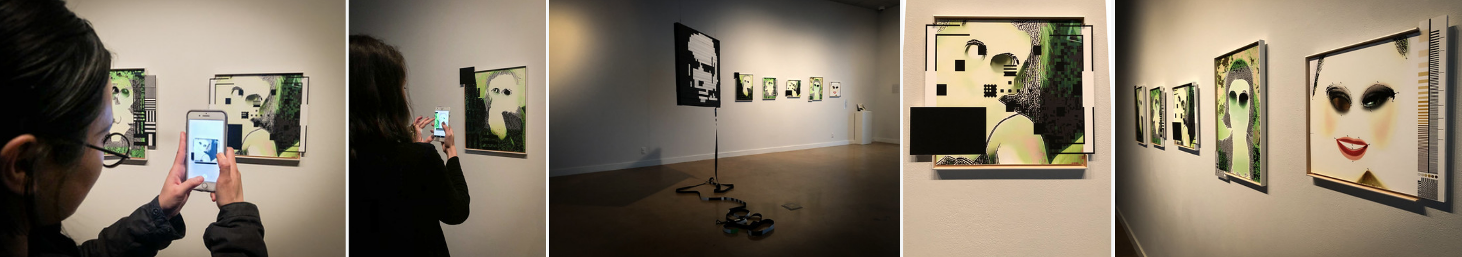
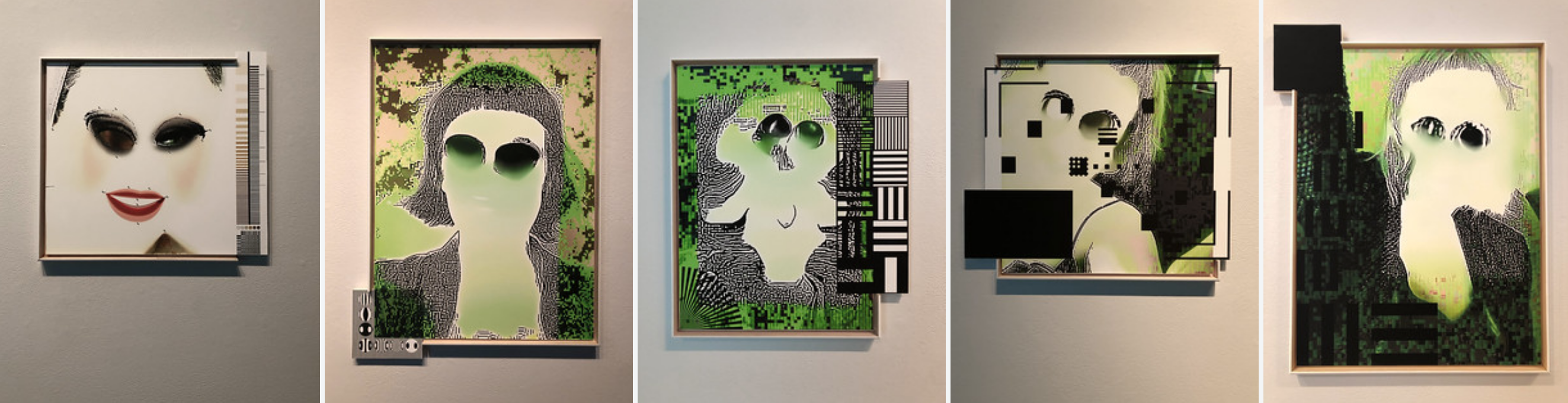 The i.R.D. Perfect DeCalibration Army (2019-ongoing)
Seven one-of-a-kind archival prints that each come with an embedded Artivive AR video (please download the Artivive app to see AR content).The prints are embedded in a custom build list of wood that has a test target extruding out of it.
1. Decalibrated Self portrait with USAF1951 Resolution test Tri-bars [46 x 58 cm including black square]
2. Decalibrated Self portrait with quarter Siemens Star and DIY Test Resolution Target for Pixel Resolution [39 x 45 cm with extruding DIY Test Resolution Target]
3. Decalibrated Self portrait with Facial Recognition crosshair [47 x 38 cm including extruding crosshair]
4. Decalibrated Self portrait with Ronchigrams for mirror curvature testing [45 x 58 cm including Ronchigrams]
5. Decalibrated Ariane Shutterstock model with Modulation Transfer Function Tests, Fitz Patrick Scale, Discrete Cosine Transform and Quadrant Pattern registration marks [41 x 37 cm including extruding Modulating Transfer Function Test]
Measurements approximate and do not include custom build list
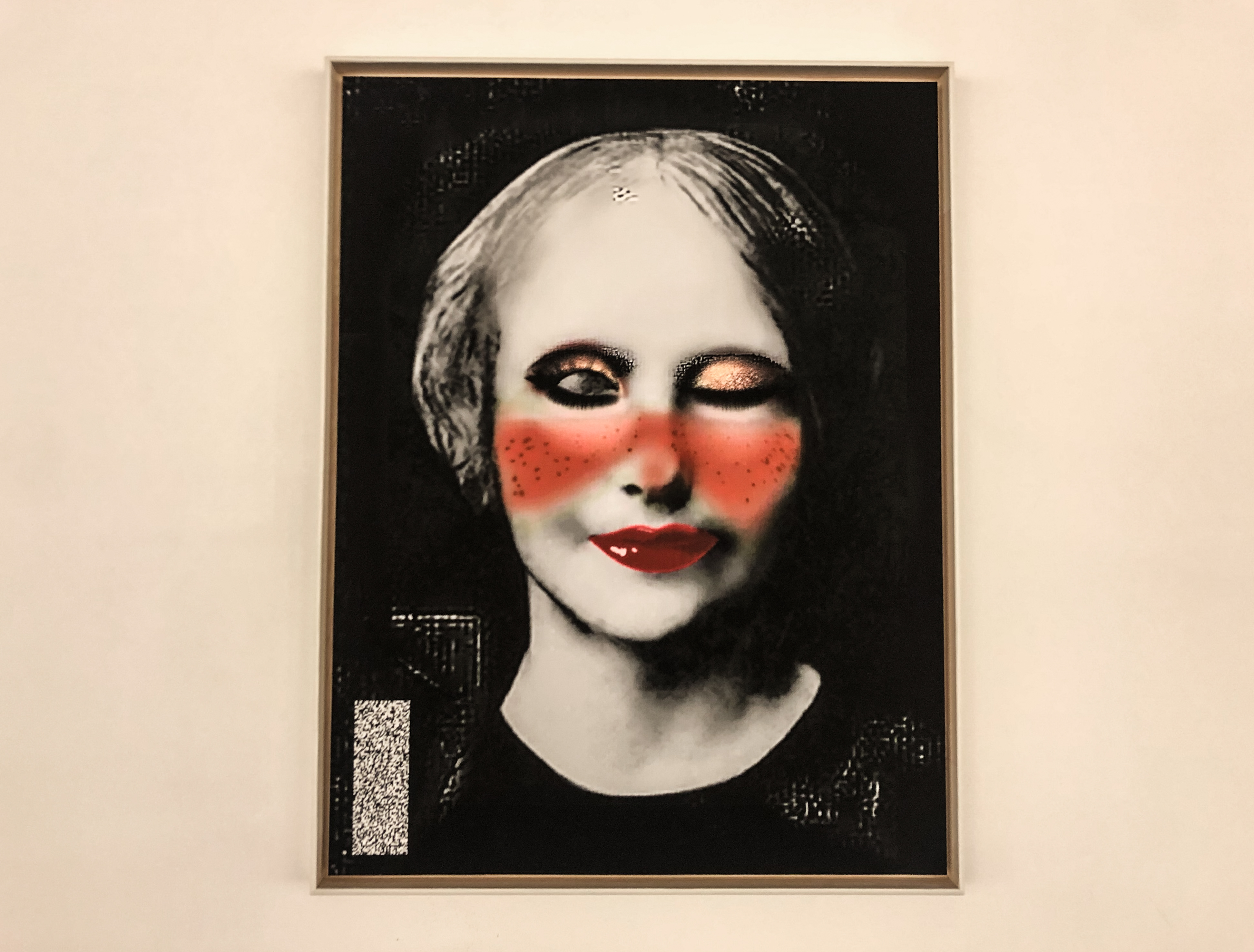
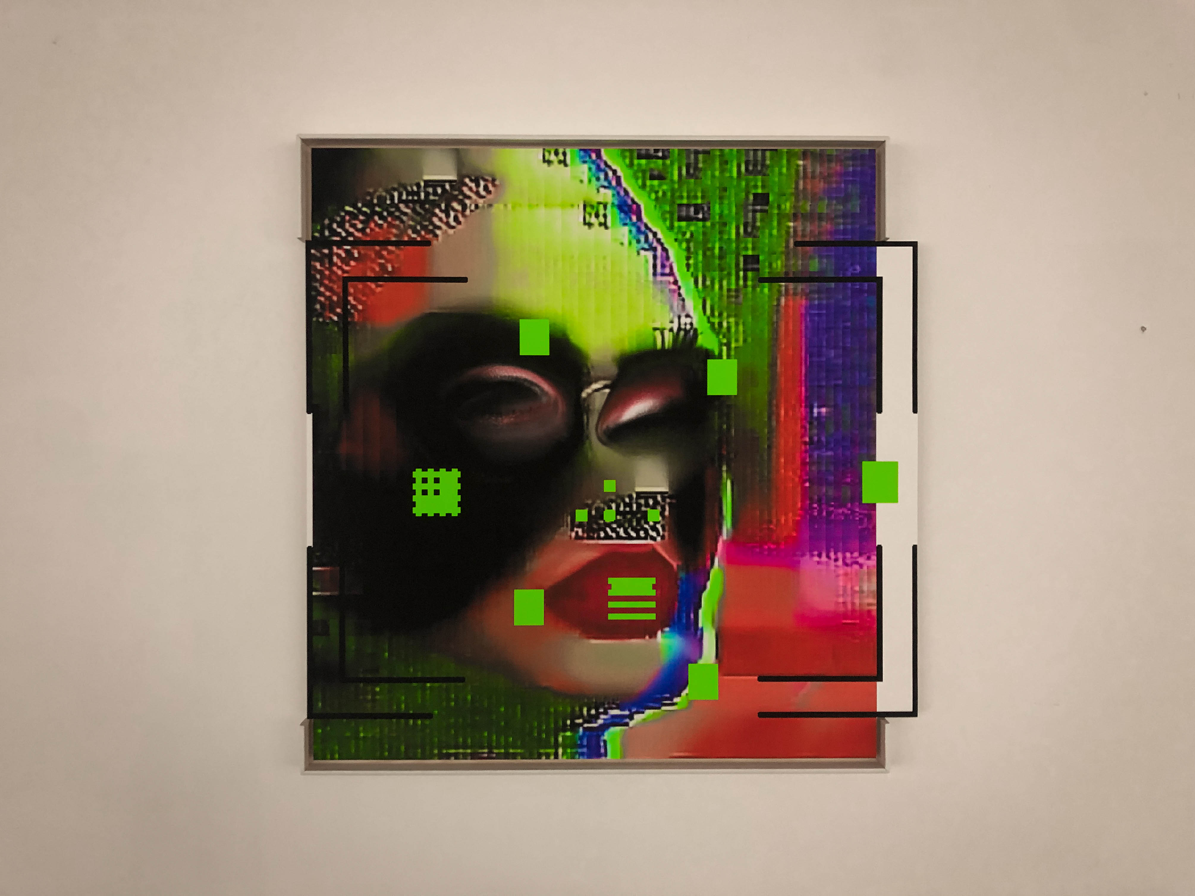
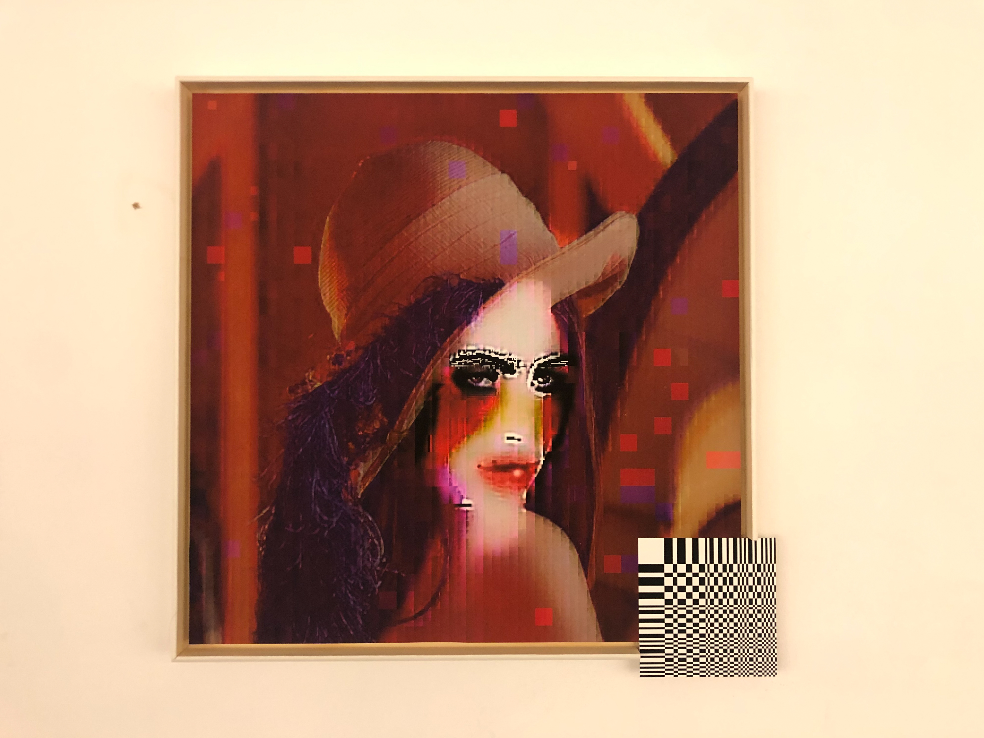
For Rainbows END festival The 365 Perfect Decalibration Army has grown to include 3 Inconnues
A. La Inconnue de la Seine (aka: CPR ANNIE / ANNIE R U OK?) with noise stripe (42.16 x 55.21 cm)
B. Lena JPEG with DCT extrusion (46.06 x 46.06 cm)
C. Tay Tweets with Facial Recognition crosshair (55 x 55 cm)
Measurements approximate and do include custom build list
From the Shadow Knowledge catalogue:
“In 365 Perfect, Menkman turns to mobile imaging softwares. 365 Perfect is “the best FREE virtual makeup app, period. It’s like having a glam squad in your pocket” - or so states the software.
The options in the app include virtual photo make-up, which has filters such as ‘delete blemishes’, or ‘brighten and soften skin’. It can also deepen the smile, put lipstick or even lip tatoos, enlarge the eyes and make the face slimmer, lift the cheeks, enhance the nose, or resize the lips. And lets not forget to whiten the teeth, add eyelashes, eye liner and eyebrows and finally change the hairstyle.
“I used the app to make myself perfect. not once, not twice, but hundreds of times over, one year long perfection. If everyday I could get just one shade lighter, slimmer cheeks or bigger eyes... how beautiful would I become? By re-saving my newly beautified face every iteration, the artifacts of a re-compressed JPEG and the absurdity of our beautifying standards are amplified incrementally.”
In this humorous, yet discomforting work, Menkman layers the standard features of beautifying software on her own image, enlarging her eyes, deleting blemishes and enhancing features, until the original face is nearly unrecognizable. Over and over, Menkman alters her likeness, seemingly to make herself appear more conventionally beautiful and more “perfect”. Saving her image at every new iteration, she arrives at a re-compressed pixelated JPEG, and a grotesque, if not almost unhuman self-portrait. Presented at the Natalie and James Thompson Gallery in the form of prints, 365 Perfect is not only a powerful commentary on the relationship between mobile technology and the beauty industry, but a careful exploration of generation loss, and the visual artifacts that are created as a result.
 les inconnues is a poster featuring my collection of unknown women of image processing. This poster was a result of my Behind White Shadows research