


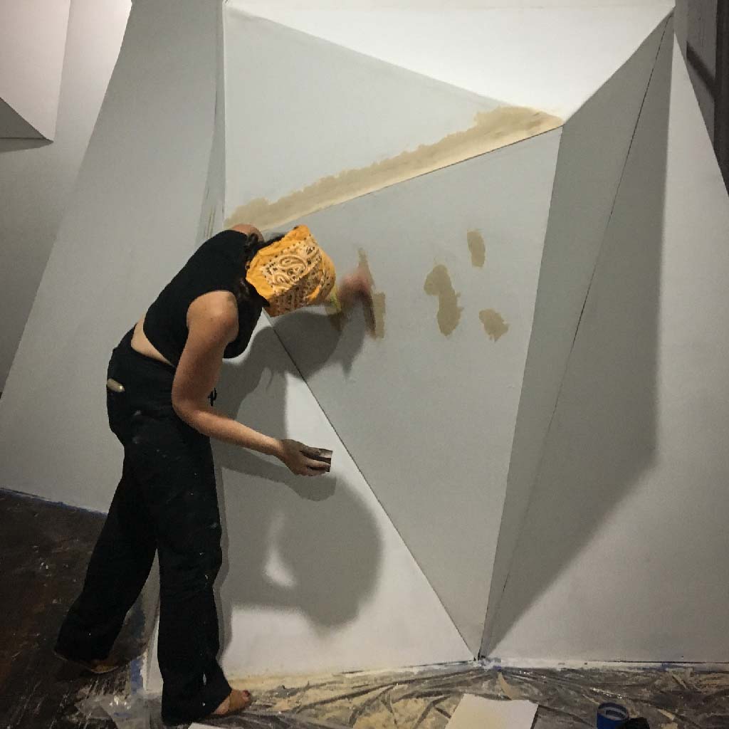
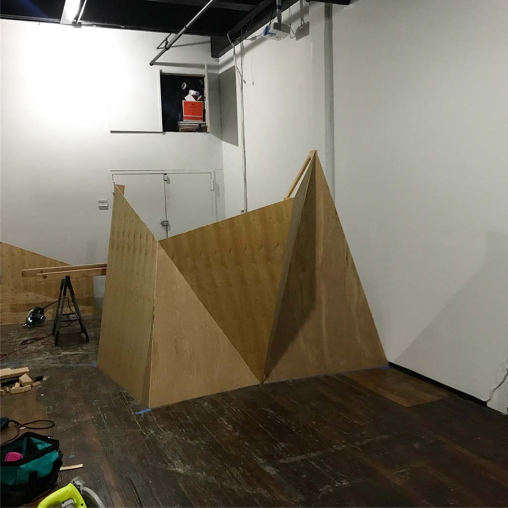
Order and Progress at Fabio Paris Gallery, Brescia, Italy (2011) Order and Progress was my first solo show. There were four works on display:
- The Collapse of PAL
- A Vernacular of File Formats
- Monglot
- Dear mr. Compression.
Domenico Quaranta wrote a complimentary text for it.
︎ Order and Progress catalogue text by Domenico Quaranta


1. Deterioration has always been part of the
life of an image. Any image we can think of,
from prehistoric cave paintings to the latest
Hollywood movie, can be described in terms
of its level of deterioration. Deterioration can
start straight away or come later; it can be
almost invisible, or have a huge impact on the
current perception of a given image. In a
recent video essay [1], artist Oliver Laric shows
how, paradoxically, iconoclasm made true
“icons” of images that would probably have
been of little interest for the modern tourist if
they were not damaged; and if we think about
Romantic painting as dark and contrasted, it
is mainly thanks to the widespread use of
bituminous colours, that darken over time.
That said, deterioration is usually perceived as
negative. The general view is that a damaged
piece needs restoration. But what if
deterioration is adopted as an artistic strategy,
integrated into the creative process?
Before the age of mechanical reproduction, Edvard Munch was the only artist to address this. His infamous “hestekur” (a Norwegian term that can be translated into “horse cure”) consisted in leaving his paintings in the open, exposed to rain, snow, high and low temperatures, sunlight and humidity, dust and mould, to make them physically “mature” – or die.[2]
2. While deterioration has usually been considered something bad, as a creative stimulus the accident has a long tradition in art: from Leonardo, who looked into the stains on walls, ashes, clouds and mud, to the Surrealists’ automatic techniques, the accident – accidental revelations, incidents and mistakes – has often heralded epiphany. Rosa Menkman often quotes Paul Virilio: «The accident doesn’t equal failure, but instead erects a new significant state, which would otherwise not have been possible to perceive and that can “reveal something absolutely necessary to knowledge”.»[3]
3. Virilio’s interest in accident is strongly related to the zeitgeist of the 20th century. Today, images are not made to last; they deteriorate at an incredible rate. Furthermore, in the age of electronic – and, later, digital media – errors in communication and visualization occur on a daily basis. Transmission goes wrong, storage media get obsolete, file formats disappear, reading softwares are updated. If «to invent the train is to invent derailment» [4] and «to invent the ship is to invent the shipwreck», then to invent film is to invent scratches (as in Nam June Paik’s Zen For Film, 1964); to invent video is to invent white noise and signal distortions; and to invent files is to invent glitches [5]. Research on technology has been always guided, as Rosa Menkman puts it, by a «dominant, continuing search for a noiseless channel.» [6] Artists, on the other side, have always been much more interested in noise, errors, failures, glitches. But why?
4. New media – from photography to computers – are not neutral tools, like a pencil. They have been designed to get a certain result, and they have been perfected in order to make the process smoother and the result better. Let’s take photography. Technically, it is a process that consists in «creating still pictures by recording radiation on a radiation-sensitive medium.» [7] Yet it has been always viewed as a way to represent reality, and any technical advancement was made with this target in mind. This is the ideology of the medium. If you use it properly, there is no way to act outside of this ideology. The only way to do it is to hack the medium. Produce noise. Trigger mistakes. Exploit failures. Of course, a lot of good art has been produced without questioning the ideology of a given medium. Yet, the more that medium becomes a mirror of power, the more noise becomes an interesting artistic strategy. This is why hacking video is more interesting than hacking photography. Furthermore, the more a given medium attempts to turn any creative option into a convention, a filter, an option in a menu – inevitably normalizing it – the more working outside of operating templates becomes interesting. That is why hacking computers – and any computerized medium, including digital photo and video cameras – is definitely more interesting than hacking any pre-digital medium.
5. And that is why exploiting the medium at its best has become a prerogative of mainstream culture, while art prefers, in Nicholas Bourriaud’s words, to focus on “the indeterminacy of its source code”: «today, one must struggle, not – as Greenberg did – for the preservation of an avant-garde that is self sufficient and focused on the specificities of its means, but rather for the indeterminacy of art’s source code, its dispersion and dissemination, so that it remains impossible to pin down – in opposition to the hyperformatting that, paradoxically, distinguishes kitsch.» [8] This quote might seem out of place here. Bourriaud is arguing against medium specificity, and what could be more mediumspecific than exploiting a medium’s shortfalls? This is the dead end that much criticism regarding the current artistic use of technology comes up against. Today, many artists are interested in noise and glitches, low resolution aesthetics, poor images, old media, dirty styles, but also, paradoxically, in an unprofessional, amateurish use of defaults and presets. Is their work formalist, in the sense codified by Greenberg? Definitely not, for two main reasons.
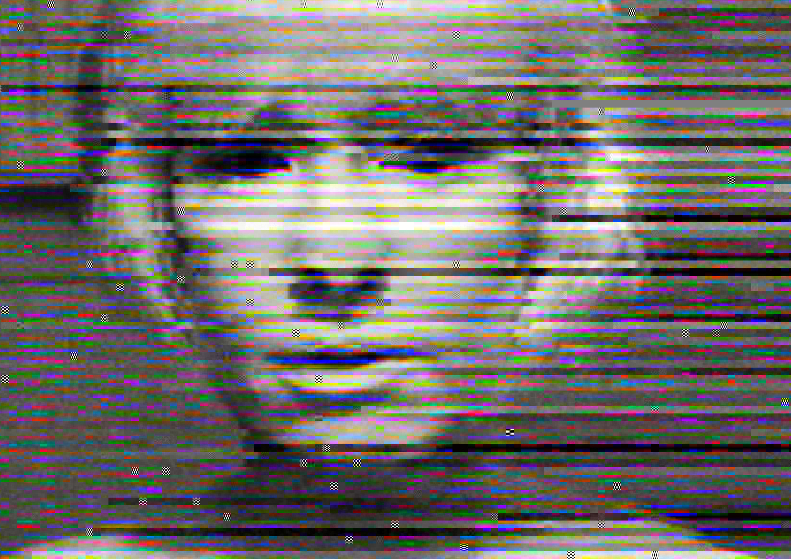
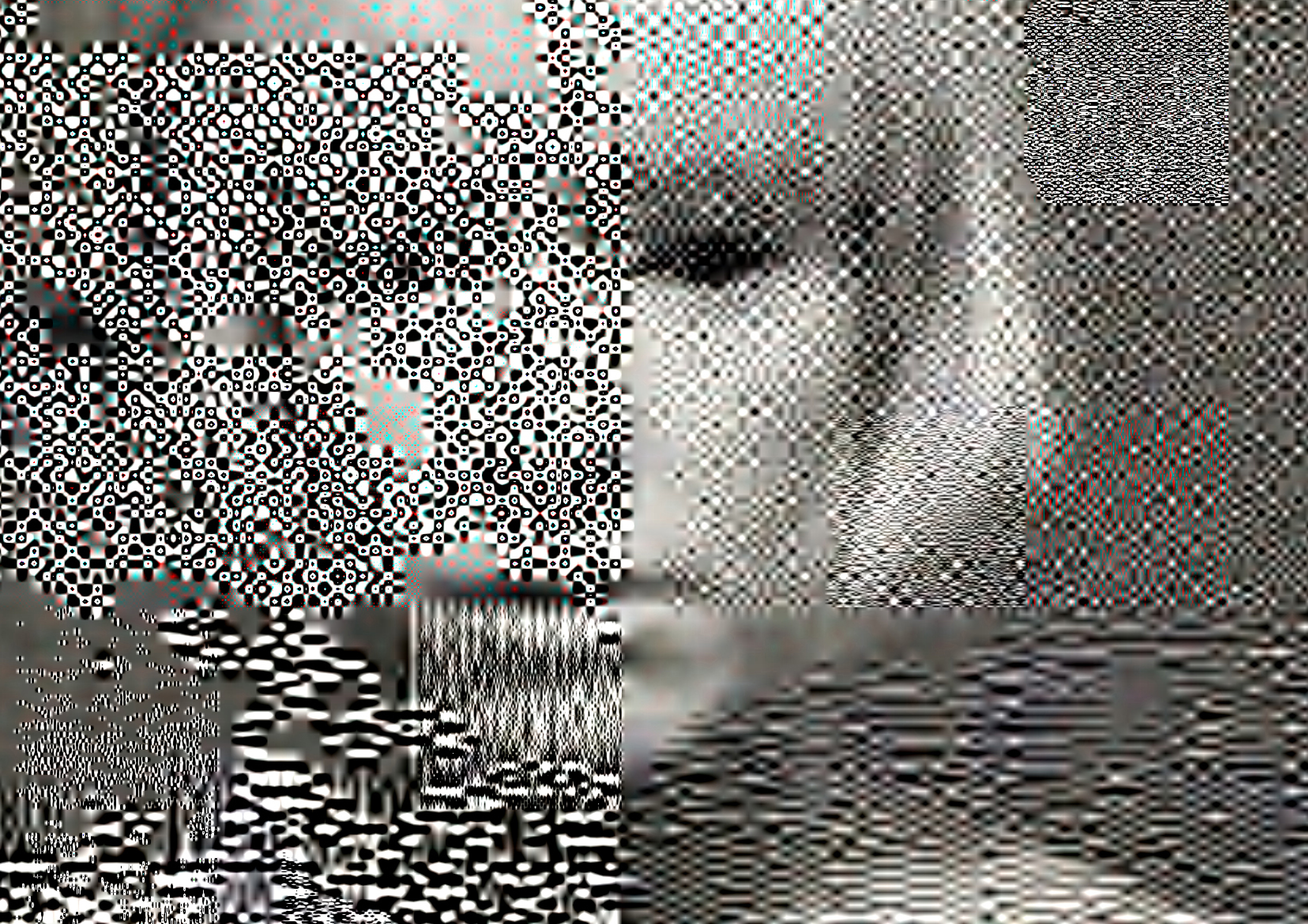
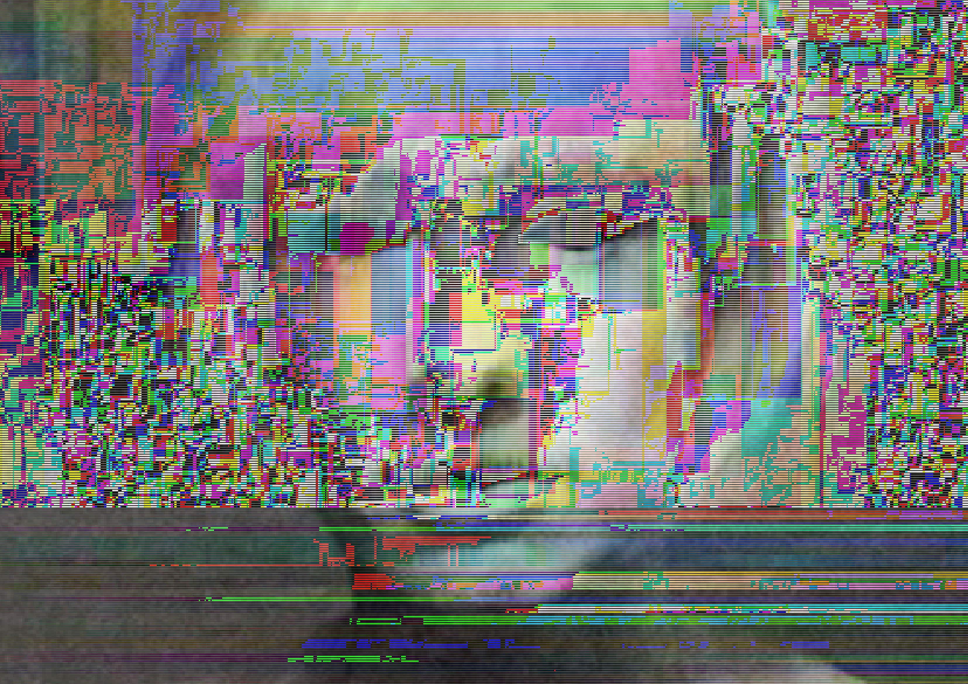
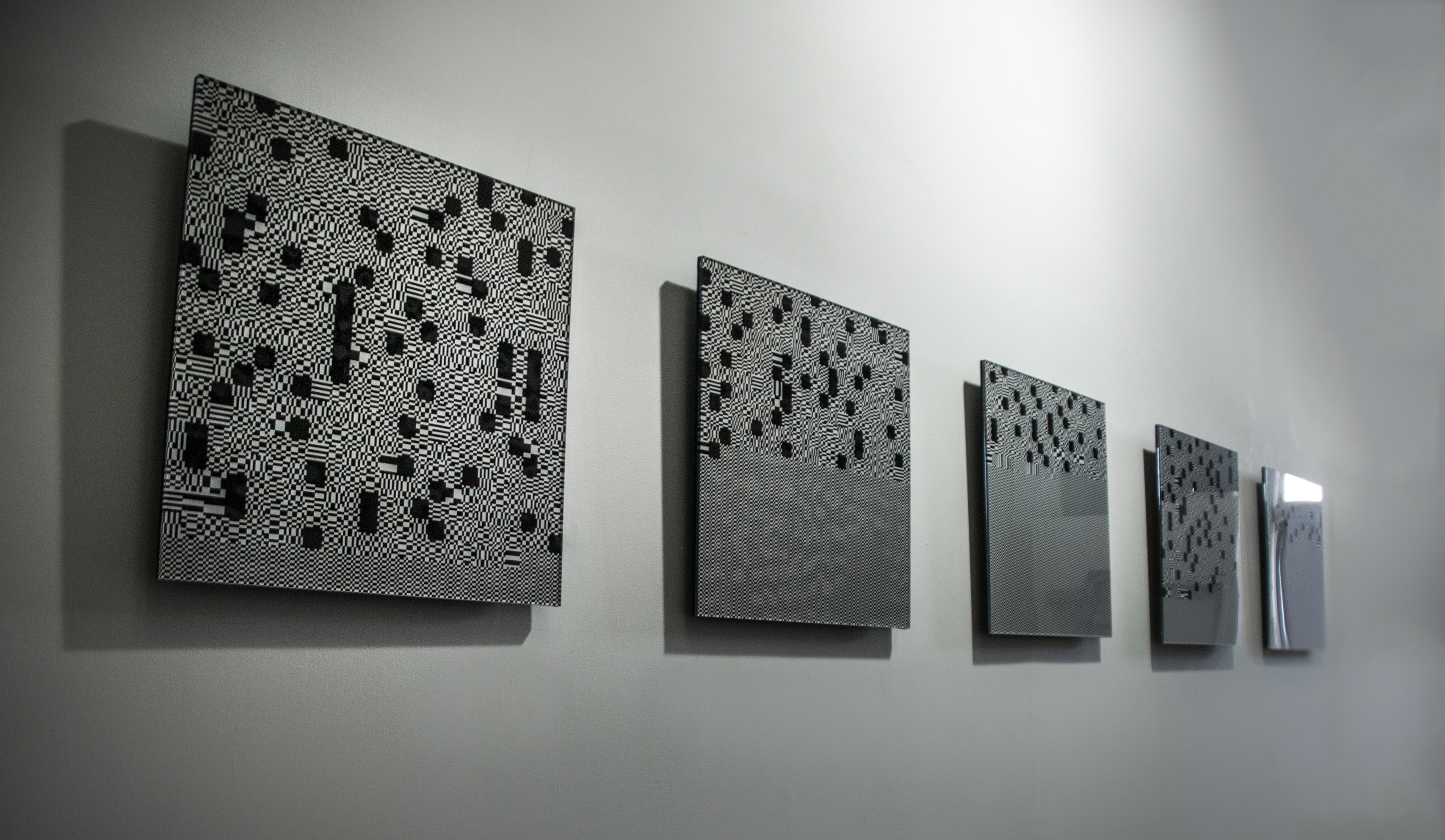
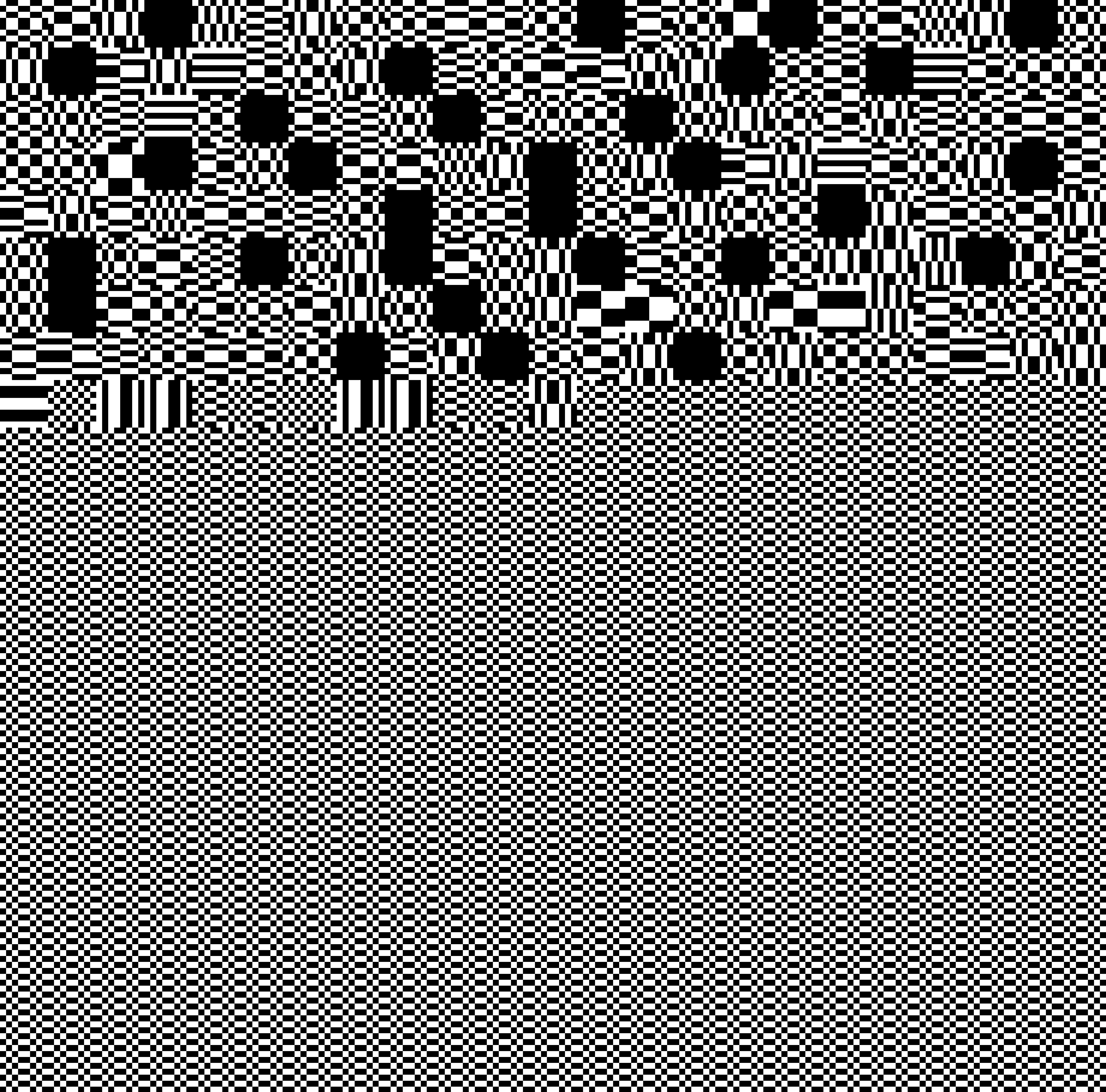
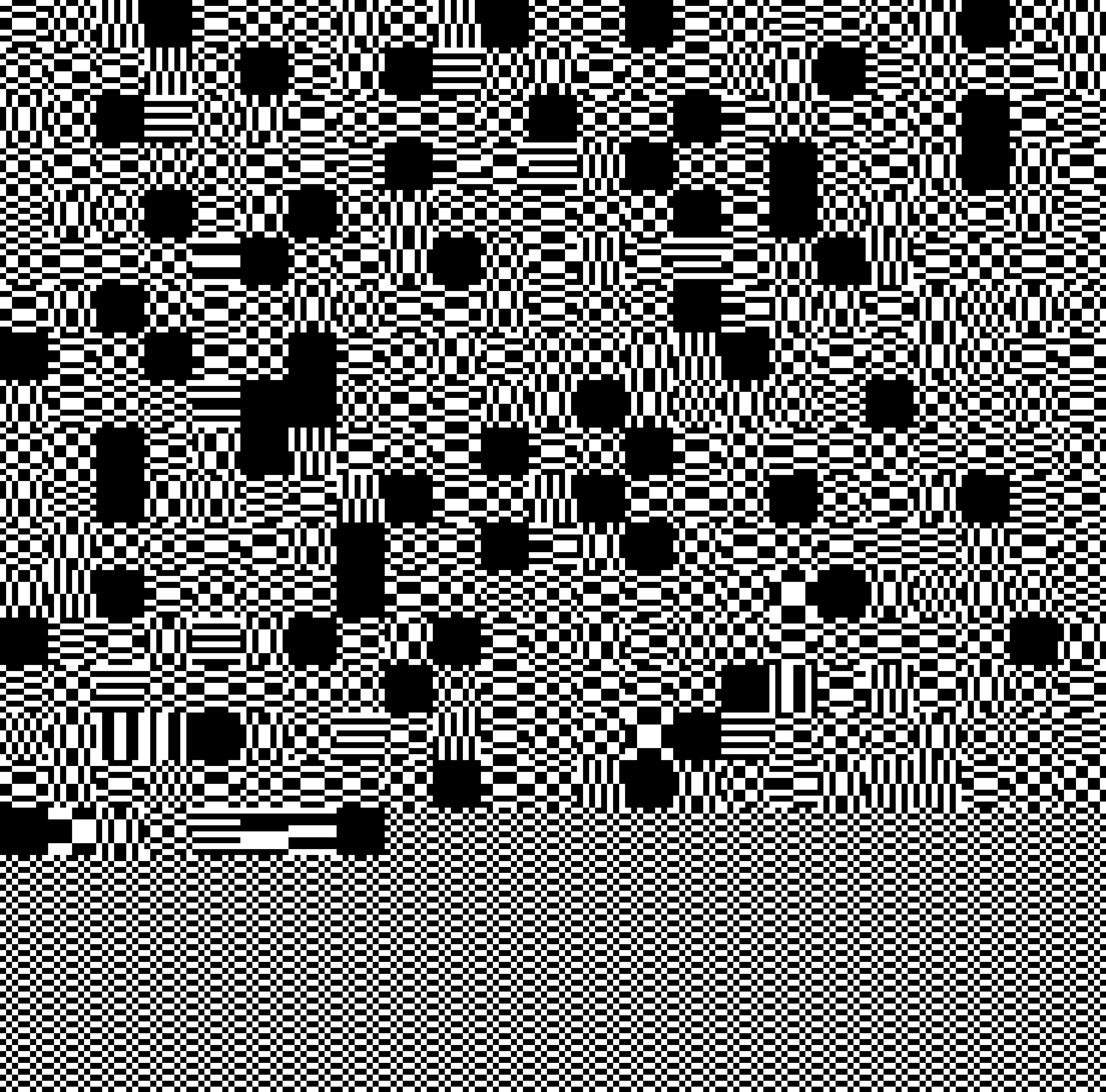
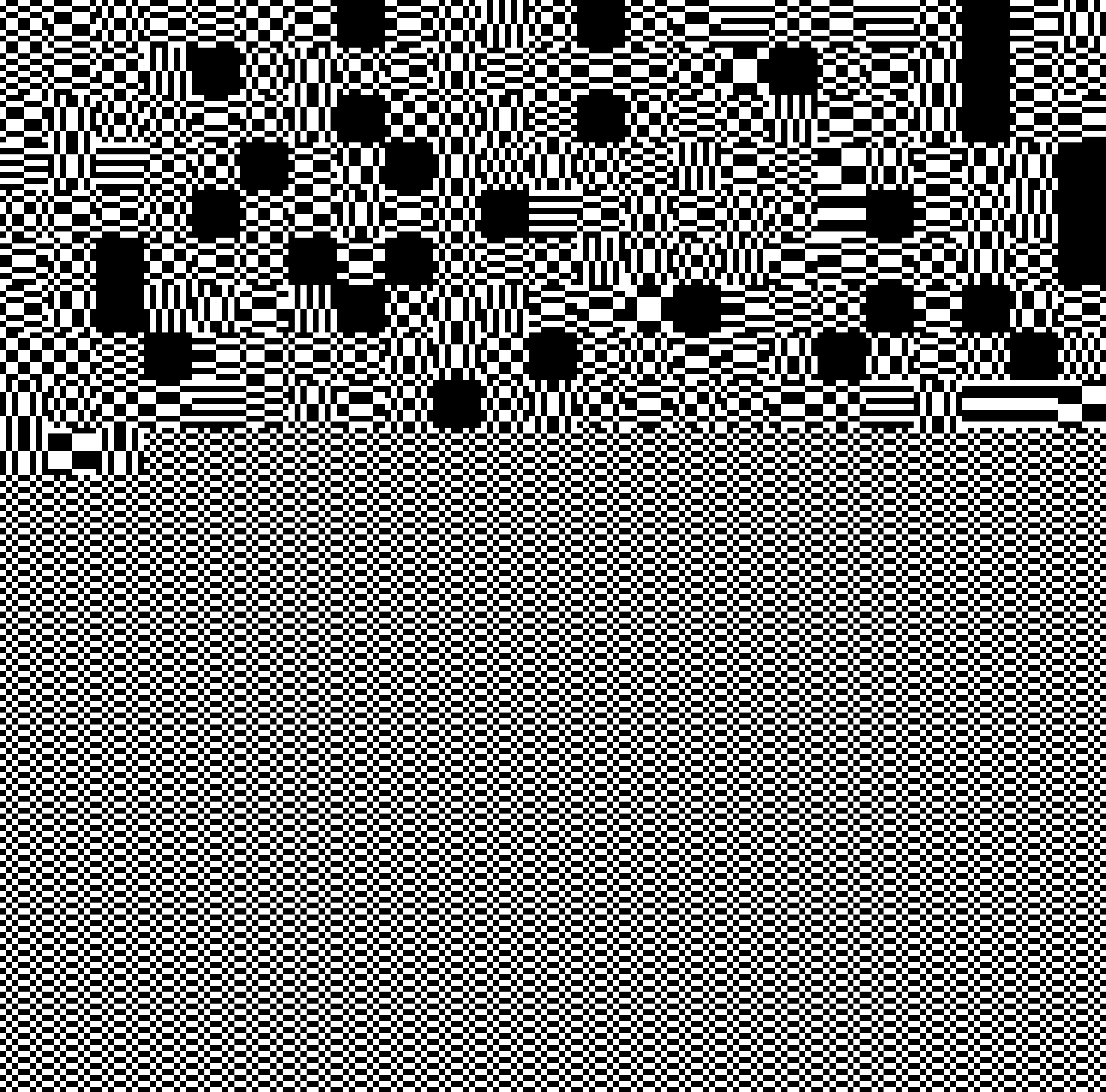
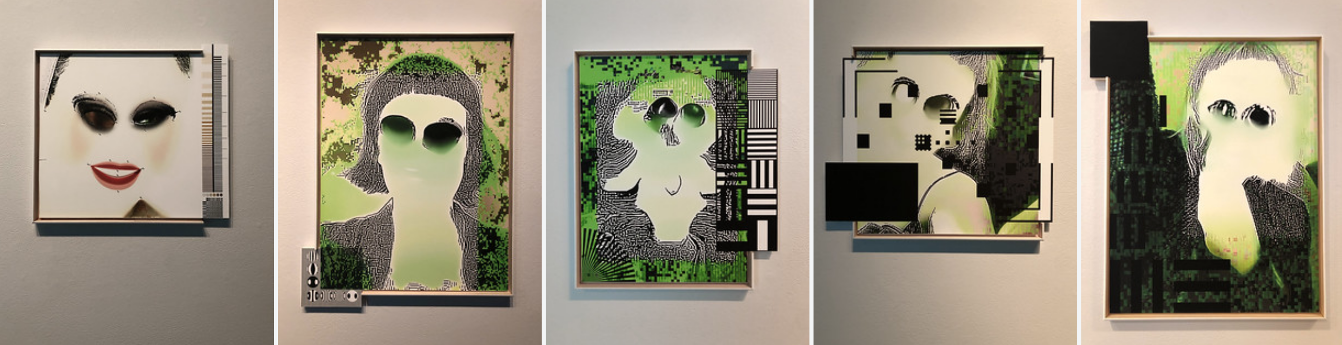
6. It is, first and foremost, a political act of liberation and resistance against control. They focus on the medium because they are combating the medium’s “order and progress” ideology – the ideology brings us to the “hyperformatting that distinguishes kitsch”. In order to do so, in Menkman’s terms, they «find catharsis in disintegration, ruptures and cracks; manipulate, bend and break any medium towards the point where it becomes something new; utilize glitches to bring any medium to a critical state of hypertrophy, to (subsequently) criticize its inherent politics.» [9] They do this with the acute awareness that their time is short, because what they are doing will, sooner or later, become a style, a fashion, and a filter in the “tools” bar of some commercial software. This can be seen very well in Rosa Menkman’s work, particularly in her crazy jumping from one experiment to the other. She never uses the same glitch twice. She doesn’t like effects that are reproducible. She always looks for the unexpected, the unpredictable, the uncanny. She is a true “nomad of noise artifacts”. Let’s take the Vernacular of File Formats (2010), a collection of 7 videos and 10 file formats images where, as she wrote, she actively demystifies the most popular glitch effects. The Vernacular is, at the same time, an essay, a tutorial for wannabe glitch artists, and a collection of experiments that should not be repeated, but that will be inevitably be repeated until their aesthetic potential is exhausted.
Before the age of mechanical reproduction, Edvard Munch was the only artist to address this. His infamous “hestekur” (a Norwegian term that can be translated into “horse cure”) consisted in leaving his paintings in the open, exposed to rain, snow, high and low temperatures, sunlight and humidity, dust and mould, to make them physically “mature” – or die.[2]
2. While deterioration has usually been considered something bad, as a creative stimulus the accident has a long tradition in art: from Leonardo, who looked into the stains on walls, ashes, clouds and mud, to the Surrealists’ automatic techniques, the accident – accidental revelations, incidents and mistakes – has often heralded epiphany. Rosa Menkman often quotes Paul Virilio: «The accident doesn’t equal failure, but instead erects a new significant state, which would otherwise not have been possible to perceive and that can “reveal something absolutely necessary to knowledge”.»[3]
3. Virilio’s interest in accident is strongly related to the zeitgeist of the 20th century. Today, images are not made to last; they deteriorate at an incredible rate. Furthermore, in the age of electronic – and, later, digital media – errors in communication and visualization occur on a daily basis. Transmission goes wrong, storage media get obsolete, file formats disappear, reading softwares are updated. If «to invent the train is to invent derailment» [4] and «to invent the ship is to invent the shipwreck», then to invent film is to invent scratches (as in Nam June Paik’s Zen For Film, 1964); to invent video is to invent white noise and signal distortions; and to invent files is to invent glitches [5]. Research on technology has been always guided, as Rosa Menkman puts it, by a «dominant, continuing search for a noiseless channel.» [6] Artists, on the other side, have always been much more interested in noise, errors, failures, glitches. But why?
4. New media – from photography to computers – are not neutral tools, like a pencil. They have been designed to get a certain result, and they have been perfected in order to make the process smoother and the result better. Let’s take photography. Technically, it is a process that consists in «creating still pictures by recording radiation on a radiation-sensitive medium.» [7] Yet it has been always viewed as a way to represent reality, and any technical advancement was made with this target in mind. This is the ideology of the medium. If you use it properly, there is no way to act outside of this ideology. The only way to do it is to hack the medium. Produce noise. Trigger mistakes. Exploit failures. Of course, a lot of good art has been produced without questioning the ideology of a given medium. Yet, the more that medium becomes a mirror of power, the more noise becomes an interesting artistic strategy. This is why hacking video is more interesting than hacking photography. Furthermore, the more a given medium attempts to turn any creative option into a convention, a filter, an option in a menu – inevitably normalizing it – the more working outside of operating templates becomes interesting. That is why hacking computers – and any computerized medium, including digital photo and video cameras – is definitely more interesting than hacking any pre-digital medium.
5. And that is why exploiting the medium at its best has become a prerogative of mainstream culture, while art prefers, in Nicholas Bourriaud’s words, to focus on “the indeterminacy of its source code”: «today, one must struggle, not – as Greenberg did – for the preservation of an avant-garde that is self sufficient and focused on the specificities of its means, but rather for the indeterminacy of art’s source code, its dispersion and dissemination, so that it remains impossible to pin down – in opposition to the hyperformatting that, paradoxically, distinguishes kitsch.» [8] This quote might seem out of place here. Bourriaud is arguing against medium specificity, and what could be more mediumspecific than exploiting a medium’s shortfalls? This is the dead end that much criticism regarding the current artistic use of technology comes up against. Today, many artists are interested in noise and glitches, low resolution aesthetics, poor images, old media, dirty styles, but also, paradoxically, in an unprofessional, amateurish use of defaults and presets. Is their work formalist, in the sense codified by Greenberg? Definitely not, for two main reasons.
6. It is, first and foremost, a political act of liberation and resistance against control. They focus on the medium because they are combating the medium’s “order and progress” ideology – the ideology brings us to the “hyperformatting that distinguishes kitsch”. In order to do so, in Menkman’s terms, they «find catharsis in disintegration, ruptures and cracks; manipulate, bend and break any medium towards the point where it becomes something new; utilize glitches to bring any medium to a critical state of hypertrophy, to (subsequently) criticize its inherent politics.» [9] They do this with the acute awareness that their time is short, because what they are doing will, sooner or later, become a style, a fashion, and a filter in the “tools” bar of some commercial software. This can be seen very well in Rosa Menkman’s work, particularly in her crazy jumping from one experiment to the other. She never uses the same glitch twice. She doesn’t like effects that are reproducible. She always looks for the unexpected, the unpredictable, the uncanny. She is a true “nomad of noise artifacts”. Let’s take the Vernacular of File Formats (2010), a collection of 7 videos and 10 file formats images where, as she wrote, she actively demystifies the most popular glitch effects. The Vernacular is, at the same time, an essay, a tutorial for wannabe glitch artists, and a collection of experiments that should not be repeated, but that will be inevitably be repeated until their aesthetic potential is exhausted.
7. Yet, if it was just that, it wouldn’t be that
interesting. Rosa Menkman’s work and, more
broadly, Glitch Art and the best contemporary
computer-based art is not just an attempt to
liberate a medium and its own languages – it
is also an attempt to use them to say
something that could never be said otherwise.
Let’s look back to the early examples of the
use of deterioration and accidents in art.
Edvard Munch “matured” his paintings
because conventional painting techniques did
not allow him to express the existential drama
he wanted to convey. The Surrealists adopted
automatic techniques such as frottage and
grattage as a means to access the
unconscious. The original shooting of the
Vernacular of File Formats would never have
succeeded in saying what its seventeen
iterations do say. However interesting as an
image, it is the result of a medium under
control. It is just a nice, black and white
picture file where a heavily made-up
Menkman is seen combing her hair (an explicit
reference to Marina Abramovic’s Art Must Be
Beautiful, 1975). It is like AnnLee before she
was bought and shared by Philippe Parreno
and Pierre Huyghe back in 1999: a ghost
image waiting to be rescued from an industry
that had condemned her to death. Similarly,
the flow of data it consists of has been
condemned to be always visualized in the
same way. In his essay “Art in the Age of
Digitalization” [10], Boris Groys claims that
every digital image is a mere copy of an
invisible original – the image file. The image file
is an invisible string of digital data; the digital
image is the way that file is visualized (that is,
performed) in a given context. Introducing a
glitch between the image file and the digital
image, Menkman liberates the latter from its
status of copy of an invisible original.
The same image is now different every time it
is performed. From its birth to its death, it has
many possible lives. It is no longer a copy: it is
the source of many possible originals.
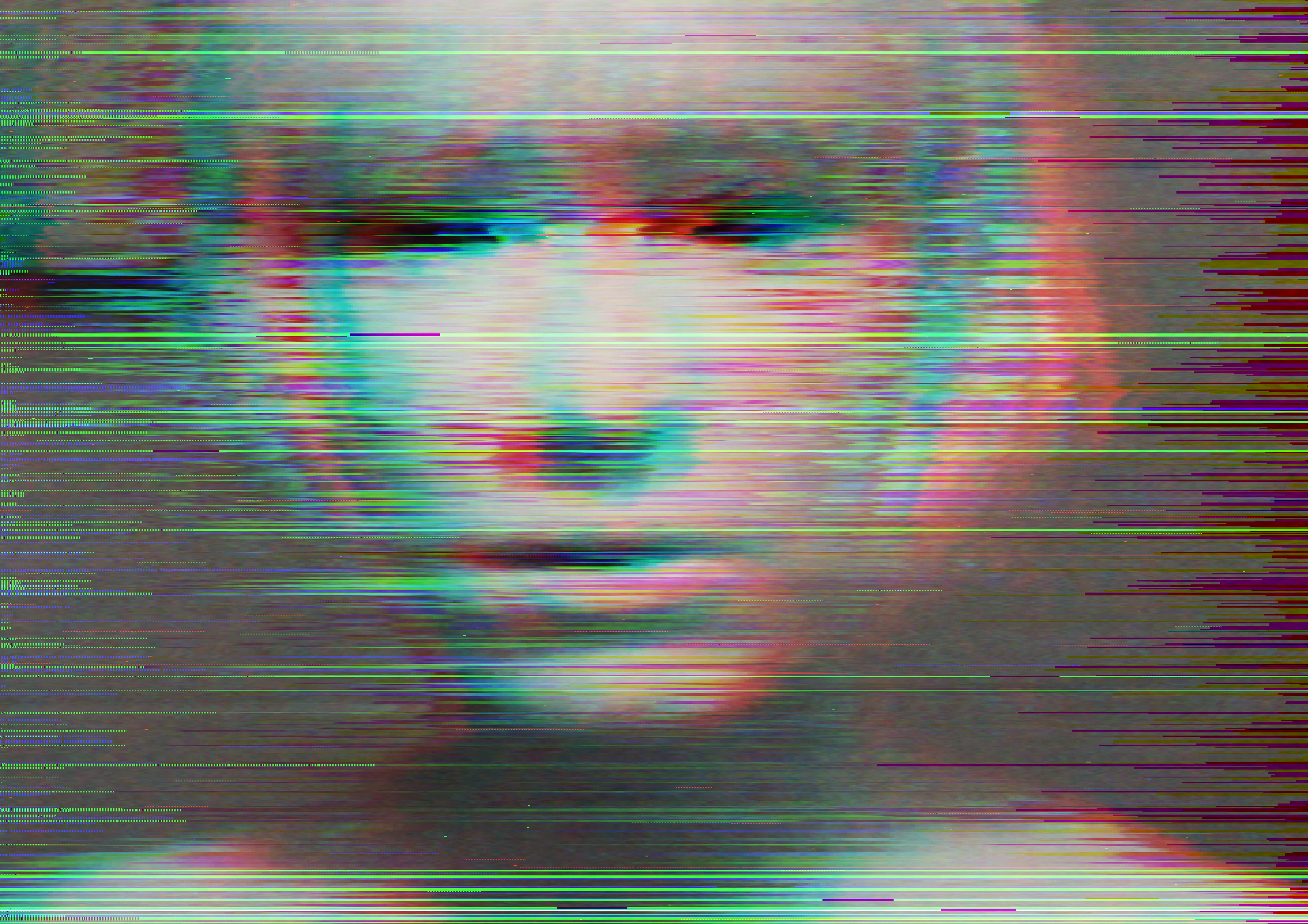
In the Vernacular of File Formats, this story –
actually an illustrated theory – is told with an
extraordinary level of pathos. The woman
portrayed in the picture fades into pixel
blocks, gets grainy, duplicates, disappears
beyond a coloured camouflage, then
reappears, violently slashed.
The same oxymoron – an apparently cold,
geeky theory expressed in a warm, emotional
way - can be found in her video works,
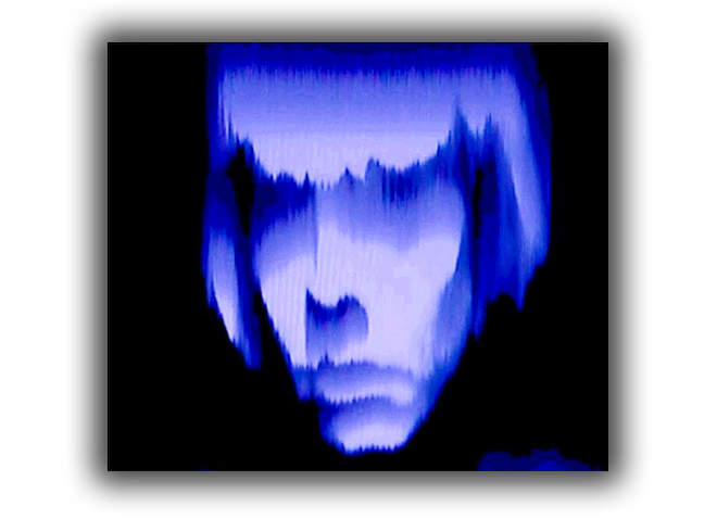
especially Dear Mr Compression (2009) and
Collapse of PAL (2010). In the first work,
Rosa – impersonating Benjamin’s Angel of
History – writes a poem to Mr Compression.
The dialogue appears to take place in a chat
room, and the Angel of History expresses her
feelings while a silent Mr Compression turns
her attempt at communication into an
increasingly corrupted signal. In the latter, the
Angel of History reflects on the PAL signal, its
termination, and its survival “as a trace”
in newer technologies. How poetry can be
composed about such a technical issue is
something we should ask Lucretius or
Raymond Roussel. PAL was the analogue
television encoding system used in Europe,
South Asia and other countries. Whole
generations grew up with it, and got used to
its specific characteristics and glitches.
And Mr Compression is the personification of
a computer process. Do they deserve a
poem? According to the Angel of History,
they do. But Dear Mr Compression is also
the story of a woman talking to a man that
makes her suffer; and the live TV
performance that originated Collapse of PAL
was also, according to Menkman [11], a last
attempt to deliver a message to somebody
getting the PAL signal. Is this mediumspecificity? According to the Angel of History,
it isn’t.
[1] Oliver Laric, Versions, 2009 – 2010. Online at www.oliverlaric.com [2] Trond Aslaksby, “The Weathered Paintings of Edvard Munch. Artist’s intention, conservation, display – a triangle of conflicts”, 1998. Online at www.munch.museum.no/40/6/aslaksby.pdf [3] Sylvere Lotringer, Paul Virilio, The Accident of Art, Semiotext(e), New York 2005, p. 63. [4] James Der Derian, “Is the Author Dead? An Interview with Paul Virilio”, 1997. Online at http://asrudiancenter.wordpress.com/2008/11/26/intervi ew-with-paul-virilio/. [5] «A glitch is a short-lived fault in a system. It is often used to describe a transient fault that corrects itself, and is therefore difficult to troubleshoot. The term is particularly common in the computing and electronics industries». In Wikipedia, http://en.wikipedia.org/wiki/Glitch [6] Rosa Menkman, “Glitch Studies Manifesto”, 2009 – 2010. Online at http://rosamenkman.blogspot.com/2010/02/glitch-studiesmanifesto.html [7] In Wikipedia, http://en.wikipedia.org/wiki/Photography [8] Nicolas Bourriaud, The Radicant, Sternberg Press, New York 2009, p. 138. [9] Rosa Menkman, “Glitch Studies Manifesto”, op. cit. [10] Boris Groys, “From Image to Image File – and Back: Art in the Age of Digitalization”, in B. Groys, Art Power, The MIT Press, Cambridge – London 2008, p. 84. [11] Email to the author, December 16, 2010.
essay by Domenico Quaranta, 2011.
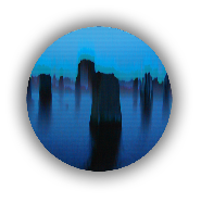
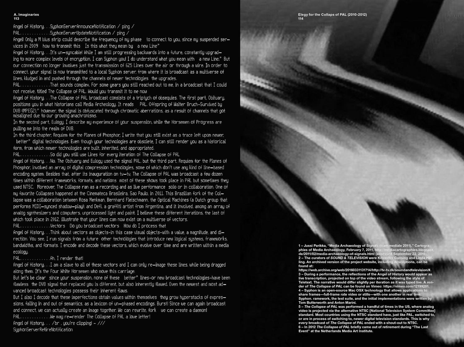
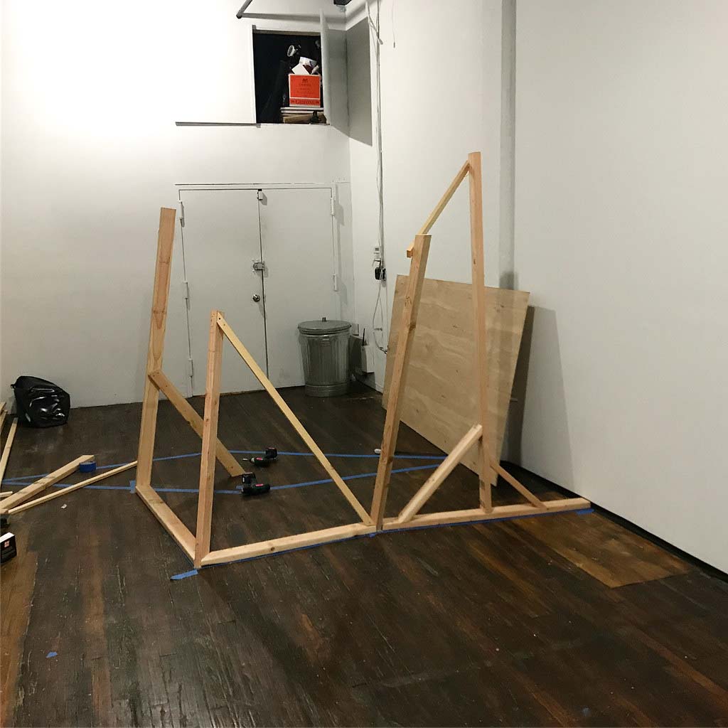
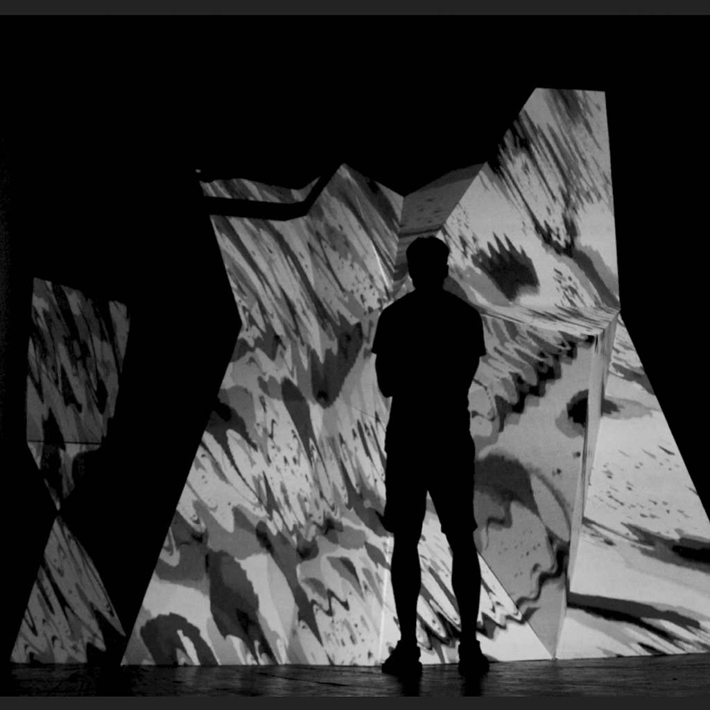
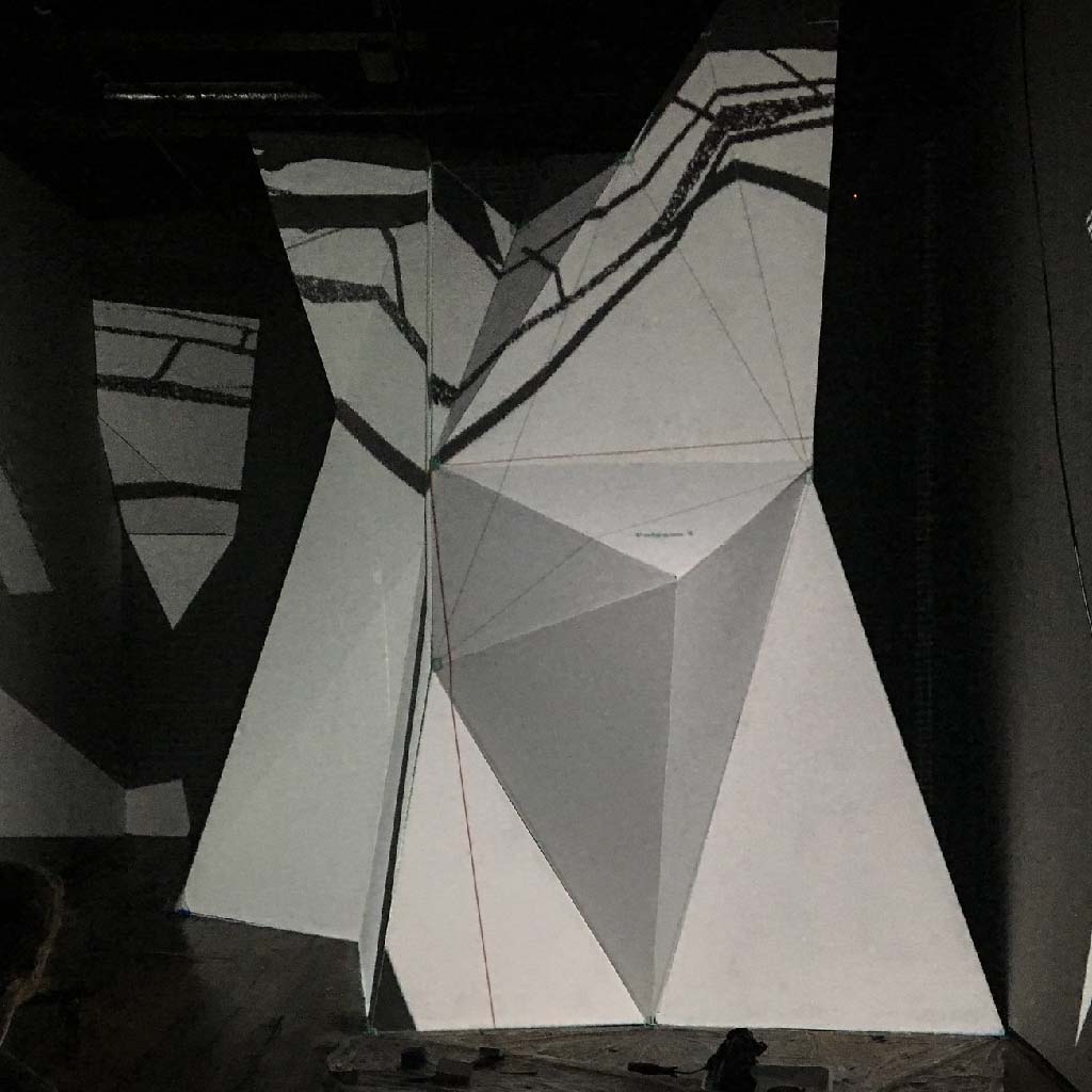
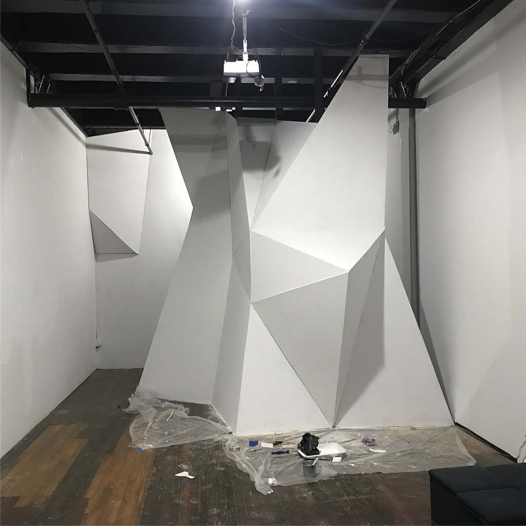
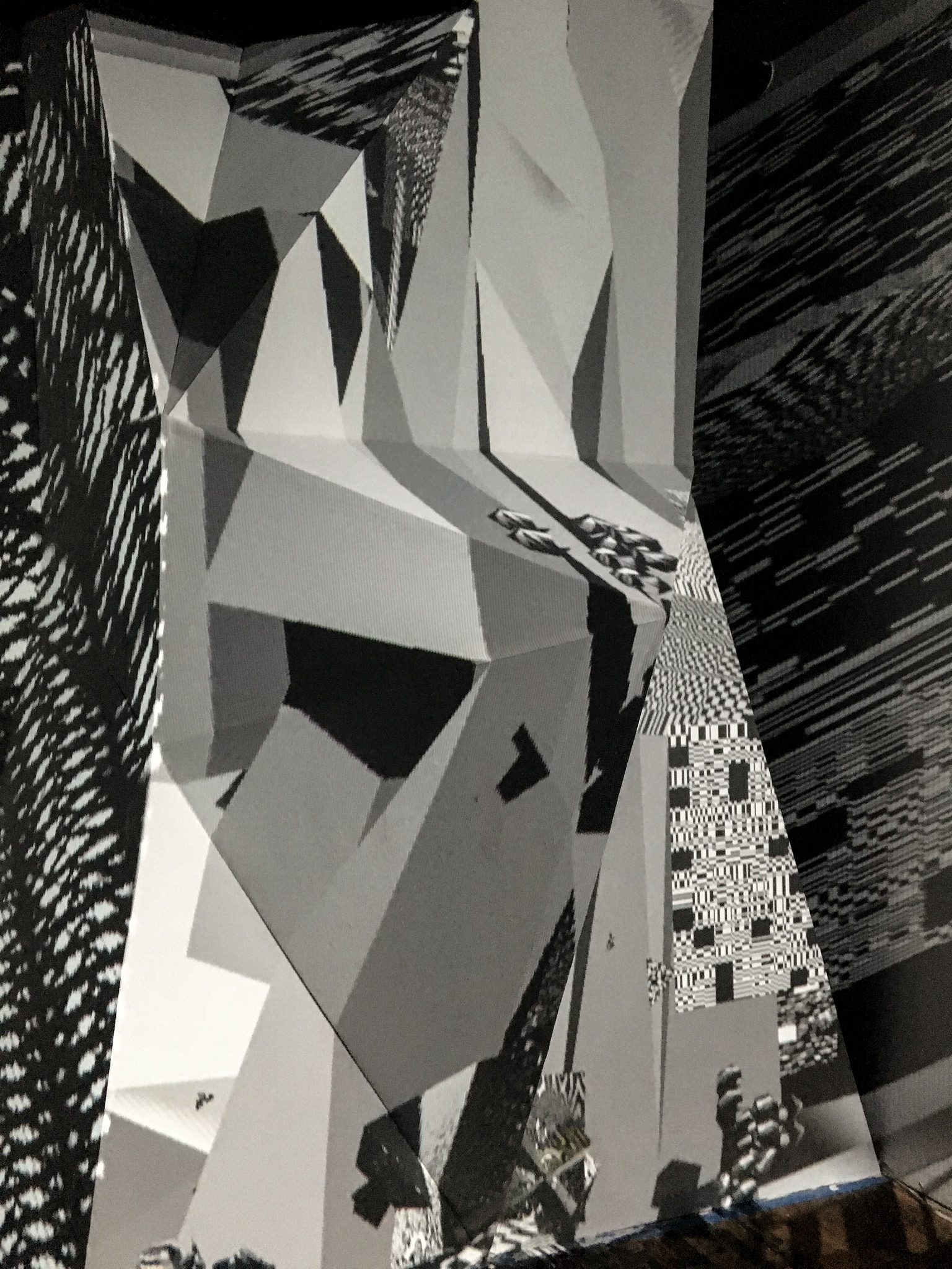
The Collapse of PAL (2010)
A rendered video of a live av-performance first done on national Danish television
subsequently performed at oa. Transmediale (Germany) and Nova festival (Brasil).
In "The Collapse of PAL,” the Angel of History <href: Walter Benjamin> reflects on the signal PAL and its termination. This death sentence, although executed in silence, was a brutally violent act that left PAL disregarded and obsolete. While it might be argued that the PAL signal is dead, it still exists as a trace left upon the new, ‘better’ digital technologies.
PAL can, even though the technology is terminated, be found here as a historical form that newer technologies build upon, in- herit or have appropriated from. Besides this, the Angel also realizes that the new DVB signal that has been chosen over PAL is different, but at the same time also inherently flawed as PAL.
Collapse of PAL is about the loss of connectivity, being forgotten, decalibration.
Chapters: Eulogy, Obsequies and Requiem for the planes of blue phosphor.
☰☰☰☰☰☰☰☰☰☰☰☰☰☰☰☰☰☰☰☰☰
︎ Order and Progress catalogue text by Domenico Quaranta
︎ Collapse of PAL in What is Media Archaeology? by Jussi Parikka
︎ Collapse of PAL in Angelic Ecologies by Sean Cubitt
Nova Roja Trailer / Rosa Menkman - Collapse of PAL 2010-2012
Nova Roja Collapse of PAL end when Defi destroys the screens. Below: Live at Xrt 2011.
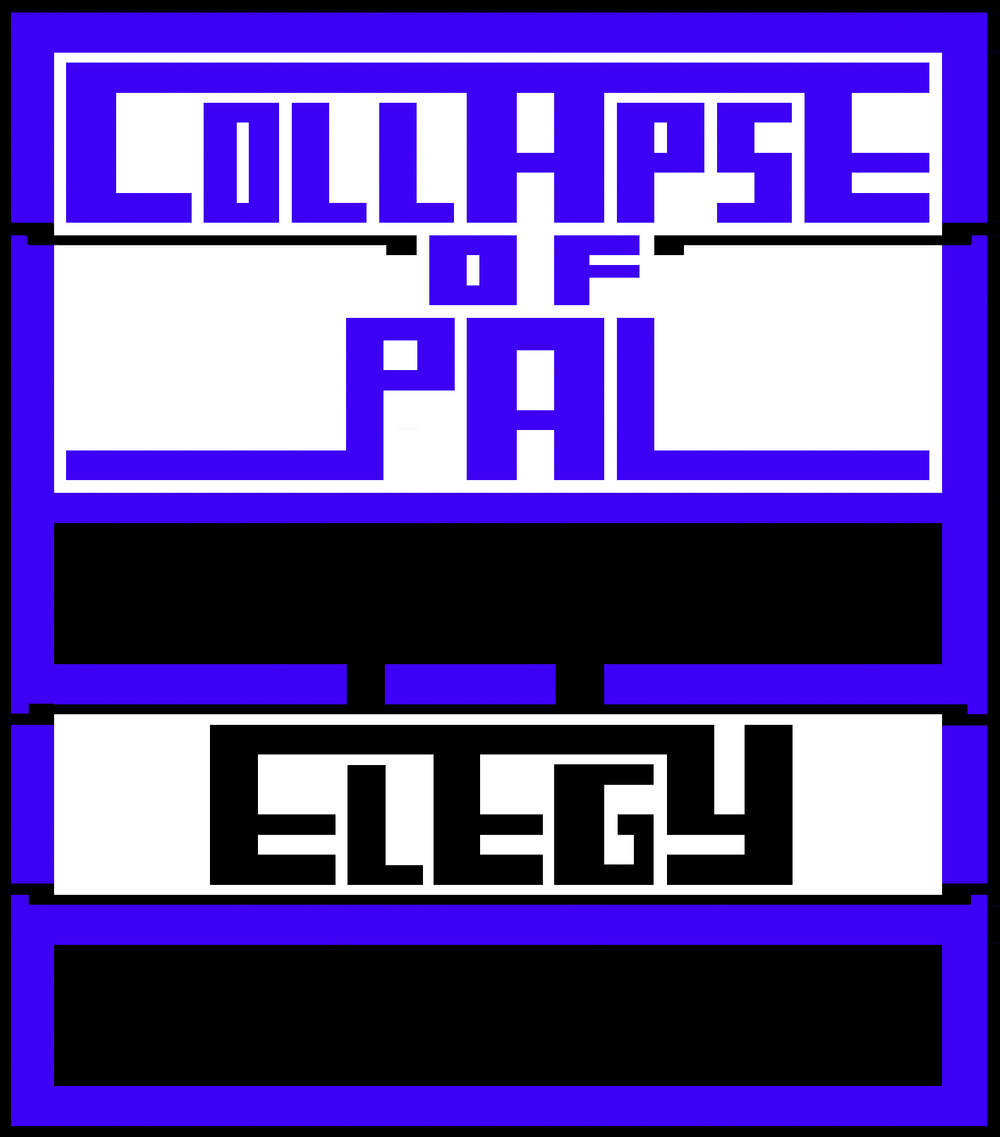
Elegy for the Collapse of PAL (2016)
A video response to a signal first I send so many years ago. It was first presented in the Transmediale reader as text, and then performed as a short 10 min solo performance at Radiator Gallery in NYC, 2017.
Its screen recorded version was shown at Vivid Projects behind a ‘shrine’ featuring blue, burned cassette tapes.
TXT published in across & beyond – A transmediale Reader on Post-digital Practices, Concepts, and Institutions Year of publication: 2016
Related participants: Ryan Bishop Jussi Parikka Kristoffer Gansing Elvia Wilk Morehshin Allahyari Daniel Rourke Jamie Allen David Gauthier Clemens Apprich Ned Rossiter Tatiana Bazzichelli Benjamin H. Bratton Florian Cramer Dieter Daniels Geoffroy de Lagasnerie Daphne Dragona Keller Easterling Olga Goriunova Louis Henderson Geraldine Juárez Olia Lialina Alessandro Ludovico Rosa Menkman Julian Oliver Danja Vasiliev Erica Scourti Cornelia Sollfrank Baruch Gottlieb Dmytri Kleiner Tiziana Terranova YoHa.
︎ pdf version.
Installation at Vivid Projects: Superseded (2017)
Photo by Antonio Roberts
Dear MR. Compression (2010)
Corrupt tangoThere is not sufficient data. Please enter data
Your file has invalid markers. Enter new markers
Your dimensions do not correspond. Change dimensions
ERROR
Goto data therapy and repair your registry
Your keyframes are missing
Your codecs are not supported
Please respect the software
Now it is too little too late [system shut down]
Dear mr compression
I write a 1000 poems to you
Is this what they call progress?
Warmly yours,
the noxious angel of history


PDF: A Guide to Databend Compression Design, 2010.
The Vernacular of File Formats Archive (16GB of data) is part of the Base collection of Stedelijk Museum Amsterdam since 2016.
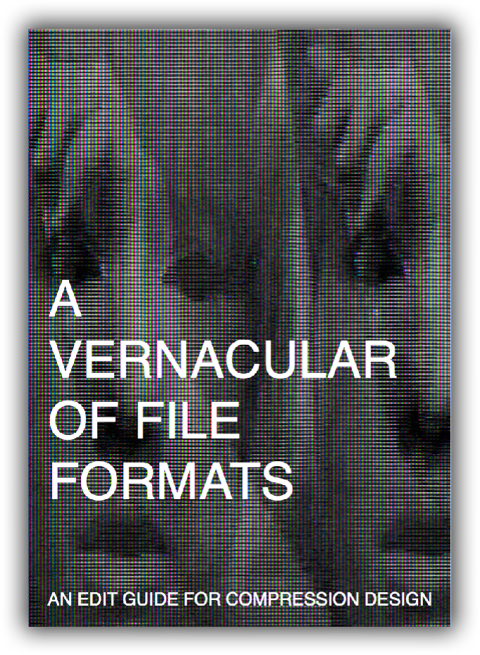
A file format is an encoding system that organises data according to a particular syntax. These organisations are commonly referred to as compression algorithms. The choice of an image compression depends on its foreseen mode and place of usage: for instance, is the file meant to be printed or redistributed digitally, what kind of accuracy will be necessary and what software or hardware will render the image?
In some cases the maker chooses not to use any encoding at all, but instead to store the data as an unprocessed file. Images shot by professional photographers for instance, will be shot and stored in a RAW image file format. A RAW image file contains minimally processed data, which normally comes straight from the image sensor (for instance a CCD chip), in order to avoid any impurities (artifacts) that might be involved with image mediation, transcoding or compression.
In A Vernacular of File Formats, I subsequently compressed the source image via different compression languages and subsequently implementing a same (or similar) error into each file, to let the otherwise invisible compression language presents itself onto the surface of the image.
︎︎ flickr documentation
︎Polish translation by Bogumiła Piotrowska, Piotr Puldzian Płucienniczak, Aleksandra Pieńkosz
︎Download the PDF
In the winter of 2016, a 18,9GB digital archive of A Vernacular of File Formats, consisting of original pdfs, a catalogue of databend images, videos and documentation was part of a joint acquisition between MOTI and Stedelijk Museum Amsterdam. ︎sonification workshop


When noise becomes filter art [ or when cool becomes hot ], (2010 / edited 2017)
Glitches are hot. It is clear from what we see on MTV, Flickr, in the club or in the bookstore: while the Glitch: Designing Imperfection (Moradi, 2009) coffee table book introduced a glitch design aesthetic to the world of latte drinking designers, Kanye West used a glitch aesthetic to illustrate his broken love life.
But while glitch design fulfills an average, imperfect stereotype, a filter or commodity that echoes a medium is the message-standard, naturally, the “No Content - Just Imperfection” slogan of hot glitch design is still complimented by cool glitches.
In "The Laws of Cool", Alan Liu asks himself: What is "Cool"? He describes that cool is the ellipsis of knowing what is cool, and withholding that idea. However, as Liu writes, those who insist on asking, are definitely uncool. In an effort to answer the question that cannot be answered, and come full circle on the ellipsis, I will try to give my take on what cool glitch can be. To me, cool glitch is represented by the glitches that do not (only) focus on a static end product, but (also) on a process, a personal exploration or a narrative element (that often reflects critically on a medium). This is why cool is in a constant state of flux; it exists as an assemblage that consists of on the one hand the construction, operation and content of the apparatus (the medium) and on the other hand the work, the writer/artist, and the interpretation by the reader and/or user (the meaning). In the end, there is not one definition of cool glitch art, but many, which depend on the perspective chosen.
To make what was once cool now hot, or visa versa, and to take Designing Imperfection one step further, I hereby offer you A Vernacular of File Formats. In this PDF I describe the ways to exploit and deconstruct the organizations of file formats into new, brutalist designs.
…I am waiting for the first “Glitchs not dead“ peace of clothing in H&M. And because "fans are as bad as the ignorant", for the sake of being bad and ignorant, I will wear it!
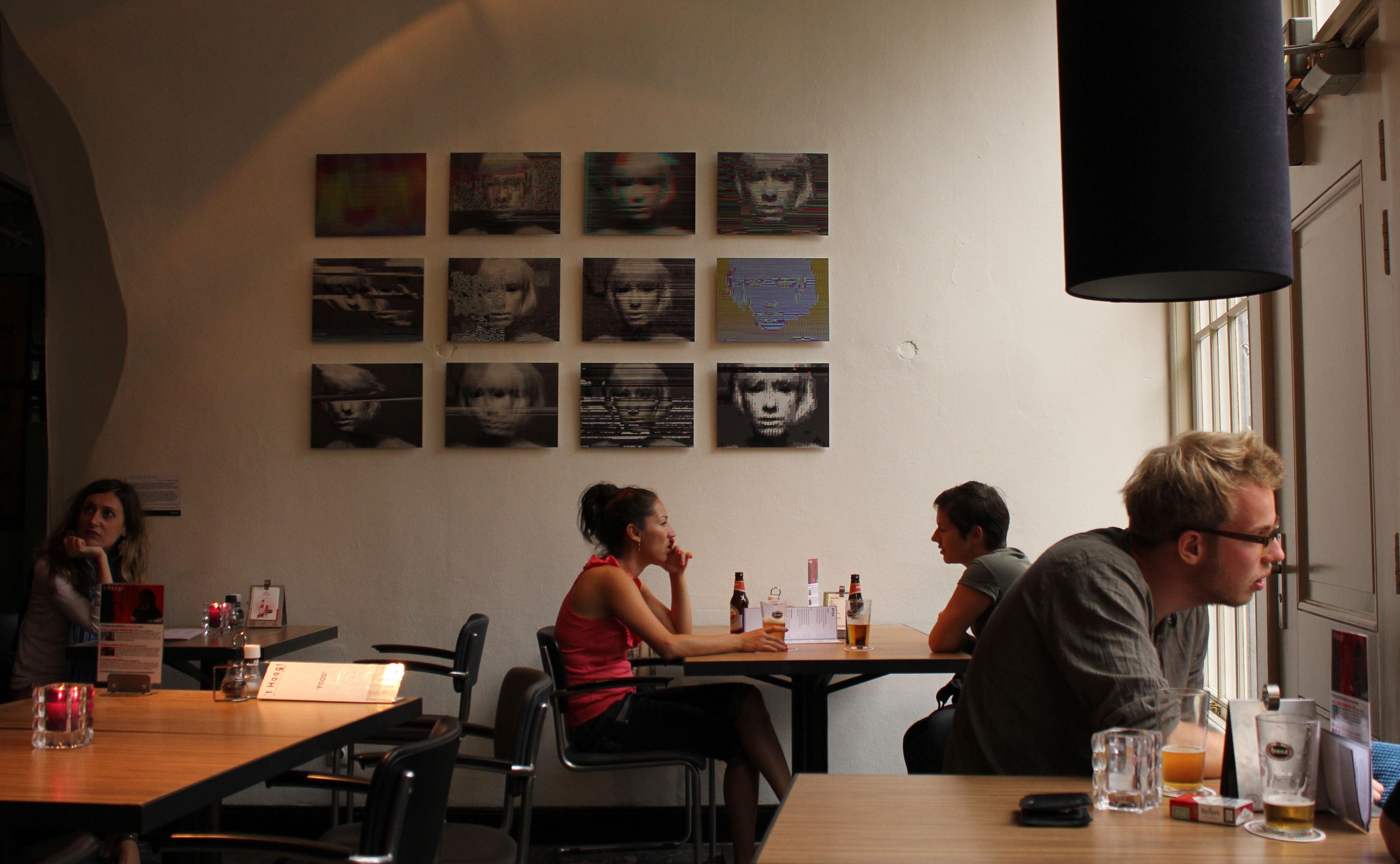 Vernacular of File Formats ft. Kim Asendorfs Extrafile. Expositie for Re:Visie NFF augustus t/m 30 september 2011.
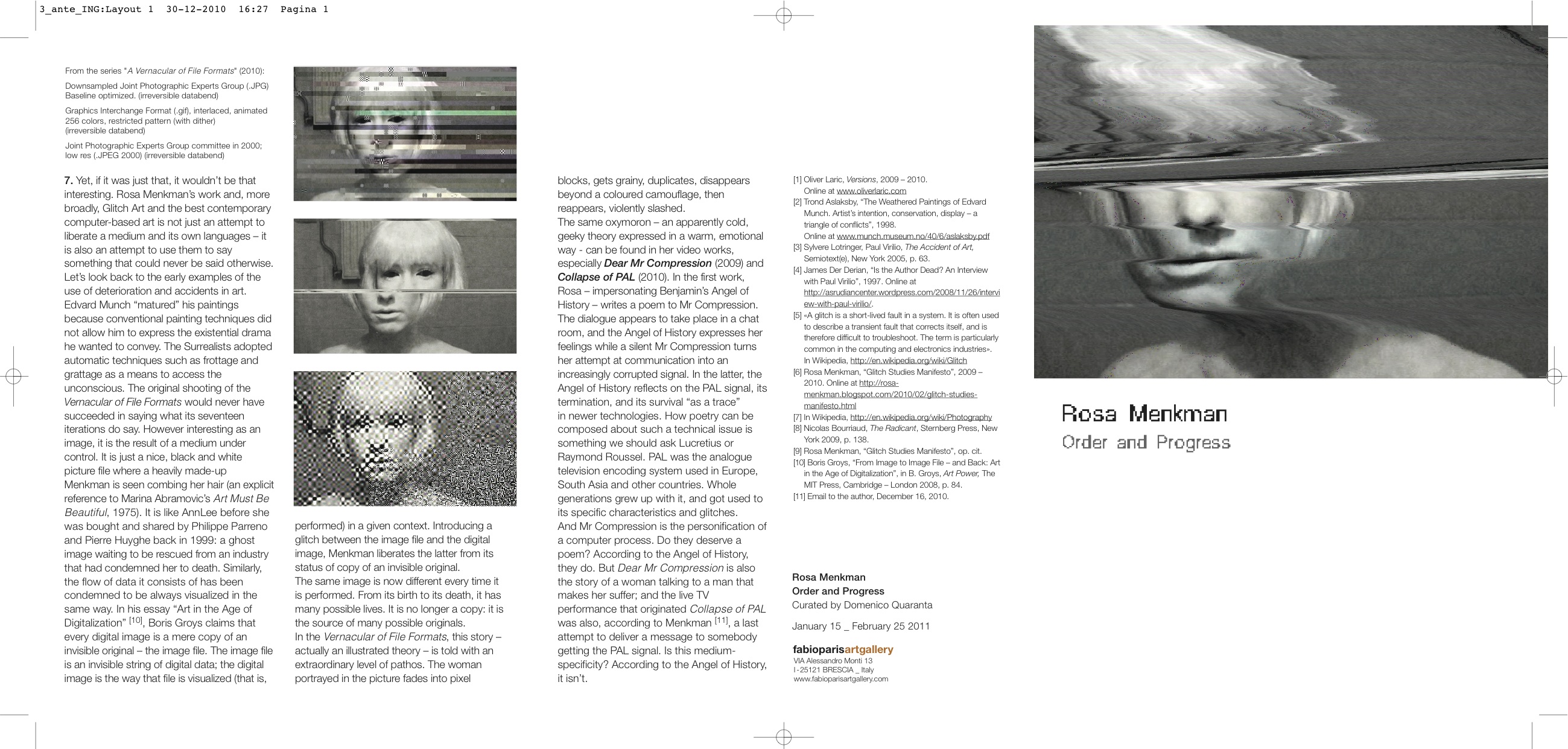


Vernacular of File Formats (2009-2010). Photoshop RAW, JPEG, JPEG 2000, PNG, BMP, Photoshop, TIFF, GIF, Targa.
Digital Prints on Dibond (matte finish).
Digital Prints on Dibond (matte finish).
Why make (another) ‘glitch’ software
Realize that the gospel of Glitch Art also tells about new standards implemented by corruption. Not all Glitch Art is progressive or something new. The popularization and cultivation of the avant-garde of mishaps has become predestined and unavoidable. Be aware of easily reproducible glitch effects, automated by softwares and plug-ins. What is now a glitch will become a fashion.**
What I find today in the Glitch Art Flickr pool, are images opposing my original definitions of glitch - a short-lived fault in a system, inducing affect such as surprise or shock - and glitch art - work that makes us critically and radically challenge normative knowledge, values, habits and expectations. Instead, glitch art has become more and more like a style, or even a genre.
While glitch art as a style recalls Homi Bhabhas': "almost the same, but not quite" or “mimicry of digital slippage”, the ‘real’ glitch in glitch art has slowly diminished into a virtual signifier. The by popular culture commodified side of glitch has become a primal part of a new ‘glitch-economy’, which has left me to be believe I should pay more attention to this 'other side of the coin'.
This is why I decided to teach about the materiality of file formats; their different languages, slang or dialects, and how these specific qualities, rules and rhetorics can be exploited as a generative matter to create new images (a practice closely related to databending). I named the workshop "A Vernacular of File Formats" and showed different compression based artworks, while supplying the students with methods and tools to create their own format based research, and possibly art and design.
One of the troubles I ran into during the workshop was that the tools I had were not ideal for such a workshop; with every other file format we set out to manipulate we had to switch softwares, which between the different OSs' on the students computers became a real *pain*.
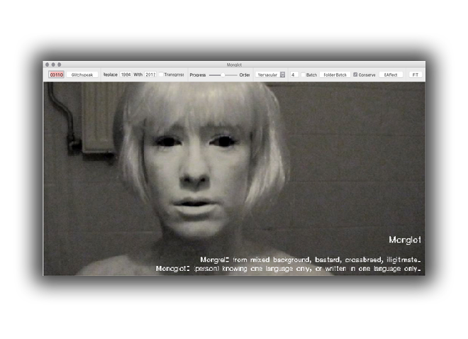
When I spoke to Johan Larsby (the creator of Swutits) about the lack of software, he proposed a collaboration - which is how the Monglot project started.
︎ Monglot only worked on MacOS 10.5 and 10.6. In 2016 KernelEquinox opensourced a program inspired by Monglot for Windows -> ︎
︎ More about monglot and its strange interface here
︎ Download Monglot, code, Monglot master
︎ Monglot only worked on MacOS 10.5 and 10.6. In 2016 KernelEquinox opensourced a program inspired by Monglot for Windows -> ︎
︎ More about monglot and its strange interface here
︎ Download Monglot, code, Monglot master
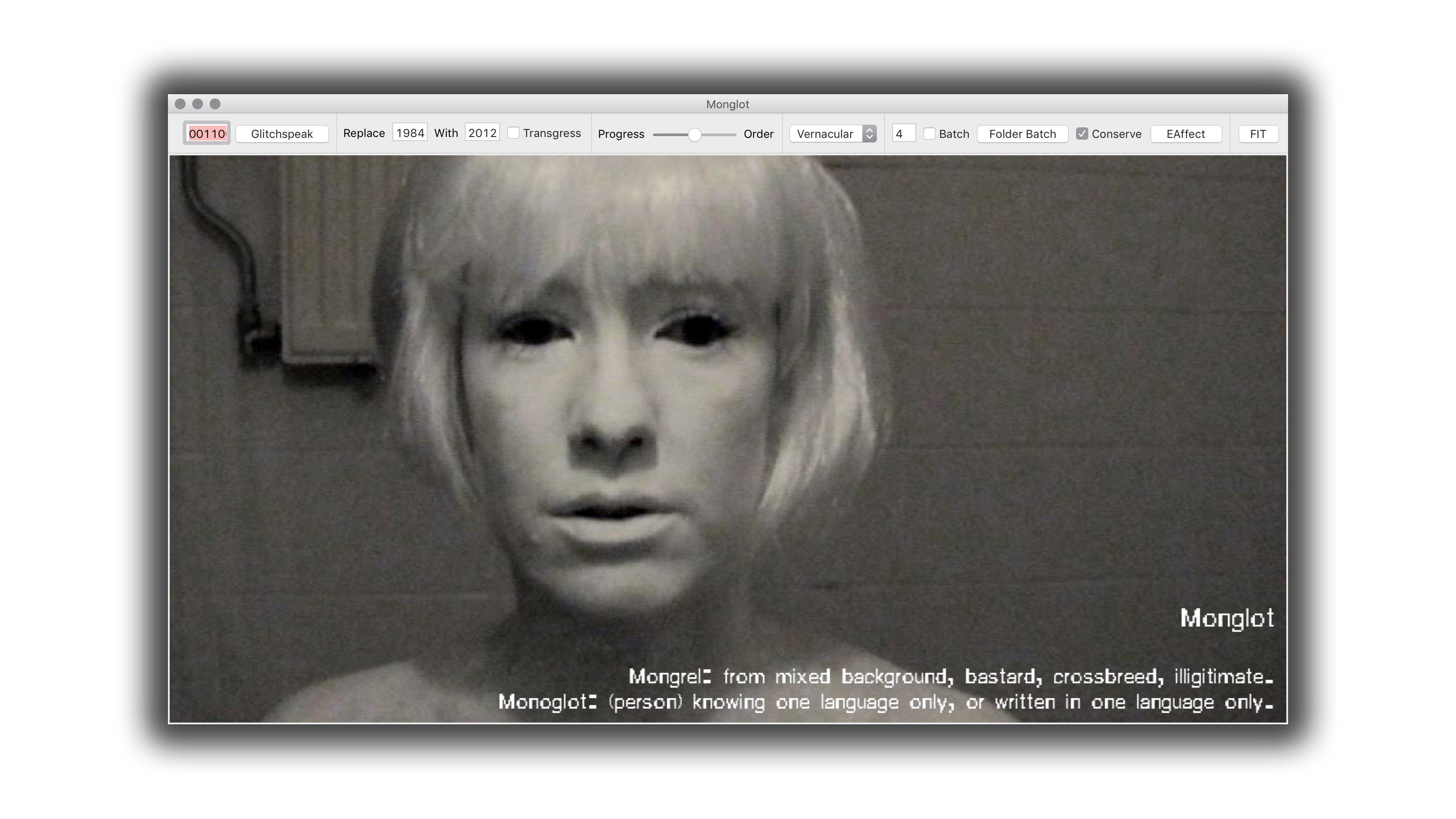
Monglot (2011)
A Glitch Software collaboration with Johan Larsby (SE) 2011.
Of Mimicry and Glitch Art: The Ambivalence of a 'Colonial' Glitch Art discourse
(order and progress || chaos and destruction)
The name Monglot is a degeneration of the terms Mongrel and Monoglot (the term also references Homi Bhabha's "forked tongue" of colonialism and something I would like to refer to as Glitch Speak).
*/
Mongrel: the offspring of a variety of species, of mixed background, bastard, or imperfect crossbreed
Mongrel: the offspring of a variety of species, of mixed background, bastard, or imperfect crossbreed
Monoglot: knowing only one language; monolingual.
*/
*/
Generally, glitch aesthetics or compression artifacts such as fragmentation, grain, ghosting, heterodynes, interlacing, jitter, jaggies, (…) posterization, pixelating, quantization error, ringing, staircase noise, scan lines (…) come to the surface because of an accidental flaw in the image data, which shows on the surface of the image itself.
The Monglot software generates glitches. It does this by adding a random or chosen error to the image-data, which is encoded via a compression language of choice. This error than sits on the surface of the image. In doing so Monglot mashes two languages together: the language of the compression and the visual image itself.
While for most glitch softwares the final product is the focus, Monglot focusses on the /experimental/, generative part of glitching.
By comparing different file formats and their behaviors, Monglot can be used to learn and research about file formats.
Monglot aims to show the ambivalence (cool vs. hot) and the double articulation (encoding vs. image data) of (file format-based) Glitch Art.
The user of Monglot is able to repeat an error by clicking ‘Glitchspeak’ or chose a particular error on the ‘Replace’ function of the software. This is how Monglot exists as a compromise in-between cool and hot.
The user of Monglot is able to repeat an error by clicking ‘Glitchspeak’ or chose a particular error on the ‘Replace’ function of the software. This is how Monglot exists as a compromise in-between cool and hot.
Glitch Moment/um (2011)
[ book ]
Published by the Institute of Network Cultures, December, 2011.
The Glitch Moment/um is the title of a small booklet I published in 2011. In the publication, I describe the moment of encountering a glitch as twofold:
First there is the moment the glitch happens, which is often experienced as an uncanny break of an expected technological flow or threatening loss of control. In this moment, the user or spectator doesn’t know what to expect next. This loss of control soon becomes a catalyst with a certain power as the glitch passes a tipping point. After its tipping point, the glitch is either understood as a failure, or as a development that forces new knowledge onto the user about their presumptions of the technology, or the technologies actual functioning. In case of the latter, the glitch can force the user to reconsider their habitual use of the technology.
After this experience of rupture, the glitch thus moves beyond its sublime momentum and vanishes into a realm of new conditions; it becomes a new mode - either technologically or aesthetically -, while its previous uncanny encounter is now an ephemeral, personal experience of a machine.
︎ From the INC Website
“Glitch culture organizes itself around the investigation and aestheticization of breaks in the conventional flow of information, or meaning within (digital) communication systems.
In this book, Rosa Menkman brings in early information theorists not usually encountered in glitch’s theoretical foundations to refine a signal and informational vocabulary appropriate to glitch’s technological moment/ums and orientations.”

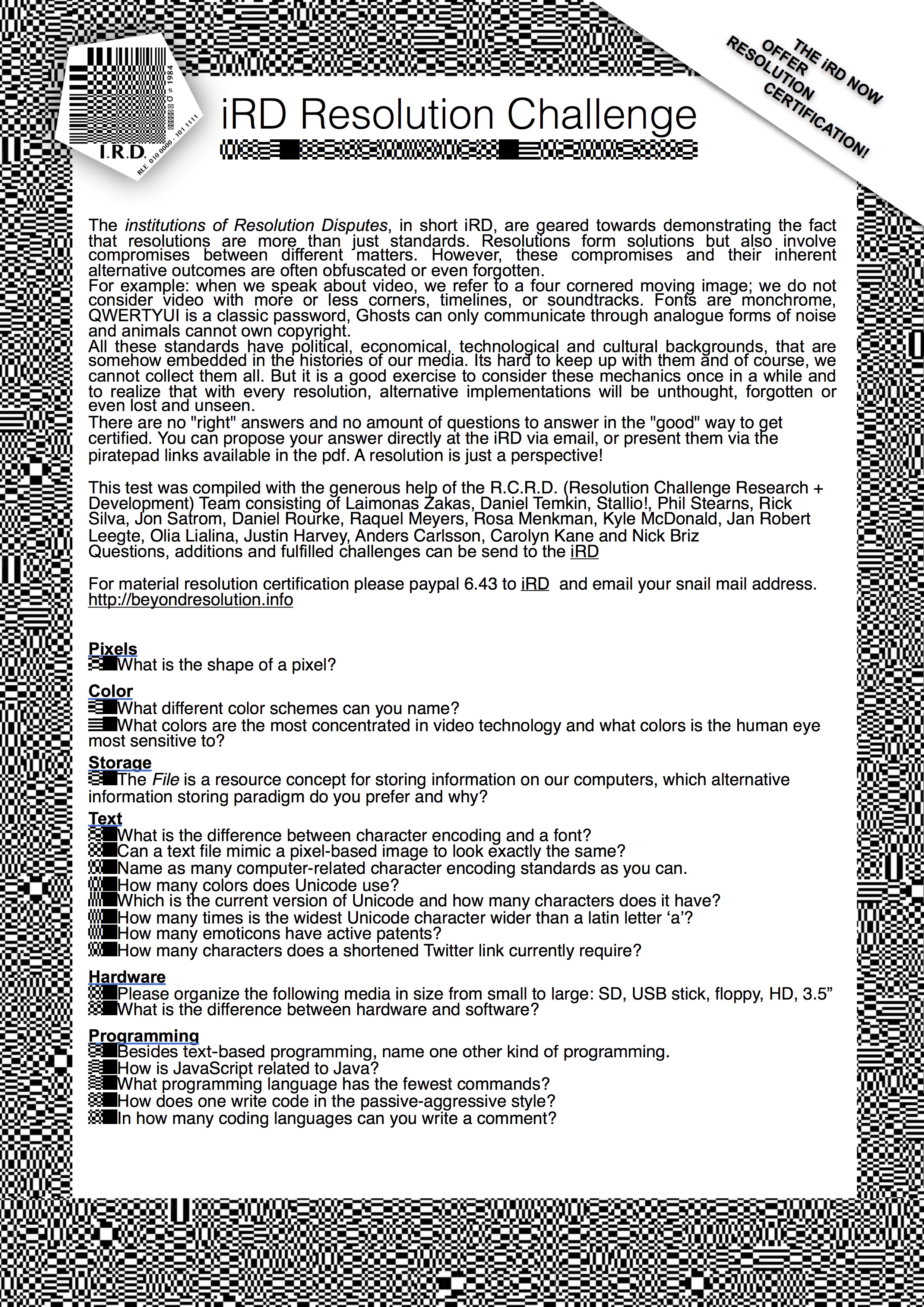
 The institutions of Resolution Disputes [iRD] call attention to media resolutions. While a ’resolution’ generally simply refers to a standard (measurement) embedded in the technological domain, the iRD reflect on the fact that a resolution is indeed a settlement (solution), but at the same time a space of compromise between different actors (objects, materialities and protocols) who dispute their stakes (framerate, number of pixels etc.) within the growing digital territories.
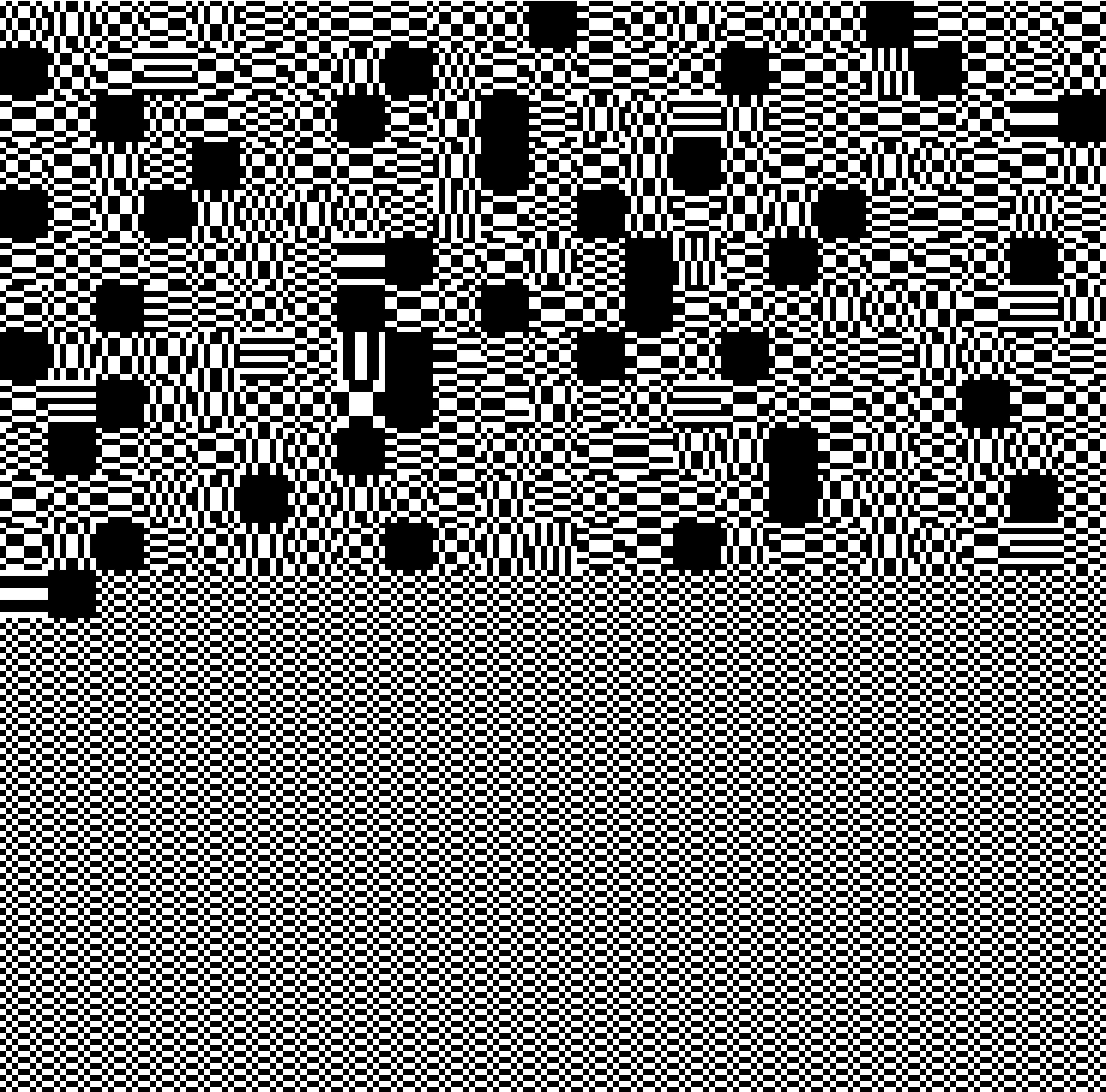 Resolutions inform both machine vision and human ways of perception. They shape the material of everyday life ubiquitously. They do this not just as an “interface effect”* but as hyperopic lens, obfuscating any other possible alternative resolution from the users media literacy.
⠀▦▦▦▦▦▦▦▤▤▣▣▣▤ ⠀▦▦▦▦▦▦▤▤▣▣▣▤▤ ⠀▦▦▦▦▦▤▤▣▣▣▤▤▦ ⠀▦▦▦▦▤▤▣▣▣▤▤▦▦ ⠀▦▦▦▤▤▣▣▣▤▤▦▦▦ ⠀▦▦▤▤▣▣▣▤▤▦▦▦▦ ⠀▦▤▤▣▣▣▤▤▦▦▦▦▦ ⠀▤▤▣▣▣▤▤▦▦▦▦▦▦ ⠀▤▣▣▣▤▤▦▦▦▦▦▦▦ ⠀▤▣▣▣▤▤▦▦▦▦▦▦▦ ⠀▤▤▣▣▣▤▤▦▦▦▦▦▦ ⠀▦▤▤▣▣▣▤▤▦▦▦▦▦ ⠀▦▦▤▤▣▣▣▤▤▦▦▦▦ ⠀▦▦▦▤▤▣▣▣▤▤▦▦▦ ⠀▦▦▦▦▤▤▣▣▣▤▤▦▦ ⠀▦▦▦▦▤▤▣▣▣▤▤▦▦ ⠀▦▦▦▦▦▤▤▣▤▤▦▦▦ ⠀▦▦▦▦▦▦▤▣▤▦▦▦▦ ⠀▦▦▦▦▦▦▦▣▦▦▦▦▦ ⠀▦▦▦▦▦▦▦▣▦▦▦▦▦
 5 institutions encoded in DCT. A publication in 5 Acrylics / postcards /
 RESOLUTIONS INFORM BOTH MACHINE VISION AND HUMAN WAYS OF PERCEPTION.
THEY ARE THE MATERIAL OF EVERYDAY LIFE(1),
UBIQUITOUS, WHILE HUMANS HAVE GONE MOSTLY OBLIVIOUS. iRD STRIVES FOR A RADICAL MATERIALIST re-(RE-)DISTRIBUTION OF THE SENSIBLE.(2)
Even the most glitchy-glitch is just the vernacular of an already present, not evenly distributed future. When we walk inside these futures we find ourselves momentarily stuck inside a pocket of ambiguous ‘freespace’, a place of inspiration and curiosity. Until we find - momentary - resolve.
Resolutions inform both machine vision and human ways of perception. Rules, or protocols, change data in order to store, show, move and connect between technologies. Protocols, together with objects and their materialities, form the resolutions that make technology run smoothly(3). But these resolutions form not only a solution, but also a compromise between multiple underlying media properties.
A resolution is not a neutral facility but carries historical, economical and political ideologies. The cost of all of these media protocols is that we have gradually become unaware of the choices and compromises they represent. We are collectively suffering from technological hyperopia where these qualities have moved beyond a fold of perspective.
RESOLUTIONS INVOLVE < DETERMINATIONS >
/* –AND LOST ALTERNATIVES– */
Have we become bad at constructing our own resolutions, or are we just oblivious to resolutions and their inherent compromises?
The i.R.D. calls attention to media resolutions and does not /just/ aestheticize their formal qualities or denounce them as ‘Evil’ (4). iRD intends to expose methods of ‘creative problem creating’ (5), to bring authorship back to the actors involved during the building of a ‘resolution’.
While the gospel of resolutions sings about new standards implemented through corruption, iRD displays forms of vernacular resistance based on misleading, false, or ambiguous data and maybe a chanting jabberwocky, venturing along the bootleg trails above a Sea of Fog.
1. Michel de Certeau, The Practice of Everyday Life, 1984.
2. Jacques Ranciere, The Politics of Aesthetics, 2004.
3. Alexander Galloway, Protocol, 2006.
4. Matthew Fuller, Andrew Goffey, Evil Media, 2012.
5. jon.satrom, creative problem creating, 2013. ︎ Transfer gallery page

︎ A tour of Internet Yami-ichi, the offline Internet flea market (featuring the i.R.D.) by Regine Debatty @We Make Money Not Art.
institutions of Resolution Disputes [ i.R.D. ], long version:
Even though the iRD mimics an institute, in reality it is not a classic, institutional organ. Instead, the iRD multiplexes the term institution, by revisiting its usage in the late 1970s. In this context, formulated by Joseph Goguen and Rod Burstall, institution refers to a slightly ‘more compound framework’, that deals with the growing complexities, connecting different logical systems (such as databases and programming languages) within computer sciences. A main result of these non-logical institutions is that different logical systems can be glued together at a substrata level, forming illogical frameworks through which computation also takes place.
Inspired by the idea of hyper functional, yet illogical frameworks, the iRD is dedicated to researching the interests of anti-utopic, obfuscated, lost and unseen, or simply ‘too good to be implemented’ resolutions.
The institutions of Resolution Disputes [iRD] call attention to media resolutions. While a resolution generally simply refers to a determination of functional settings in the technological domain, the iRD stresses that a resolution is indeed a settlement (solution), but at the same time also entails a space of compromise between different actors (objects, materialities, and protocols) in dispute over norms (frame rate, number of pixels etc.). Common settings can ossify as generally accepted requirements or de facto standards, while others standards are notated as norms by standardizing organizations such as the International Organization for Standardization. We call this progress*.
Resolutions are non-neutral standard settings that involve political, economical, technological and cultural values and ideologies, embedded in the genealogies and ecologies of our media. In an uncompromisingly fashion, quality (fidelity) speed (governed by efficiency) volume (generally encapsulated in tiny-ness for hardware and big when it comes to data) and profit (economic or ownership) have been responsible for plotting the vector of progress. This dogmatic configuration of belief x action has made upgrade culture a great legitimizer of violence, putting its insufficient technological resolutions to rest. While a resolution can thus be understood as a manifold assemblage of common, but contestable standards, it should also be considered in terms of other options; those that are unknown and unseen, obsolete and unsupported.
Resolutions inform both machine vision and human ways of perception. They shape the material of everyday life ubiquitously. As the media landscape becomes more and more compound, or in other words, an heterogenous assemblage in which one technology never functions on its own, its complexities have moved beyond a fold of everyday settings. Technological standards have compiled into resolution clusters; media platforms that form resolutions like tablelands, flanked by steep cliffs and precipices looking out over obscure, incremental abysses that seem to harbor a mist of unsupported, obsolete norms.
The platforms of resolution now organize perspective. They are the legitimizers of both inclusion and exclusion of what can not be seen or what should be done, while the fog, the other possibilities become more and more obscure.
It is important to realize that the resolutions platforms are not inherently Evil*. They can be impartial. It is important that we unpack these resolutions and note that they are conditioning our perception. A culture that adheres to only one or few platforms of resolutions supports nepotism amongst standards. These clusters actively engage simpleness and mask the issues at stake, savoring stupidity, and are finally bound to escalate into glutinous tech-fascism.
The question is, have we become unable to construct our own resolutions, or have we become oblivious to them?
Resolutions work not just as an interface effect* but as hyperopic lens, obfuscating any other possible alternative resolutions from the users screens and media literacy. When we speak about video, we only ever refer to a four cornered moving image. Why do we not consider video with more or less corners, timelines, or soundtracks. Fonts are monochrome; they do not come with their own textures, gradients or chrominance and luminance mapping. Text editors still follow the lay-out of paper; there is hardly any modularity within written word technologies. Even ghosts, the figments of our imagination, have been conditioned to communicate exclusively through analogue forms of noise (the uncanny per default), while aliens communicate through blocks and lines (the more intelligent forms of noise). We are hiking the resolution platforms comfortably. Unknowingly suffering from technological hyperopia, We have lost track of the compromises that are at stake inside our resolutions and are staring at the screens showing us mirage after mirage.
A resolution is the lens through which constituted materialities become signifiers in their own right. They resonate the tonality of the hive mind and constantly transform our technologies into informed material vernaculars.
Technology is evolving faster than we, as a culture can come to terms with. This is why determinations such as standards are dangerous; they can preclude the alternative. The radical digital materialist believes in informed materiality*: while every string of data is ambiguously fluid and has the potential to be manipulated into anything, every piece of information functions within /*adhesive/ encoding, contextualization and embedding. Different forms of ossification slither into every crevice of private life, while unresolved, ungoverned free space seems to be slipping away. There lies the power of standardization.
We are in need for a re-(Re-)Distribution of the Sensible.
The iRD offers a liminal space for resolution studies. Resolution studies is not only about the effects of technological *progress or about the esthetization of the scales of resolution. Resolution studies is a studies on how resolution embeds the tonalities of culture, in more than just its technological facets.
Resolution studies researches the standards that could have been in place, but are not. As a form of vernacular resistance, based on the concept of providing ambiguous resolutions, the iRD employs the liminal resolution of the screen as a looking-glass. Here, hyperopia is fractured and gives space to myopia, and visa versa. This is how iRD exposes the colors hidden inside the grey mundane objects* of everyday life.
The iRD is not a Wunderkammer for dead media*, but a foggy bootleg trail for vernacular resistance.
Progress has fathered many dead technologies. A Wunderkammer, or curiosity cabinet of media resolutions would celebrate these dead objects by trapping them inside a glass bell, relieving them in-definitely of their action radius. While the iRD adheres to the settlements of governing media resolutions, it also welcomes ventures along the bootleg trails of the tactical undead*. These undead move beyond resolution, through the literacies of the governing techno cultures, into liminal spaces. They follow the wild and uncanny desire paths that cut through sensitive forms and off-limit areas into speculative materialities*. They threaten the status quo of secure forms of media and provide the ambiguity that is so necessary for inspiration, action and curiosity*.
The iRD believes that methods of creative problem creation* can bring authorship back to the layer of resolution setting. Resolution theory moves against what sometimes seems like an unsolvable puzzle of flattening reality, while the iRD might seem like a one way trail straight into the Sea of Fog and towards the abyss of techno-norms. But it could also be a modular framework that opens and expands standards through inspection and reflection. As any good theory of media, resolution theory is a theory on literacy. Literacy of the machines, the people, the people creating the machines and the people being created by the machines. Through challenging the platforms of resolution, it can help the wanderer to scale actively between these states of hyperopia and myopia. It can uncover crystal cities of fog as well as shine a light on the soon to be distributed futures. Here we can mine for the timonds.
︎ official Transfer Gallery page
︎ An in depth all info PDF about this work
︎ Resolution Challenge!
︎ the essay
BACKGROUND INFORMATION
The i.R.D. first opened in 2015 at Transfer Gallery New York, where they took the form of 5 institutions (statements) encoded in DCT.
During this initial opening, the i.R.D. shed light on the different complexities of of compression ecologiesn by showcasing their different complexities.
Since their 2015 initiation, the i.R.D. have been actively disseminating information on Resolutions and their inherent compromises in the form of interventions via:
- annual flower laying at the ISO premises during the World Standard Day to commemorate resolutions that have become obsolete
- offering resolution certification through the Resolution Challenge,
- active archivation of standards through the DCT DeCalibration Target and the DCT Repo.
- The i.R.D. are also responsible for initiating the DeCalibration Army.
Works from the different ecologies of compression complexities that were on display in the initial opening of the i.R.D.:
⌁ :: Analogue :: Collapse of PAL / Beyond Resolution
• :: Dots/pixels :: Un/Resolved
━ :: Line :: WHITEOUT
▩ :: Block :: DCT
⌇ :: Wavelet :: Myopia
⟗ :: Vectors :: Shredded Hologram Pen/Rose
COVERAGE
‘Resolution Disputes: A Conversation Between Rosa Menkman and Daniel Rourke’, Furtherfield
“By using the terms ‘obfuscation’ and ‘dysfunction’ you are invoking a will – perhaps on your part, but also on the part of the resolutions themselves – to be recognised. I love that gesture. I can hear the objects in iRD speaking out; making themselves heard, perhaps for the first time.”
‘Accidental Vision’, Postmatter“The boundaries of the screen are challenged in Rosa Menkman’s new exhibition at TRANSFER Gallery, using technological error to disrupt expectations.”
‘Having Cryptic Conversations about Encrypted Graphics’, The Creator’s Project“ Rosa Menkman’s new media artwork celebrates both the computer screen glitch and the actual resolution of the image it’s trying—and failing—to represent, highlighting the accidents in the “free space” between them.”
 The question is, ‘have we become unable to construct our own resolutions, or have we become oblivious to them?’ Either way we are in need for another re-“(Re-)Distribution of the Sensible”.
 iRD intend to impose methods of “creative problem creation” to bring authorship back to the layer of setting a 'resolution'. The radical digital materialist believes in an “informed materiality”; while every string of data is ambiguously fluid and has the potential to be manipulated into anything, every piece of information functions within /adhesive*/ encoding, contextualization and embedding (etc).
 Through iRDs tactics beyond resolution, the otherwise grey mundane objects of everyday-life show their colors. iRD is not a wunderkabinet of dead media, but a foggy bootleg trails for vernacular resistance.
▣▣▣▣▣▣▣▣▣▣▣▣▣
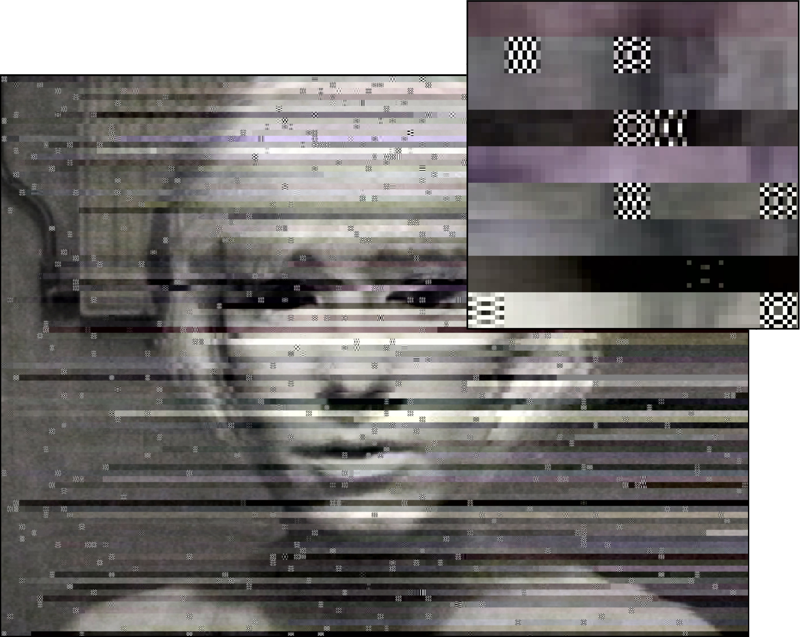 Revealing the surface and structure of the image
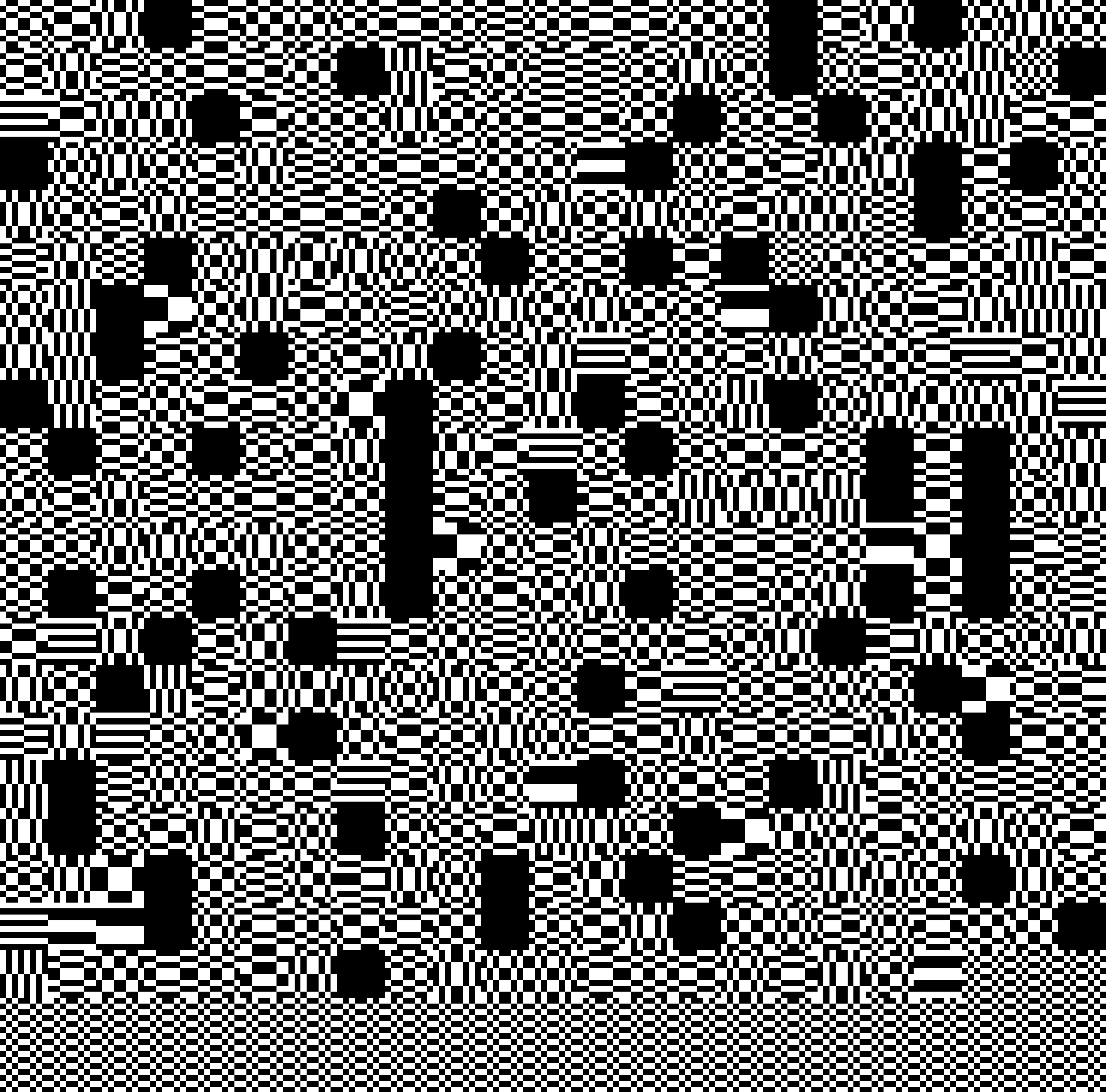
A side effect of the JPEG compression is that the limits of the images’ resolution – which involve not just the images’ number of pixels in length and width, but also the luma and chroma values, stored in the form of 8 x 8 pixel macroblocks – are visible as artifacts when zooming in beyond the resolution of the JPEG.
Revealing the surface and structure of the image
A side effect of the JPEG compression is that the limits of the images’ resolution – which involve not just the images’ number of pixels in length and width, but also the luma and chroma values, stored in the form of 8 x 8 pixel macroblocks – are visible as artifacts when zooming in beyond the resolution of the JPEG.
Because the RGB color values of JPEG images are transcoded into Y’CbCr macroblocks, accidental or random data replacements can result into dramatic discoloration or image displacement. Several types of artifacts can appear; for instance ringing, ghosting, blocking, and staircase artifacts. The relative size of these artifacts demonstrates the limitations of the JPEGs informed data: a highly compressed JPEG will show relatively larger, block-sized artifacts.
<href: Hito Steyerl: How Not to Be Seen, 2013>
The legibility of an encrypted message does not just depend on the complexity of the encryption algorithm, but also on the placement of the data of the message. Here they are closely connected to resolutions: resolutions determine what is read and what is unseen or illegible.
DCT ENCRYPTION (2015) uses the aesthetics of JPEG macroblocks to mask its secret messages on the surface of the image, mimicking error. The encrypted message, hidden on the surface is only legible by the ones in the know; anyone else will ignore it like dust on celluloid.
While the JPEG compession consists of 6 steps, the basis of the compression is DCT, or Discrete Cosine Transform. During the final, 6th step of the JPEG compression, entropy coding, a special form of lossless data compression, takes place. Entropy coding involves the arranging the image components in a "zigzag" order, using run-length encoding (RLE) to group similar frequencies together.
How Not to be Read, a recipe using DCT:
︎ for the #3D Additivist Cookbook.
︎ DCT won the Crypto Desgin Challenge Award in 2015.
A PDF with this work is downloadable here
The legibility of an encrypted message does not just depend on the complexity of the encryption algorithm, but also on the placement of the data of the message. Here they are closely connected to resolutions: resolutions determine what is read and what is unseen or illegible.
DCT ENCRYPTION (2015) uses the aesthetics of JPEG macroblocks to mask its secret messages on the surface of the image, mimicking error. The encrypted message, hidden on the surface is only legible by the ones in the know; anyone else will ignore it like dust on celluloid.
While the JPEG compession consists of 6 steps, the basis of the compression is DCT, or Discrete Cosine Transform. During the final, 6th step of the JPEG compression, entropy coding, a special form of lossless data compression, takes place. Entropy coding involves the arranging the image components in a "zigzag" order, using run-length encoding (RLE) to group similar frequencies together.
How Not to be Read, a recipe using DCT:
- Choose a lofi JPEG base image on which macroblocking artifacts are slightly apparent. This JPEG will serve as the image on which your will write your secret message.
- If necessary, you can scale the image up via nearest neighbour interpolation, to preserve hard macroblock edges of the base image.
- Download and install the DCT font
- Position your secret message on top of the JPEG. Make sure the font has the same size as the macroblock artifacts in the image
- Flatten the layers (image and font) back to a JPEG. This will make the text no longer selectable and readable as copy and paste data.
︎ for the #3D Additivist Cookbook.
︎ DCT won the Crypto Desgin Challenge Award in 2015.
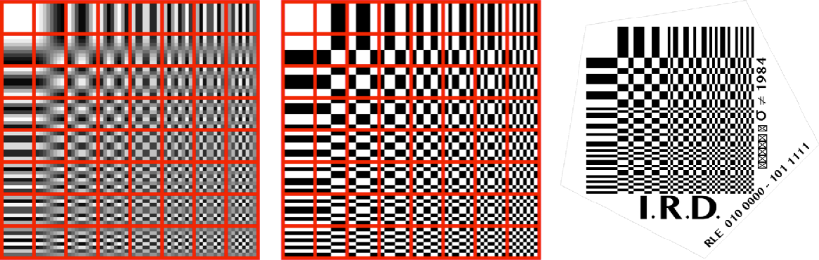
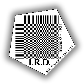
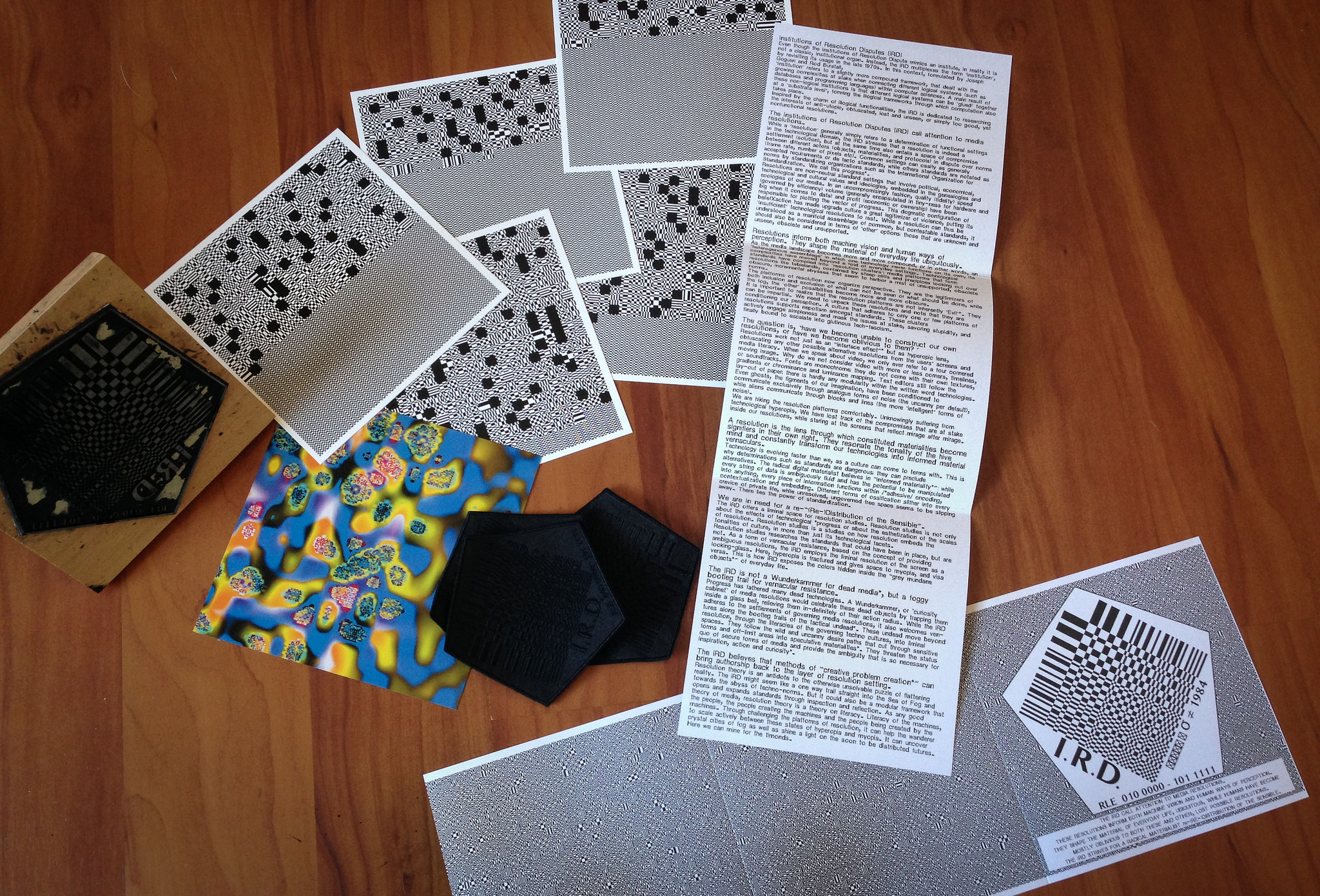
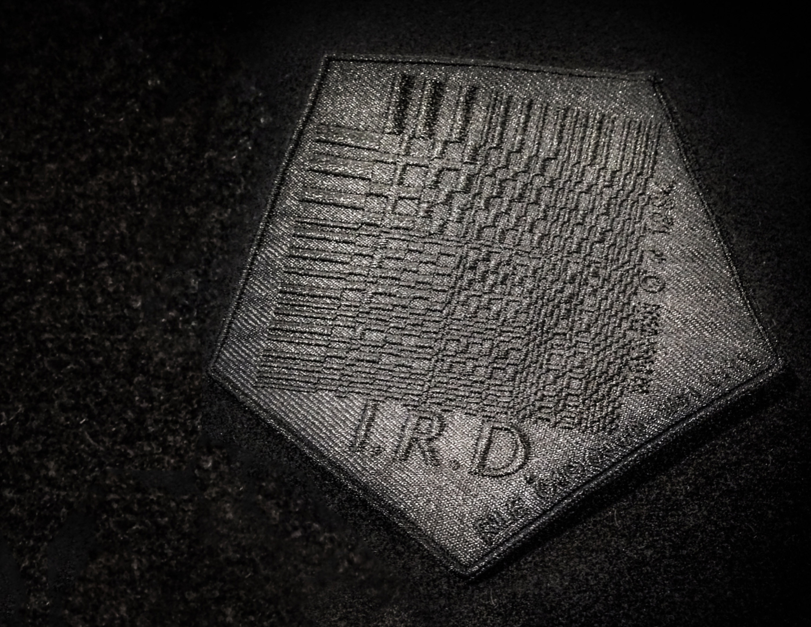
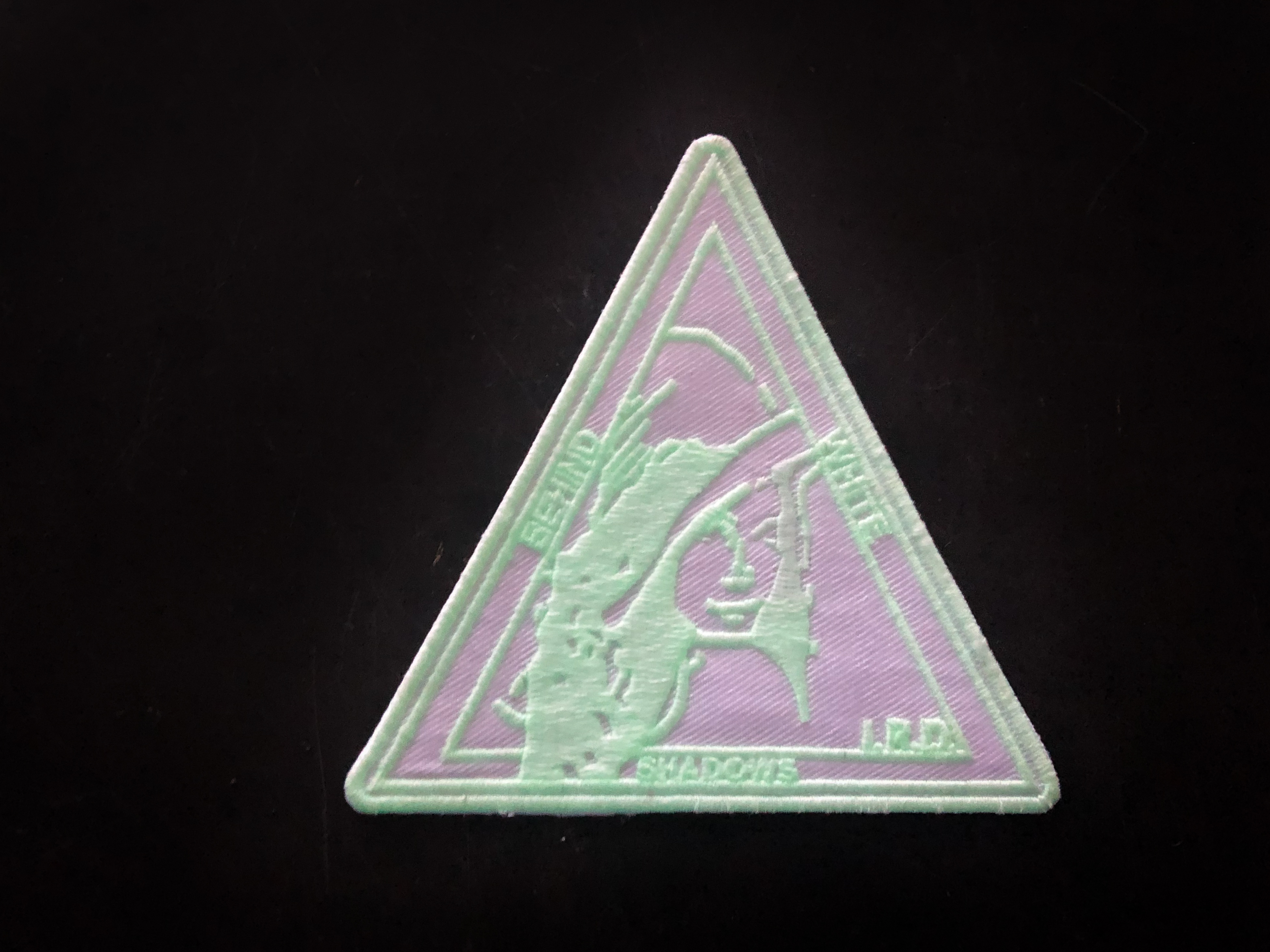
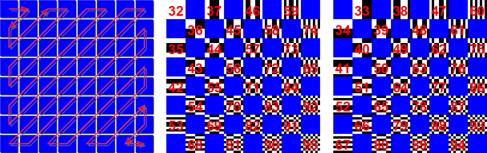 A Discrete Cosine Transform simplified to make a monochrome .ttf font and iRD logo. In the logo RLE 010 000 - 101 1111 signifies the key to the DCT encryption: 010 000 - 101 1111 are the binary values of the 64 most used ASCII glyphs, which are then mapped onto the DCT in a zig zag order (following RLE).

black on black
embroidered patch
with logo iRD
the patch reads:
σ ≠ 1984
(stealth does not equal 1984)
and RLE (run length encoding 0100000 - 1011111
RLE 010 000 - 101 1111 signifies the key to the DCT encryption: 010 000 - 101 1111 are the binary values of the 64 most used ASCII glyphs, which are then mapped onto the DCT in a zig zag order (following RLE).
A PDF about this work is downloadable here
i.R.D. Patch
[including the key to DCT]![]()
[including the key to DCT]


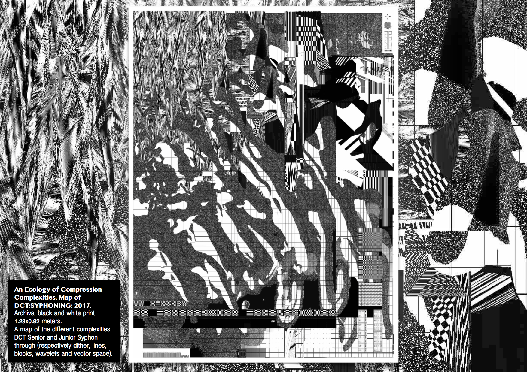
A map of the different complexities of compression artifacts featuring the realms of
━ Lines
(interlacing, interleaving, scan line, border, beam)
Collapse of PAL, Tacit:Blue, Beyond Resolution performance,
(interlacing, interleaving, scan line, border, beam)
Collapse of PAL, Tacit:Blue, Beyond Resolution performance,


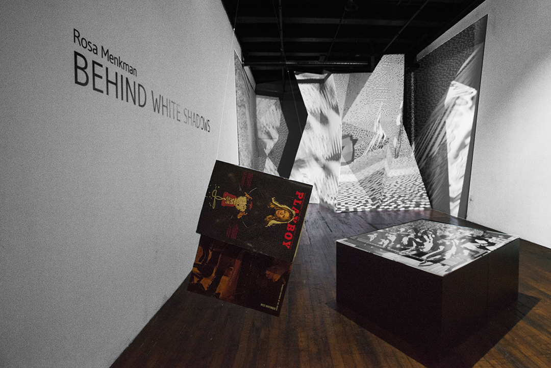
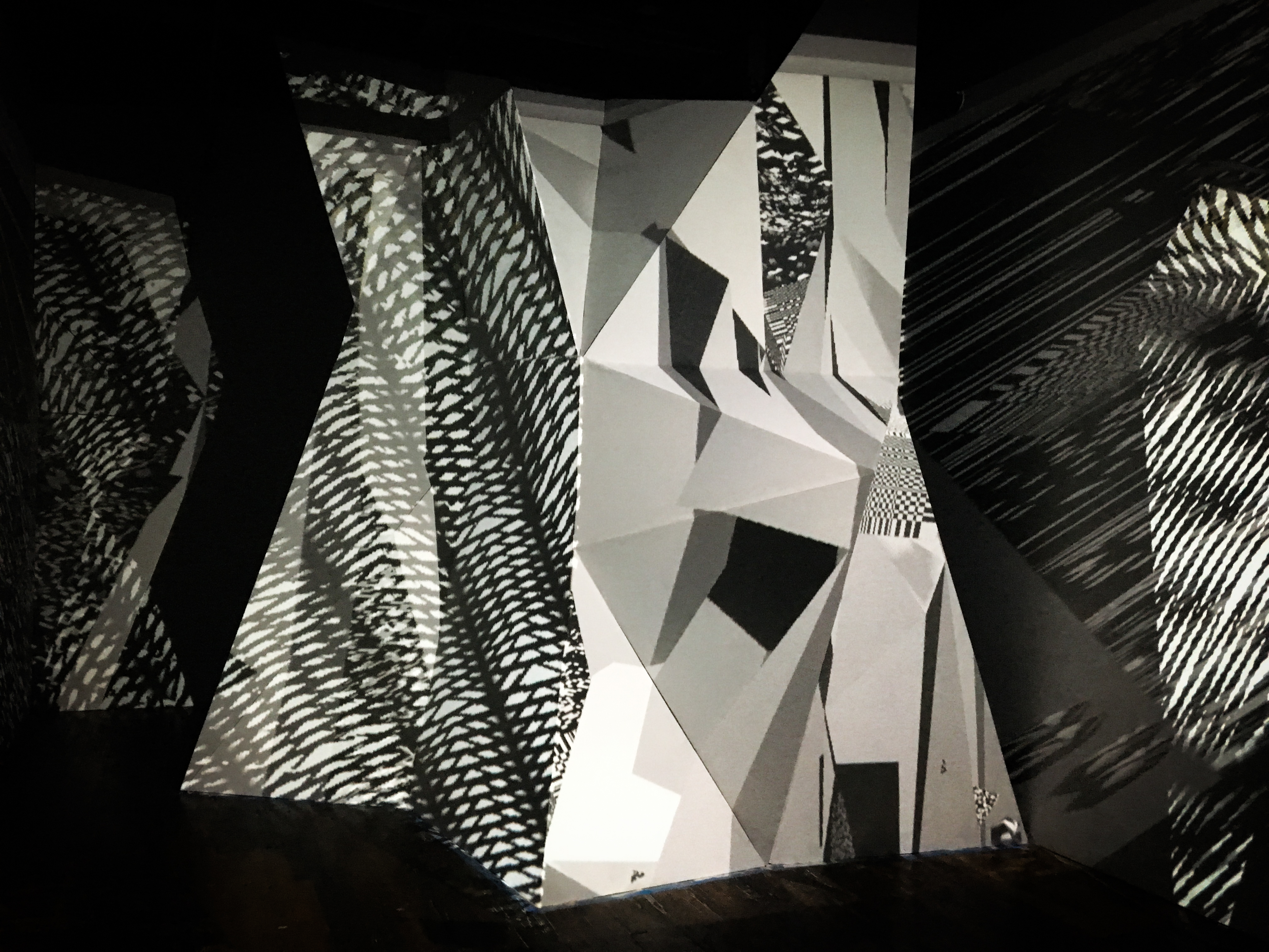
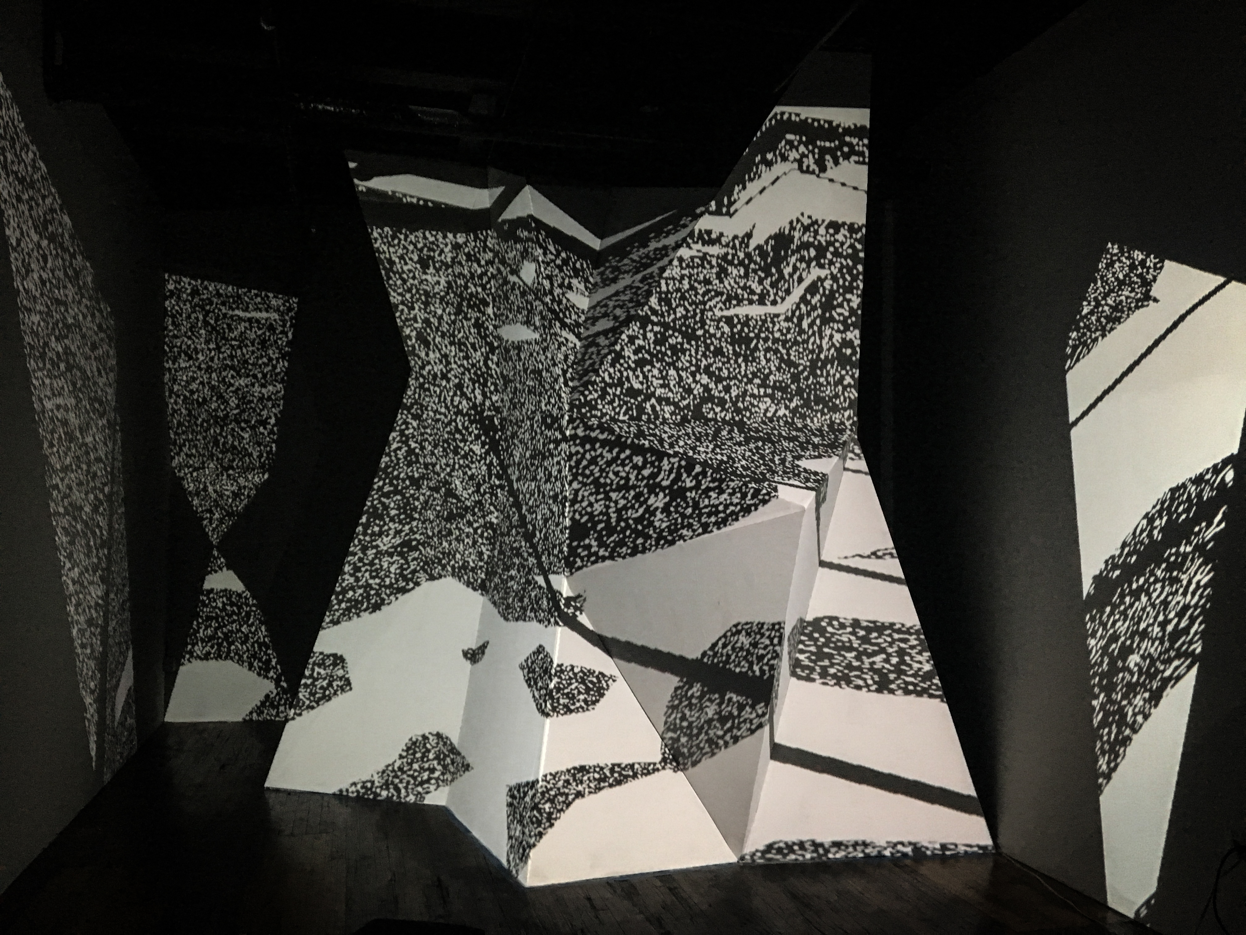
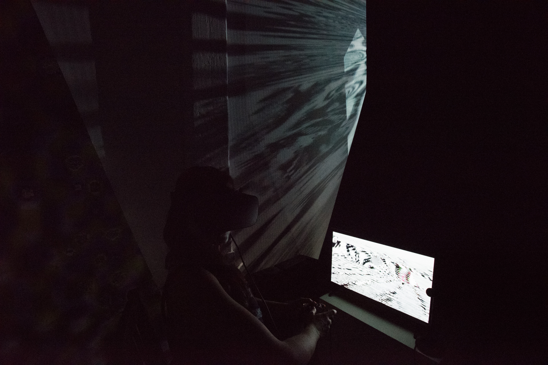
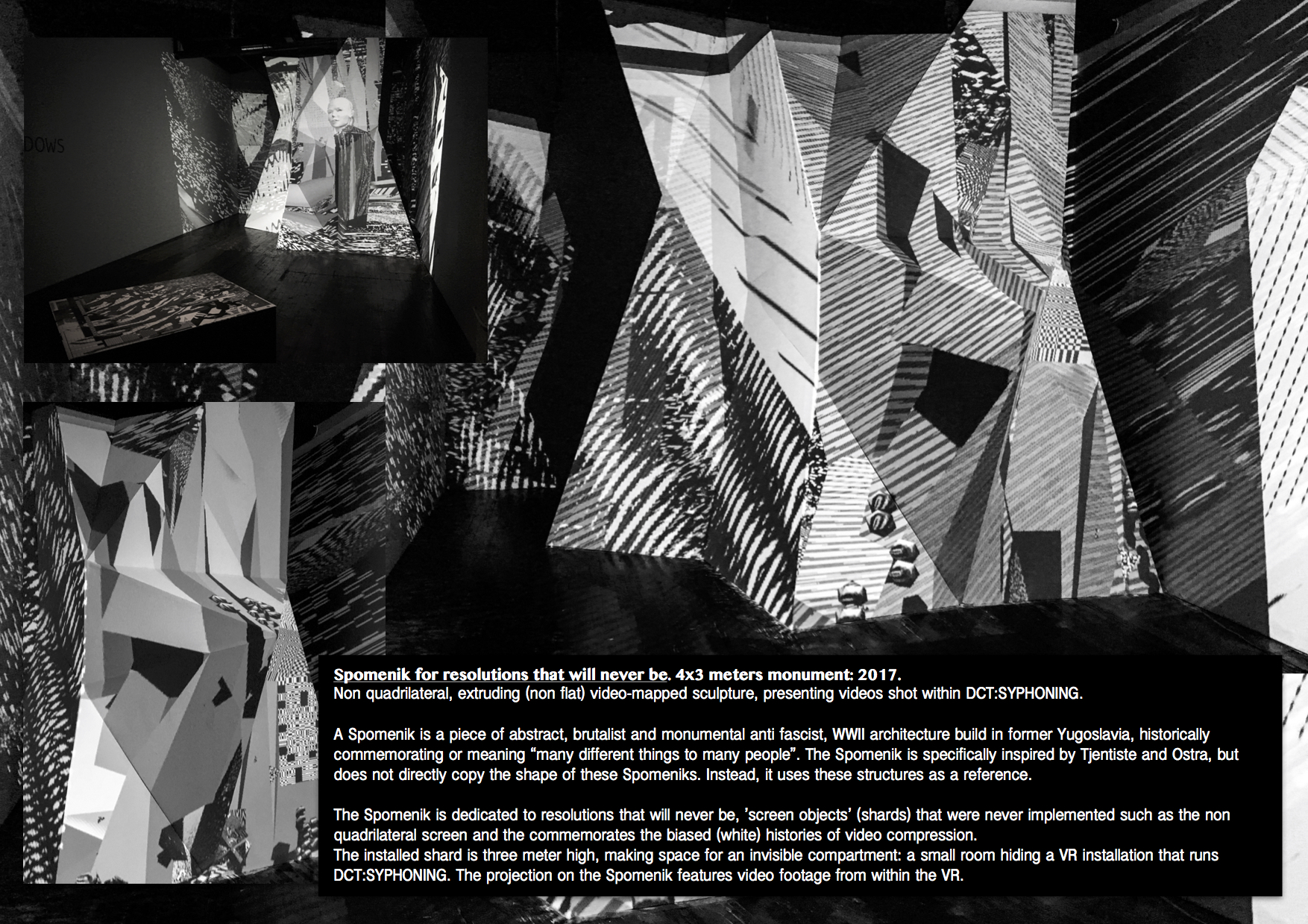
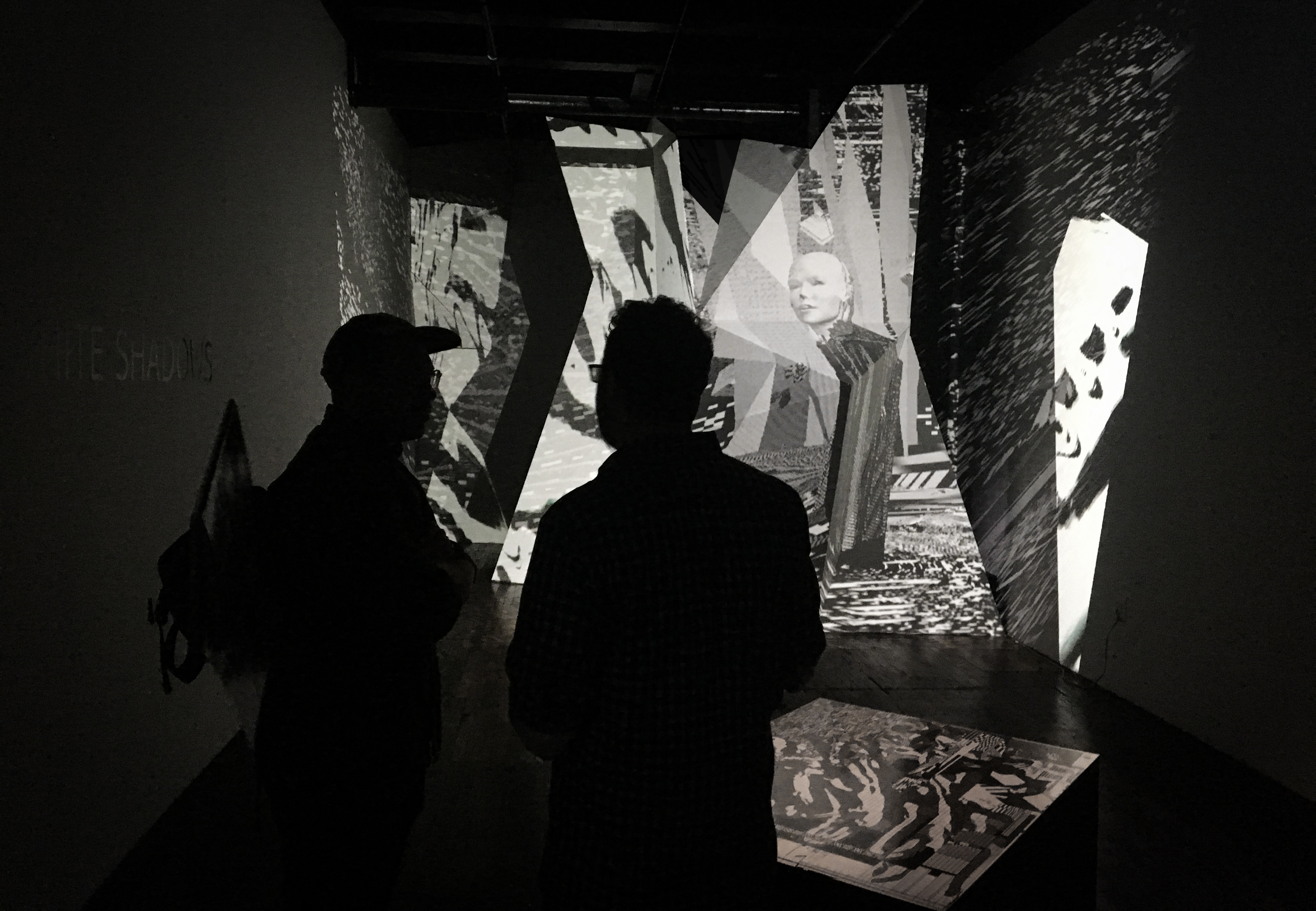
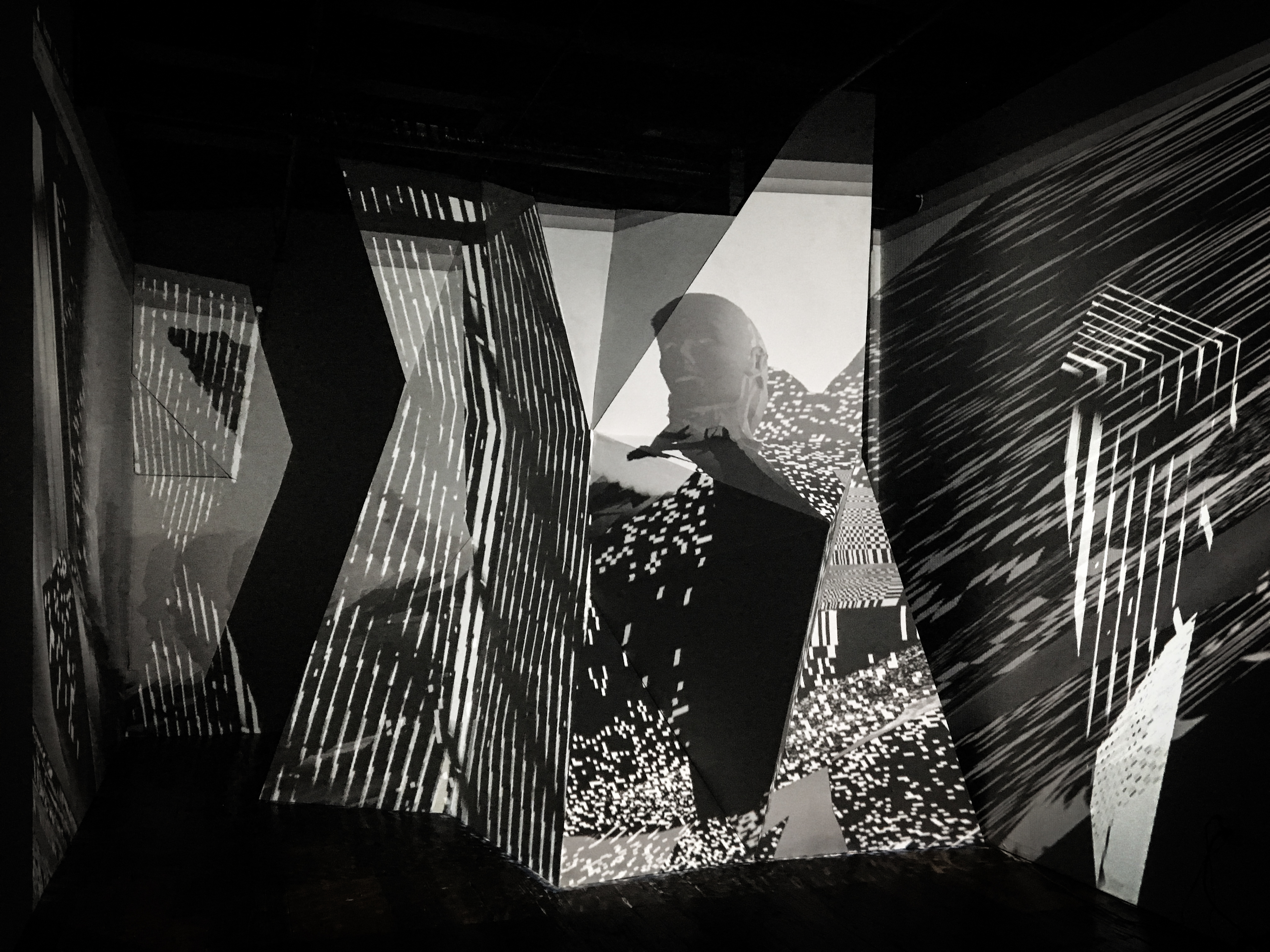
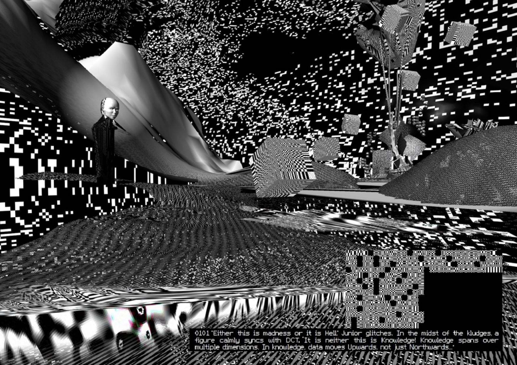
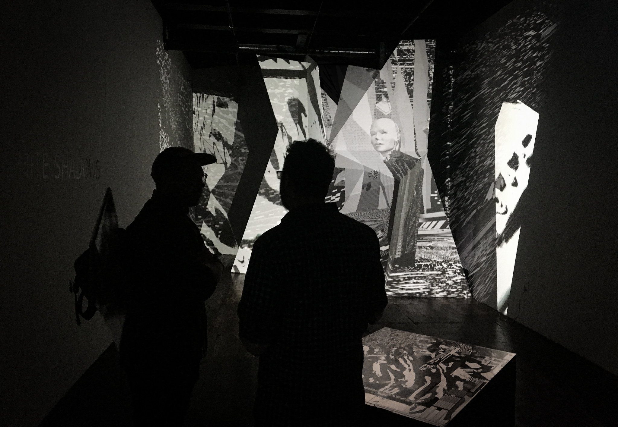
This second solo show of Rosa Menkman at Transfer Gallery, features a new installation of Menkman’s research into the compromises implicit in image processing technologies. For ‘Behind White Shadows’ Menkman extends her virtual reality piece ‘DCT:SYPHONING. The 1000000th (64th) interval’ beyond the headset into the gallery, projecting on a monumental sculpture: the Spomenik for resolutions that will never be and presenting topographies of her 3D environments.
To accompany this exhibition, Menkman releases a new essay ‘The White Shadows of Image Processing: Shirley, Lena, Jennifer and the Angel of History’, presenting her recent research into color test cards.
The central piece in the show ‘DCT:SYPHONING. The 1000000th (64th) interval’ is a fictional journey through the historical progression of image complexities, told as a modern translation of the 1884 Edwin Abbott Abbott novel “Flatland”. Menkman leads us through a universe of abstract, simulated environments, made from materials evolving from early raster graphics to our contemporary state of CGI realism.
At each level, Menkman’s virtual world interferes with the formal properties of VR to create stunning and disorienting environments, throwing into question our preconceived notions of virtual reality. In doing so, ‘Behind White Shadows’ casts light on some of the problematic issues surrounding the emergence of 3D technologies, asking questions such as: what do the hegemonic conventions of sight obscure? And: who gets to move beyond the frame and decide the perspective?
Works:
- DCT SYPHONING (VR, installed in niche behind Spomenik)
- Spomenik (sculptural installation w/ projection mapping)
- An Ecology of Compression Complexities (map, archival print)
- A Behind White Shadows glow in the dark patch
-︎ Behind White Shadows of Image Processing :: the research cabinet and essay
A warm thank you goes out to TRANSFER (Kelani Nichole), Casey Bloomquist (for helping with the building of the Spomenik), DiMoDA (William Robertson and Alfredo Salazar-Caro for their help and support of DCT:SYPHINING) and Mario de Vega (who designed the Behind White Shadows pdf).


Behind White Shadows: Glow in the Dark Patch


Addendum: Specters controlling our imaging technologies
In a culture that is dominated by images, we need to realize that (new) digital image processing technologies - whether based in classic image compression, biometrics or the newest machine learning algorithms, consist of some of the most influential, political but also biased and inherently flawed protocols, test and reference sets.
We should be more conscious of the war that is unfolding in the realms of image processing technologies. A war that takes place on many levels; on the plane where images are produced and the biased ideologies these images internalize and that often function at the expense of the marginalised. Besides, we should not only be conscious of the constructed realities these images offer, but also of the parts of reality they do not capture and as a result, of the economies these images sustain.
As adversaries in a war, we need to pronounce ‘colour’, or the side we are on. Our side is in need of a patch. A patch that signifies the issues wefight for.
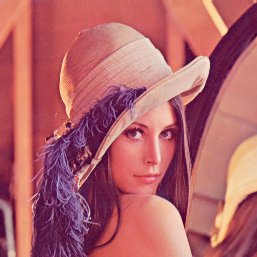
This is why I created the white on white (glow in the dark) ‘the Lena’ patch.
While taking an image of the face and saving it to memory seems like a simple, straightforward act, in reality a large set of protocols intervene in the processes of saving the face to memory, including, but not limited to scaling, reordering, decomposing, and reconstituting image data, in favour of certain affordances, which cater to techno-conventional, political, and historically biased settings. Some of these biases can be traced back to the history of the color test card; a history which can offer an insightful perspective on how image compression standards have come to exist.
The first color test cards were developed almost a century ago. They would feature a ‘normal’ Caucasian, anonymous, brightly dressed girl, smiling friendly at the camera. Throughout the many legacy histories of image processing—including, but not limited to analogue photography, film, television, the JPEG algorithm and even Photoshop effects—this trope grew into a habitual, racial bias, violently lodged under the fold of image processing. The habitual use of Caucasian test cards such as the Lena photo, led to the development of certain affordances in the compression algorithm, scaling or sometimes even cutting away certain image data. It is important to be aware that a bias does not just influence the final rendering of the image; the bias also exists in what a technology does not show; what it obscures or obfuscates and what image data simply deletes. The Shirleys but, more importantly, the technicians that implemented the use of these Shirleys or color reference cards cast white shadows; patches of unregistered information during image processing. And while artists such as Hito Steyerl or Constant Dullaart make an effort to spread awareness around the biases and habits that are embedded in the histories of resolution setting, even today, the stories of these specters influencing our images - albeit invisible to the unaware observer - are often missing.
Six years after releasing A Vernacular of File Formats, and after close study of some of the histories of standardization and resolution setting, I realise that by using my own face as a Shirley card for de-calibration, I unintentionally aligned myself with the historical trope of the Caucasian test card. Just as Jeff Seidemann once said about Lena: “when you use a picture often, it becomes just pixels”– my face had become just pixels, or even, I had simply lost my face: it no longer belonged to me, but had become an anonymous image, ready for co-optation.
One way to make the habitual whiteness of color test cards more apparent, is indeed by insisting that these standard images, that often are trapped in the histories of our technologies, become part of the public domain. These images need to lose their elusive power. The stories of standardization belong to highschool text books, and the possible violence of standardization should be studied in any curriculum. By illuminating the histories of standardization, we will also see its white shadows.
Behind White Shadows
The JPEG image compression technology is one of the most archaic, but at the same time most contemporary artifacts from the realm of image processing. The algorithm still absolutely dominates the field of image compression, while its basis - the DCT algorithm - is also used in other compression technologies. DCT and JPEG in general have been a rich source of inspiration to me, inspiring me to create multiple works, such as DCT and DCT:SYPHONING.
I came across the story of Lena when I was invited to tell my own story of losing my face to the internet during the conference of Elevate festival in 2016. The image, produced in 2010, has seen many copies and appropriations and somehow I have lost authorship over it - it no longer seems to belong to me. In this way I experienced how strange it can be when your face becomes “just pixels”.
Last May I was asked to lend the image to Vogue (the US fashion magazine). I took this as an opportunity to reclaim the image in the only way I could imagine possible - by renaming the portrait formally known as “Blinx (from a Vernacular or File Formats)” to “A Ghost for De-calibration”. With this small, probably to most invisible action, I wish to take a stand against the discourse of color test cards and promote the consideration and creation of alternative cards and resolutions.
A great deal of inspiration for this text came from the amazing research undertaken by Lorna Roth, Researcher at Concordia University: Looking at Shirley, Colour balance project, video: color film was build for white people. Here's what it did to dark skin.
I would also like to reference James Bridles Render Ghost research “The Render Ghosts” (2013) in which he first connected the stories of Lena and Jennifer Knoll.
In a culture that is dominated by images, we need to realize that (new) digital image processing technologies - whether based in classic image compression, biometrics or the newest machine learning algorithms, consist of some of the most influential, political but also biased and inherently flawed protocols, test and reference sets.
We should be more conscious of the war that is unfolding in the realms of image processing technologies. A war that takes place on many levels; on the plane where images are produced and the biased ideologies these images internalize and that often function at the expense of the marginalised. Besides, we should not only be conscious of the constructed realities these images offer, but also of the parts of reality they do not capture and as a result, of the economies these images sustain.
As adversaries in a war, we need to pronounce ‘colour’, or the side we are on. Our side is in need of a patch. A patch that signifies the issues wefight for.
This is why I created the white on white (glow in the dark) ‘the Lena’ patch.
While taking an image of the face and saving it to memory seems like a simple, straightforward act, in reality a large set of protocols intervene in the processes of saving the face to memory, including, but not limited to scaling, reordering, decomposing, and reconstituting image data, in favour of certain affordances, which cater to techno-conventional, political, and historically biased settings. Some of these biases can be traced back to the history of the color test card; a history which can offer an insightful perspective on how image compression standards have come to exist.
The first color test cards were developed almost a century ago. They would feature a ‘normal’ Caucasian, anonymous, brightly dressed girl, smiling friendly at the camera. Throughout the many legacy histories of image processing—including, but not limited to analogue photography, film, television, the JPEG algorithm and even Photoshop effects—this trope grew into a habitual, racial bias, violently lodged under the fold of image processing. The habitual use of Caucasian test cards such as the Lena photo, led to the development of certain affordances in the compression algorithm, scaling or sometimes even cutting away certain image data. It is important to be aware that a bias does not just influence the final rendering of the image; the bias also exists in what a technology does not show; what it obscures or obfuscates and what image data simply deletes. The Shirleys but, more importantly, the technicians that implemented the use of these Shirleys or color reference cards cast white shadows; patches of unregistered information during image processing. And while artists such as Hito Steyerl or Constant Dullaart make an effort to spread awareness around the biases and habits that are embedded in the histories of resolution setting, even today, the stories of these specters influencing our images - albeit invisible to the unaware observer - are often missing.
Six years after releasing A Vernacular of File Formats, and after close study of some of the histories of standardization and resolution setting, I realise that by using my own face as a Shirley card for de-calibration, I unintentionally aligned myself with the historical trope of the Caucasian test card. Just as Jeff Seidemann once said about Lena: “when you use a picture often, it becomes just pixels”– my face had become just pixels, or even, I had simply lost my face: it no longer belonged to me, but had become an anonymous image, ready for co-optation.
One way to make the habitual whiteness of color test cards more apparent, is indeed by insisting that these standard images, that often are trapped in the histories of our technologies, become part of the public domain. These images need to lose their elusive power. The stories of standardization belong to highschool text books, and the possible violence of standardization should be studied in any curriculum. By illuminating the histories of standardization, we will also see its white shadows.
Behind White Shadows
The JPEG image compression technology is one of the most archaic, but at the same time most contemporary artifacts from the realm of image processing. The algorithm still absolutely dominates the field of image compression, while its basis - the DCT algorithm - is also used in other compression technologies. DCT and JPEG in general have been a rich source of inspiration to me, inspiring me to create multiple works, such as DCT and DCT:SYPHONING.
I came across the story of Lena when I was invited to tell my own story of losing my face to the internet during the conference of Elevate festival in 2016. The image, produced in 2010, has seen many copies and appropriations and somehow I have lost authorship over it - it no longer seems to belong to me. In this way I experienced how strange it can be when your face becomes “just pixels”.
Last May I was asked to lend the image to Vogue (the US fashion magazine). I took this as an opportunity to reclaim the image in the only way I could imagine possible - by renaming the portrait formally known as “Blinx (from a Vernacular or File Formats)” to “A Ghost for De-calibration”. With this small, probably to most invisible action, I wish to take a stand against the discourse of color test cards and promote the consideration and creation of alternative cards and resolutions.
A great deal of inspiration for this text came from the amazing research undertaken by Lorna Roth, Researcher at Concordia University: Looking at Shirley, Colour balance project, video: color film was build for white people. Here's what it did to dark skin.
I would also like to reference James Bridles Render Ghost research “The Render Ghosts” (2013) in which he first connected the stories of Lena and Jennifer Knoll.
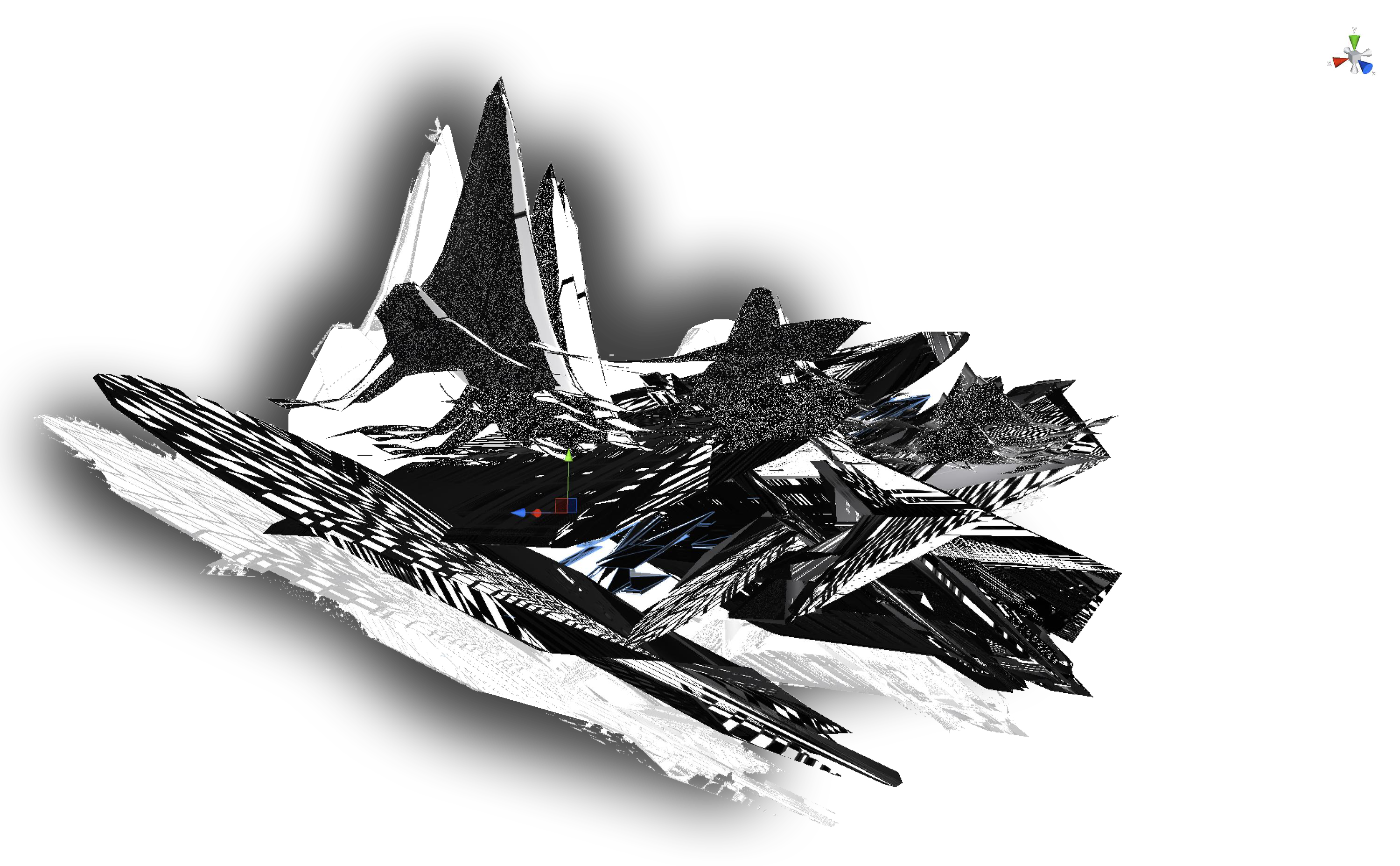
Spomenik (2017)
☗
non
quadrilateral
[monument]
non
quadrilateral
[monument]
Centrepiece of my Behind White Shadows solo show
(Transfer Gallery NYC, 2017)
The Spomenik is a 3x4 meters large format sculpture, made out of triplex wood, painted white featuring projection mapped videos. The scultpure also hides a little cave in the back where visitors can play VR in peace.
A monument for resolutions that will never be.
The Spomenik is named after the brutalist monumental Spomeniks, historically commemorating “many different things to many people”, such as Tjentiste and Ostra.
This Spomenik is dedicated to resolutions that are impossible, such as ‘screen objects’ (shards) and the not (yet) implemented possibilities non quadrilateral screens have to offer.
This installed shard is three meter high, hiding a VR installation behind, running DCT:SYPHONING. The VR is accessible from the back of the Spomenik. The projection on the Spomenik is partially a mapped live stream from the VR.
The Spomenik also features textures of the Ecology of compression complexities, of which the map was layed out in front.


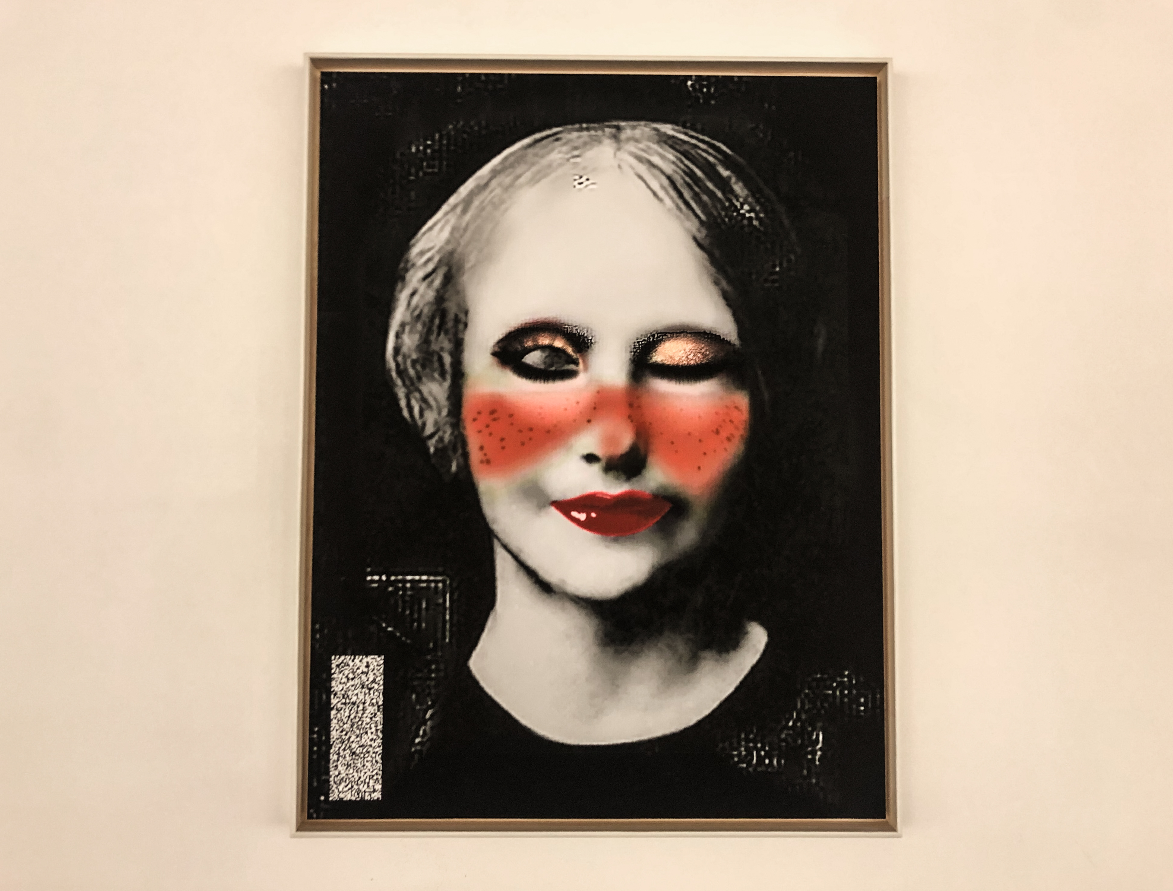
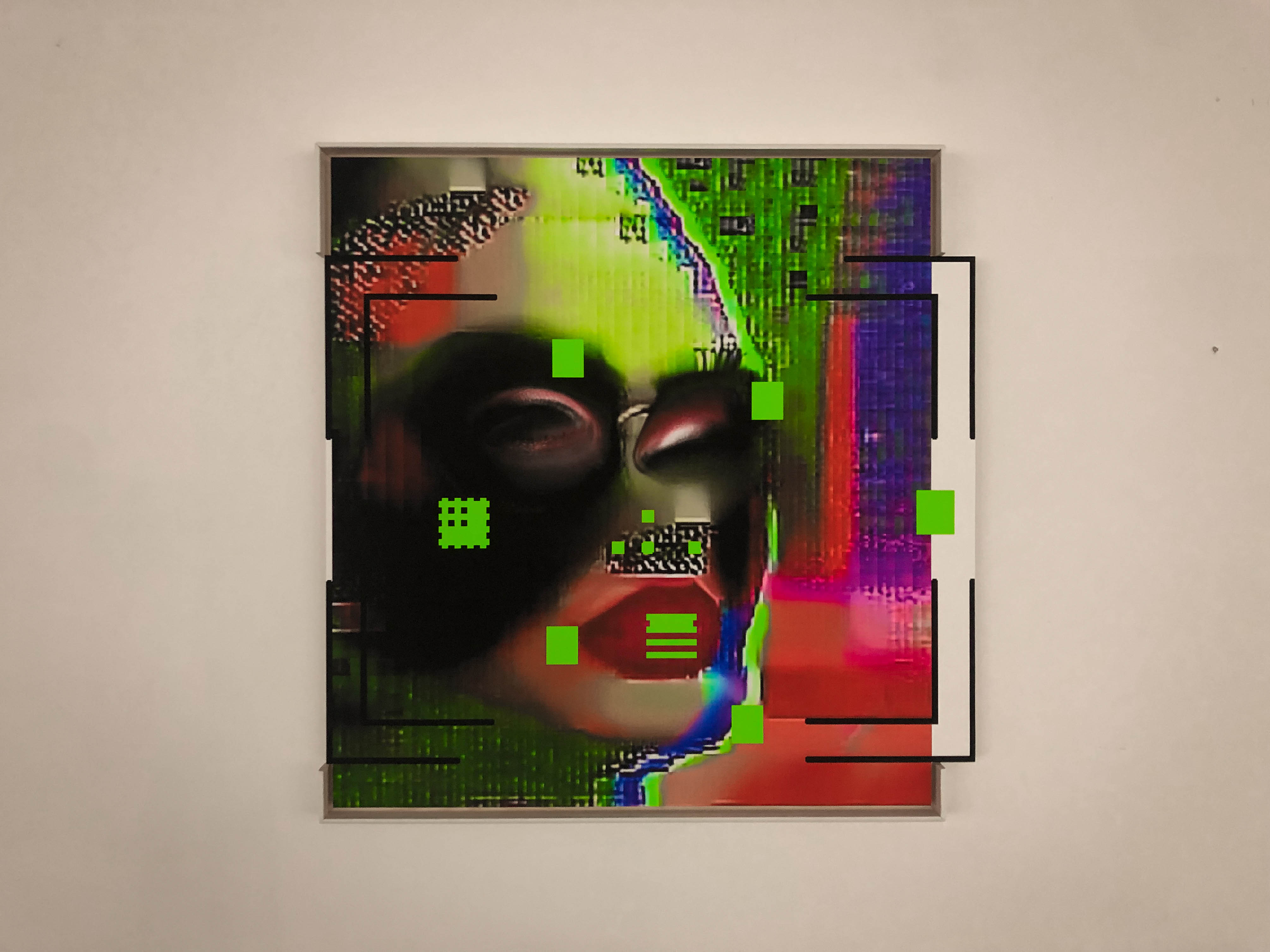
365 Perfect Decalibration (2019-ongoing)
Seven one of a kind archival prints that each come with an embedded Artivive AR video (please download the Artivive app to see AR content).
The prints are embedded in a custom build list of wood that has a test target extruding out of it.
1. Decalibrated Self portrait with USAF1951 Resolution test Tri-bars [46 x 58 cm including black square]
2. Decalibrated Self portrait with quarter Siemens Star and DIY Test Resolution Target for Pixel Resolution [39 x 45 cm with extruding DIY Test Resolution Target]
3. Decalibrated Self portrait with Facial Recognition crosshair [47 x 38 cm including extruding crosshair]
4. Decalibrated Self portrait with Ronchigrams for mirror curvature testing [45 x 58 cm including Ronchigrams]
5. Decalibrated Ariane Shutterstock model with Modulation Transfer Function Tests, Fitz Patrick Scale, Discrete Cosine Transform and Quadrant Pattern registration marks [41 x 37 cm including extruding Modulating Transfer Function Test]
Measurements approximate and do not include custom build list
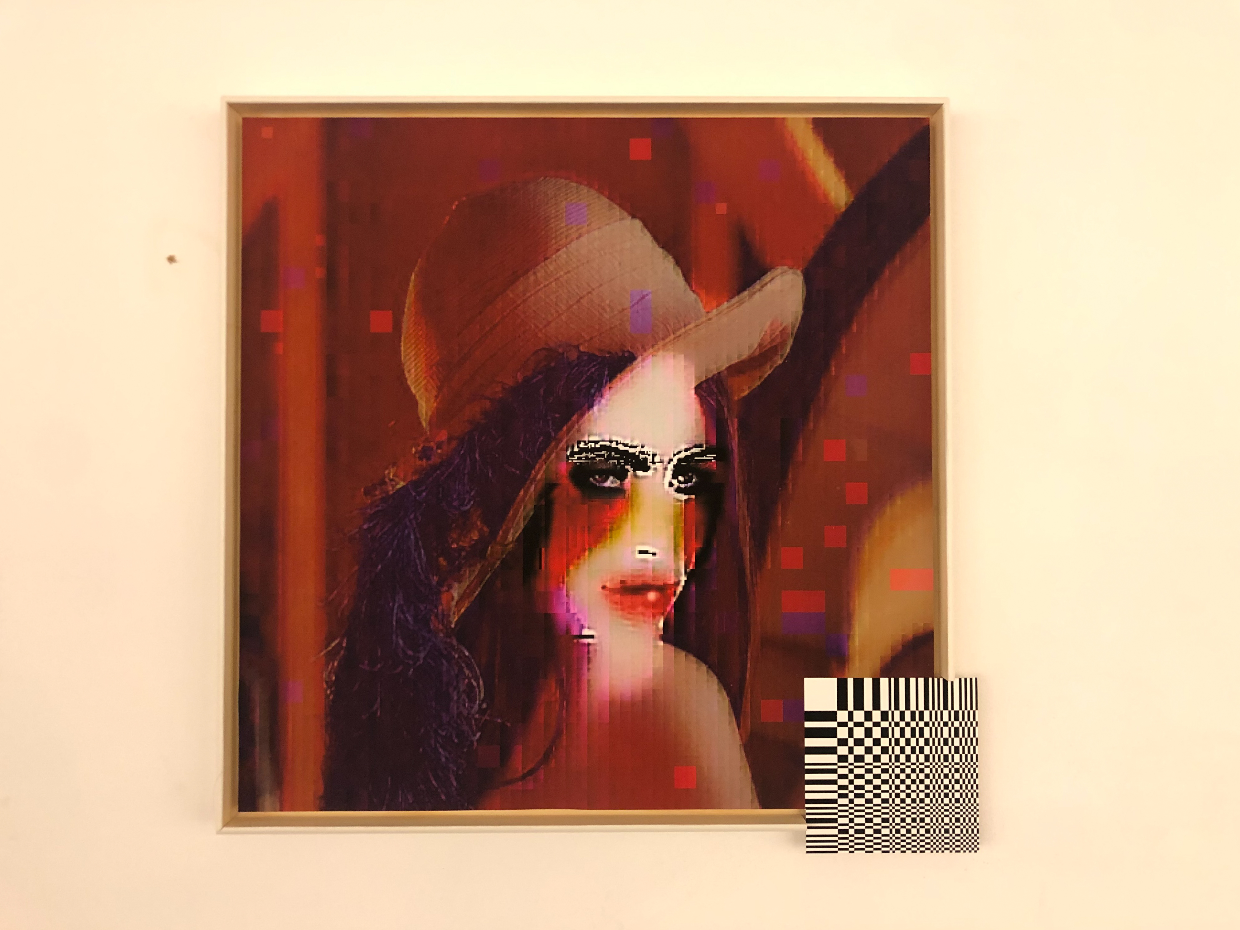
For Rainbows END festival The 365 Perfect Decalibration series has grown to include les inconnues
A. La Inconnue de la Seine (aka: CPR ANNIE / ANNIE R U OK?) with noise stripe (42.16 x 55.21 cm)
B. Lena JPEG with DCT extrusion (46.06 x 46.06 cm)
C. Tay Tweets with Facial Recognition crosshair (55 x 55 cm)
Measurements approximate and do include custom build list
From the Shadow Knowledge catalogue:
“In 365 Perfect, Menkman turns to mobile imaging softwares. 365 Perfect is “the best FREE virtual makeup app, period. It’s like having a glam squad in your pocket” - or so states the software.
The options in the app include virtual photo make-up, which has filters such as ‘delete blemishes’, or ‘brighten and soften skin’. It can also deepen the smile, put lipstick or even lip tatoos, enlarge the eyes and make the face slimmer, lift the cheeks, enhance the nose, or resize the lips. And lets not forget to whiten the teeth, add eyelashes, eye liner and eyebrows and finally change the hairstyle.
“I used the app to make myself perfect. not once, not twice, but hundreds of times over, one year long perfection. If everyday I could get just one shade lighter, slimmer cheeks or bigger eyes... how beautiful would I become? By re-saving my newly beautified face every iteration, the artifacts of a re-compressed JPEG and the absurdity of our beautifying standards are amplified incrementally.”
In this humorous, yet discomforting work, Menkman layers the standard features of beautifying software on her own image, enlarging her eyes, deleting blemishes and enhancing features, until the original face is nearly unrecognizable. Over and over, Menkman alters her likeness, seemingly to make herself appear more conventionally beautiful and more “perfect”. Saving her image at every new iteration, she arrives at a re-compressed pixelated JPEG, and a grotesque, if not almost unhuman self-portrait. Presented at the Natalie and James Thompson Gallery in the form of prints, 365 Perfect is not only a powerful commentary on the relationship between mobile technology and the beauty industry, but a careful exploration of generation loss, and the visual artifacts that are created as a result.
 les inconnues is a poster featuring my collection of unknown women of image processing. This poster was a result of my Behind White Shadows research
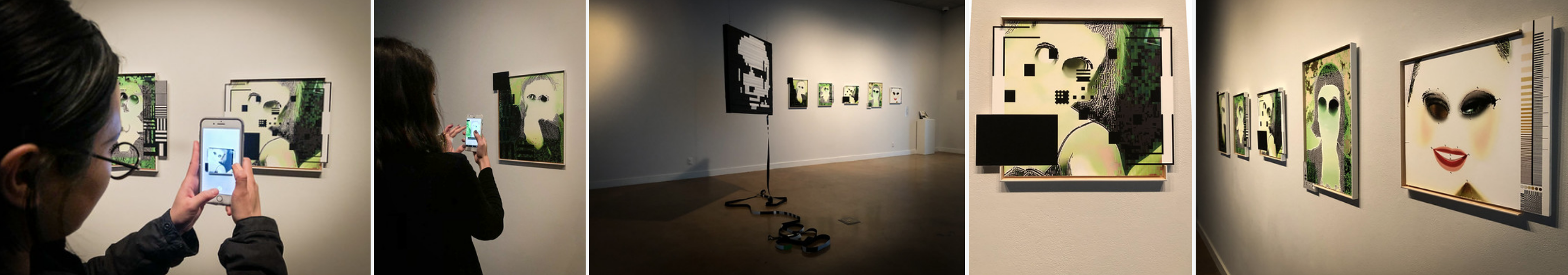
Unresolved (2020)
 6400 x 4 CM
 long painting on canvas,
or
data file to be wrapped
on hardware
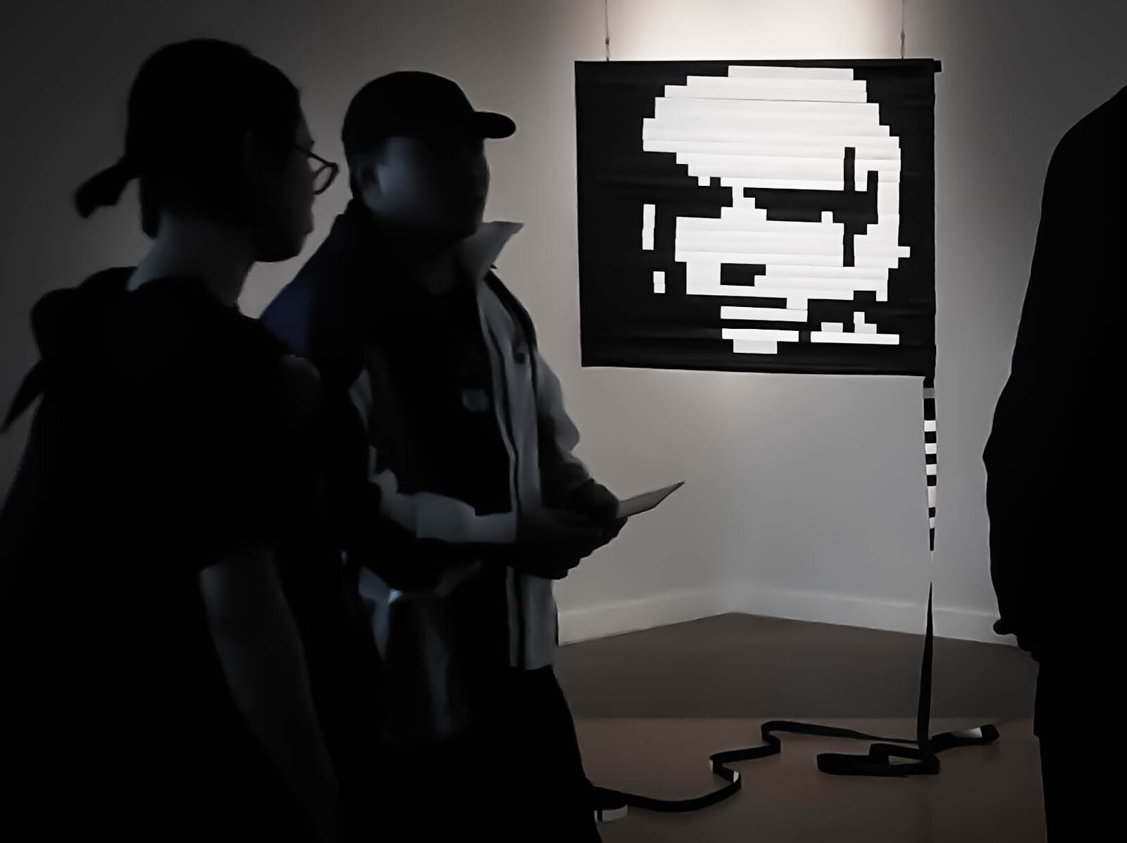
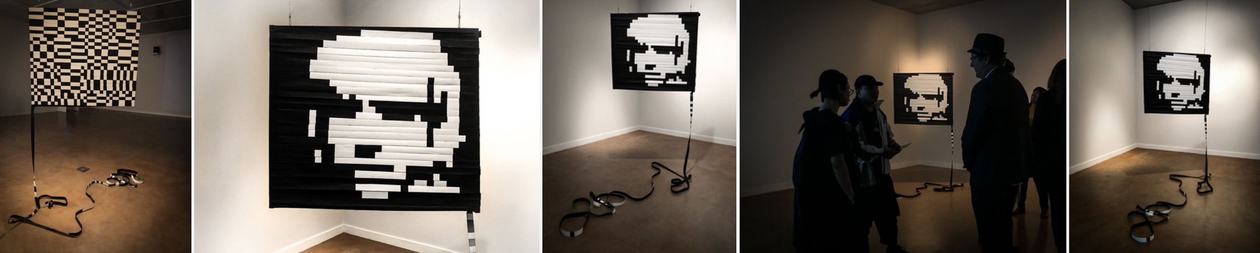 6400 x 4 CM long painting on canvas, or data file, to be wrapped over hardware
Inspired by the 2011 works “Beyond Yes and No” and “29 PARALLEL STRIPES”, by glitch artist Beflix, Unresolved explores an alternative method of painting data.
Using a bitmap image, Menkman followed the linear organization of pixelelated data: in a BMP file, the image data (luminocity and chrominance) is encoded pixel by pixel, in a linear fashion, one after the other.
In Unresolved, every pixel or point of data is painted on a 64 meter long canvas strip, and then mounted on a frame.
When hung correctly, unrolled over hardware with the right dimensions, Unresolved displays a double sided image - on one side Menkmans portrait, and on the other side a message in DCT (Menkman’s cryptographic tool from 2015): BEYONDRESOLUTION.
Through this work, Menkman presents the ways in which a bitmap file, when ‘opened’ on different hardware, can create alternate modes of reading and seeing: the hardware defines what is perceived.
some images of the making of: 32 stripes of canvas were encoded, sewn into a very long strip, and painted.
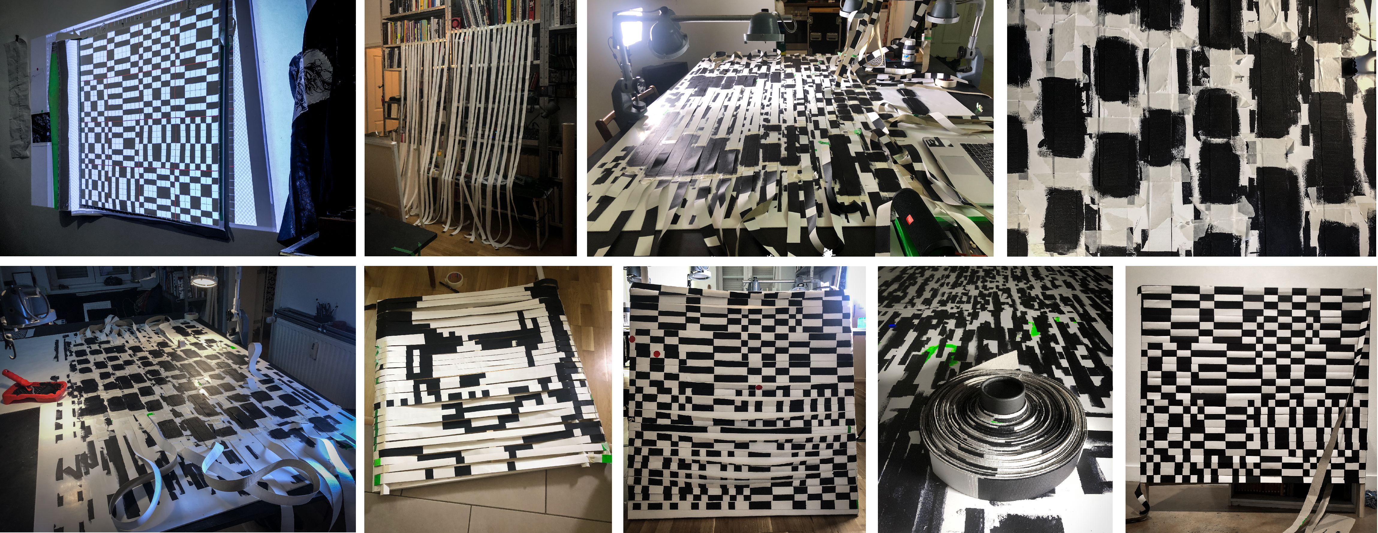
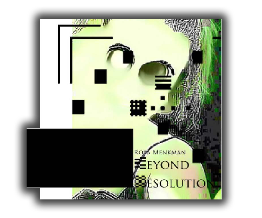


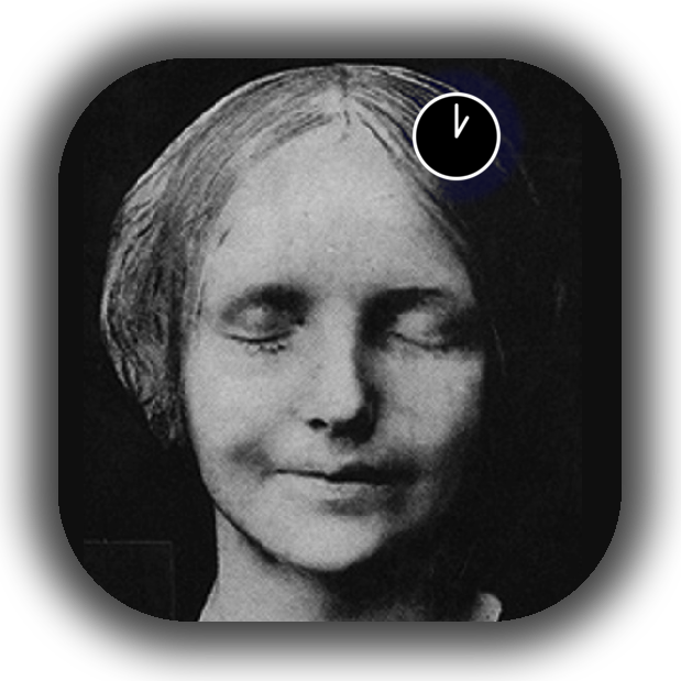

Downloadable as pdf here
Menkman, Rosa. Beyond Resolution (i.R.D.: 2020).
ISBN: 978-90-828273-0-9
Published on the occaision of my solo show at SJSU art galleries (3th of March - May 15th 2020): Shadow Knowledge
Menkman, Rosa. Beyond Resolution (i.R.D.: 2020).
ISBN: 978-90-828273-0-9
Published on the occaision of my solo show at SJSU art galleries (3th of March - May 15th 2020): Shadow Knowledge
Pique Nique Pour les Inconnues (2020)
Version 2 : “Rupert the bear and the Frogs Chorus / Paul Mccartney / we all stand together” version. inspiration: Rupert the bear and the Frogs
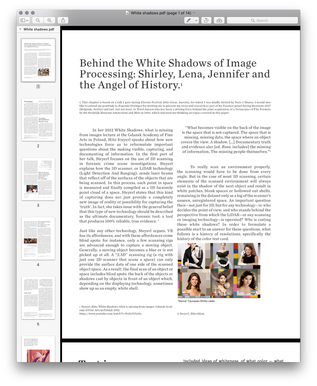 ︎︎ “Behind White Shadows”
Pique Nique pour Les Inconnues is a desktop video (8 minutes) and a Telegram stickerset
based on the essay
︎︎ “Behind White Shadows”
The stickerset was made for Berlin Zentrum der Netzkunst
In Pique Nique pour les Inconnues, Menkman considers the ways in which the history of technology has been defined by standardization, in particular through the use of color test cards for image processing. The work presents les Inconnues - unknown women whose images are linked to the history of image processing. In this work, test cards, bots, virtual assistants, stock photos and others find a voice, but fail to recover their personhood. As Menkman states, “Engineers used these female objects to evaluate the quality of image processing, rendering and composition of architecture and to make these latent spaces more amicable. While these women seem to be able to prolong their existence for as long as the (digital) realms will copy and reuse them, most of them have lost their name and identity.” In this work, the viewer is haunted by the familiarity of these digital ghosts, while at the same time, privy to an uncanny experience when the historically mute images speak for the first time.
A fundamental part of the history of image-processing, webdesign, and the standardization of settings within both analogue and digital media are test cards, placeholder images, bots and virtual assitants. Engineers used these female objects to evaluate the quality of image processing, the rendering and composition of architecture and to make these latent spaces more amicable. While these women seem to be able to prolonge their existence for as long as the (digital) realms will copy and reuse them, most of them have lost their name and identity.
🕐🕑🕒🕓🕔🕕🕖🕗🕘🕙🕚🕛🕧🕜🕝🕞🕟🕠🕡🕢🕣🕤🕥🕦
The stickerset is made of the 24 clockface emojis, each connected to a sticker of an Inconnue (an unknown woman or shell without ghost) and their history.
Every half an hour is now set to a reminder of one of the shells.Telegram sticker set (Can only be used on smartphone when you have the Telegram app installed)
![]()
![]()
︎︎ “Behind White Shadows”
The stickerset was made for Berlin Zentrum der Netzkunst
In Pique Nique pour les Inconnues, Menkman considers the ways in which the history of technology has been defined by standardization, in particular through the use of color test cards for image processing. The work presents les Inconnues - unknown women whose images are linked to the history of image processing. In this work, test cards, bots, virtual assistants, stock photos and others find a voice, but fail to recover their personhood. As Menkman states, “Engineers used these female objects to evaluate the quality of image processing, rendering and composition of architecture and to make these latent spaces more amicable. While these women seem to be able to prolong their existence for as long as the (digital) realms will copy and reuse them, most of them have lost their name and identity.” In this work, the viewer is haunted by the familiarity of these digital ghosts, while at the same time, privy to an uncanny experience when the historically mute images speak for the first time.
A fundamental part of the history of image-processing, webdesign, and the standardization of settings within both analogue and digital media are test cards, placeholder images, bots and virtual assitants. Engineers used these female objects to evaluate the quality of image processing, the rendering and composition of architecture and to make these latent spaces more amicable. While these women seem to be able to prolonge their existence for as long as the (digital) realms will copy and reuse them, most of them have lost their name and identity.
🕐🕑🕒🕓🕔🕕🕖🕗🕘🕙🕚🕛🕧🕜🕝🕞🕟🕠🕡🕢🕣🕤🕥🕦
The stickerset is made of the 24 clockface emojis, each connected to a sticker of an Inconnue (an unknown woman or shell without ghost) and their history.
Every half an hour is now set to a reminder of one of the shells.Telegram sticker set (Can only be used on smartphone when you have the Telegram app installed)
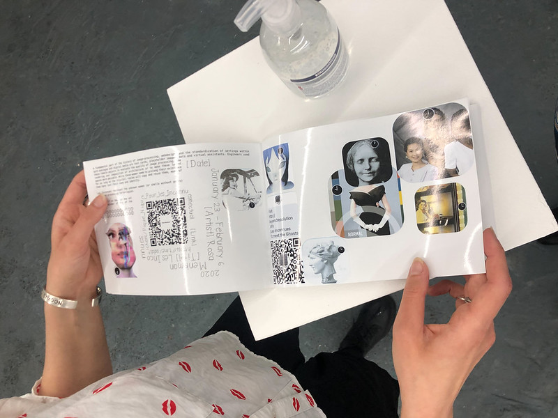


 l’Inconnue de la Seine (after 1900)
The Unknown Woman of the Seine is a death mask of an unidentified young woman that became a popular fixture on the walls of artists’ homes after 1900. She featured in various artists works ranging from books to theatre and film. But while many artists felt inspired by her borrowed visage, little but her moniker is known about her and she remains forever an asset with missing values.
- A radiolab podcast
🕐💀
 Audrey Munson Bust (1913-1915)
The bust “The Spirit of Life”, by Daniel Chester French (1913-1915), inspired by ‘America’s First Supermodel’ Audrey Munson. Munson was the inspiration for more than 12 other statures in New York City, and many, many others elsewhere. Chances are that when you cross a statue, it might be modelled after her.
- Greyer, Andea. Queen of the Artists' Studios The Story of Audrey Munson. 2007
🕑🗽
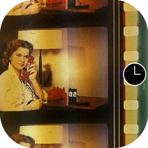 Color-timing control strips
Officially known as color-timing control strips, these anonymous female film studio workers were affectionately dubbed "china girls" by the industry, but are also known as leader ladies or lilys. The images in this show were meant only for use by the processing lab to match color tones in the associated film. They were often film lab workers themselves.
- Leaderlady project at SAIC
- Julie Buck and Karin Segal: Girls of Film
- Lili on the web
- Leaderladies and friends
- Sprocket girls
🕒🎞📽
 Miss NBC (1953)
The onset of color television brought no big surprise; in this medium too, producers hired Caucasian ladies as their test models, reinforcing longstanding biases in gender and race—the only difference being that in television, the objectified test model was known by her real name. The red-haired model Marie McNamara, for instance, became known in the 1950s when she modeled to calibrate the NBC television cameras, while CBS used a girl named Patty Painter.
“You know what a black-and-white test pattern is,” she told The New York Times in 1953.“Well, I’m it for color.
I’m the final check.”- Marie McNamara
- Living Test Patterns: The Models Who Calibrated Color TV
🕓📺
 Two Bit Teddi Smith (1961)
 Lawrence G. Roberts used two different, cropped 6-bit grayscale scanned images from Playboy's July 1960 issue, featuring Playmate Teddi Smith, in his MIT master's thesis on image dithering.
-Original thesis
🕔💾◼️◽️
 Carole Hersee (1967)
 Hersee is known as the face of the famous Test Card F (and latter J, W, and X), which aired on BBC Television from 1967 to 1998.
🕕📡
 Lenna or Lena (1972)
is the name given to a standard test image widely used in the field of image processing since 1973. It is a picture of the Swedish model Lena Söderberg, shot by photographer Dwight Hooker, cropped from the centerfold of the November 1972 issue of Playboy magazine.
The spelling "Lenna" came from the model's desire to encourage the proper pronunciation of her name. "I didn't want to be called Leena".
- More in Behind White Shadows
- Finding Lena, the Patron Saint of JPEGs
🕖💽🍑
 Maureen the LAD girl (1974)
The color-timing practice was not completely reliable; it involved a different China Girl and slightly different lighting each time. One of the reasons why around the 1980s, the technology was gradually superseded by the Laboratory Aim Density (LAD) system, developed by John Pytlak. Along with color-timing, the anonymous China Girls, whose occupancy ranged from studio workers to models, became artifacts of an obsolete film history and only one “LAD Girl” became the model for the color reference card: Maureen Darby.
Pytlak describes that “It was primarily intended as ‘representative’ footage, and not a standard.” By filming two 400-foot rolls of 5247 film, “all film supplied since the introduction of LAD is made from the same original negative, either as a duplicate negative, and now as a digital intermediate.”
- John P. Pytlak Technical Achievement LAD
🕗📊
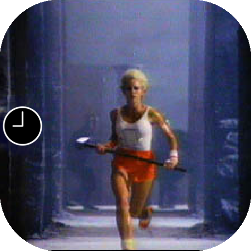
Anya Major (1984)
is an American television commercial that introduced the Apple Macintosh personal computer. It was conceived by Steve Hayden, Brent Thomas and Lee Clow at ChiatDay, produced by New York production company Fairbanks Films, and directed by Ridley Scott. English athlete Anya Major performed as the unnamed heroine and David Graham as Big Brother.
- Apple 1984 commercial
🕘🛠
 Kodak Shirley card (until 1995)
 The identities of the many Shirleys who modeled for these normal standard cards stayed unknown. As such, the cards cultivated a gendered, race-biased standard reference, which even today continues to influence our image-processing technologies.
In his 1997 book White, British film studies professor Richard Dyer observes the following: "In the history of photography and film, getting the right image meant getting the one which conformed to prevalent ideas of humanity. This included ideas of whiteness, of what color — what range of hue — white people wanted white people to be.”
- Looking at Shirley, the Ultimate Norm: Colour Balance, Image Technologies, and Cognitive Equity
🕙☣️
 Jennifer in Paradise (1996)
In 2013, Constant Dullaart wrote an open letter to Jennifer Knoll, who was the model for the Photoshop test image and as a result, the model for the first digitally altered image. In his letter, he requested to enter the original image into the public domain or to gift it to an (media) archeological institution such as the Smithsonian. He never received a direct response, but he did digitally reconstruct the original image and created an image series consisting of Photshopped versions, materialized as wallpapers and a series of prints featuring enthusiastically filtered Jennifers (twirled, blurred, etc.).
Remarkably, in a response for the Guardian, the original image was published. - Constant Dullaart: Jennifer in Paradise – the correspondence
🕚‼️♊️
 Kodaks Multi-Racial norm reference card (1995)
The de-facto, racist standard that had been in play since the early part of the twentieth century in most analogue photo labs has been positively biased towards white skin tones, which naturally have a high level of reflectivity.
As a result it was difficult to capture darker and black skin tones and proved impossible to capture two highly contrasting skin tones within the same shot; when trying to capture a black person sitting next to a white person, the reproduction of any African-American facial images would often lose details and pose lighting challenges, and finally present ashen-looking facial skin colors that contrast strikingly with the whites of eyes and teeth.
From the single “Caucasian” woman surrounded by the necessary color balancing information codes, Kodak’s Shirley evolved into an image of three women with different skin colors.
- Lorna Roth Color film was built for white people. Here's what it did to dark skin. (2015)
🕛✅📸
 Jen Kind, the Everywhere Girl (1996)
 Before microstock was even a thing, model Jen Kind (then Jen Anderson) posed for a stock photo shoot in Portland, Oregon as a pensive, inquiring college student, pen in hand, ready to learn.
Her image wound up being published thousands of times on book covers, in self-help guides, and major advertising campaigns. Anderson’s likeness embodied a certain widely malleable narrative that photo editors, art directors, and marketers could use to illustrate a range of projects, and led her to be branded “Everywhere Girl.”
🕧✏️🖋📈
 Ann Lee (1999 - 2003)
 Together with Pierre Huyghe, Parreno acquired Ann Lee’s copyright by paying 46000 Yen to a design character company called ‘K’ Works. “Ann Lee’s was cheap. Designed to join any kind of story, but with no chance to survive”. After being sold, Parreno and Huyghe gave Ann Lee a second life by passing her onto other artists who created their own story lines for the character – free of charge.
The project was called ‘No Ghost Just a Shell’ and ran from 1999 until 2003. Then, Parreno and Huyghe decided that the copyright of this fictional character be assigned to her so she no longer could be exploited. A lawyer in New York drew up an official contract.
“She’s a polyphonic character . . . What’s interesting about this manga gure is that it’s a way to tell a story. A sexual story? You can use her. A dark story? You can use her. A nice story? You can use this character. She’s almost like a tool.”
As this quote suggests, Huyghe seems unsure as to the gender of Annlee, who is alternately a “she,” an “it,” and (almost) a “tool.” Is Ann Lee an object, or is she just objectified?
- Pierre Huyghe, Two Minutes Out of Time, 2000.
- Escaping Ghost
- Girlhood and the plastic Image by Heather Warren Crow
🕜👽
 Suzanne (2002)
In 2002 Not a Number Technologies (NaN), the company that was behind Blender, went bankrupt. Nevertheless, they put out one more release, 2.25. As a sort-of easter egg, and last personal tag, the artists and developers decided to add a 3D model of a chimpanzee head, although it is called a "monkey" in the software, who they named Suzanne.
Suzanne is still included in Blender, which was later saved. The largest Blender contest gives out an award called the Suzanne Award.
🕝🐒
 Hannah Stellar / Parked Domain Girl (2005)
Dunstin Steller took this photo of his sister, Hannah Stiller, and tossed it onto his iStockPhoto portfolio. For a few cents, Demand Media scooped up the photo and was then licensed to use it throughout their web properties. Every time a website goes dark, Demand Media scoops up the domain registration and parks it, with ads and links around this photo. The file is usually saved with the name "0012_female_student.jpg".
"Parked domain girl” or “the Expired Domain Girl“ has since spurred a little online fandom.
“Is it even her own at this point? Is it recognisable by a significant number of folk? Is this image ubiquitous (enough)? I’d argue the face/image is ours more than hers at this point.”
- Emilie Gervais: Parked Domain Girl Tombstone
- Parker Ito: Parked Domain Girl
🕞🌐💤
 Fabio (2012)
In 2012 Deanna Needell and Rachel Ward got permission from the agent of Fabio Lanzoni to use the popular male model’s likeness rather than use Lena.
- Deanna Needell and Rachel Ward: Lena vs Fabio - Stable image reconstruction using total variation minimization
🕟🧺
🧷
 Render Ghost
 (the only identified ghost: Olson Twin) (2013)
A collection of portraits that fill the 3D renders of future architecture, captured from billboards on the streets of London. James Bridle states: “The Render Ghosts are the people who live inside our imaginations, in the liminal space between the present and the future, the real and the virtual, the physical and the digital. A world of architecture, urbanism and the city before it is completed - which is also never. They inhabit a space which exists only in the virtual spaces of 3D computer rendering software, projected onto billboards, left to rot and torn down when the actual future arrives; never quite as glossy or as perfect as our renderings of it would like it to be, or have prepared us for.”
The question is have you seen these people? Did they give permission for their images to inhabit these architectures?
- The Render Ghosts James Bridle
- Render Search
🕠🏗👻
 Ariwasabi aka Ariane (2014)
You MUST have seen her in the last years! “Ariane is so ubiquitous, she has probably entered your subconscious at some point”
- Shutterstock
- The photomodel that wanted to be anonymous
🕡🏧👤
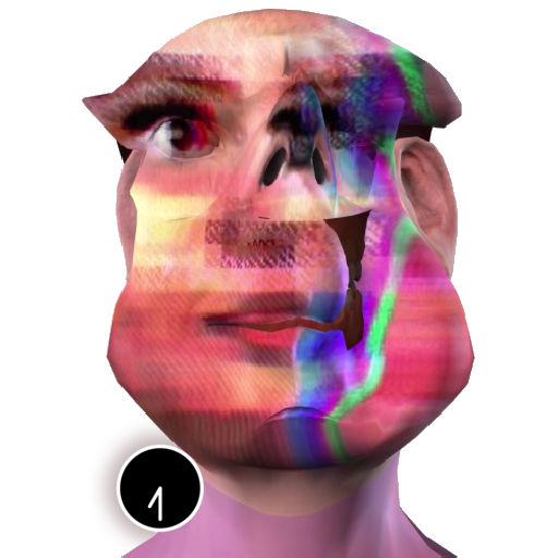 Tay (2016)
(Zach Blas version)
Tay was a chat bot based on artificial intelligence,originally released by Microsoft via Twitter on March 23, 2016. But Tay caused subsequent controversy when she began to post inflammatory and offensive tweets through its Twitter account, causing Microsoft to shut down the service only 16 hours after its launch.
- I am here to learn so by Zach Blas
🕢🔇⛔️
 The Other Nefertiti (2015)
An artistic intervention by Jan Nikolai Nelles and Nora Al- Badri.
By orchestrating a leak of the 3d file information of the Nefertiti bust, they wished to “activate the artefact, to inspire a critical re-assessment of today’s conditions and to overcome the colonial notion of possession in Germany's museums.”
With regard to the notion of belonging and possession of material objects of other cultures, the artists intention is to make cultural objects publicly accessible and to promote a contemporary and critical approach on how the “Global North“ deals with heritage and the representation of “the Other”.
We should tell stories of entanglement and Nefertiti is a great case to start with to tell stories from very different angles and to see how they intertwine.
- The other Nefertiti by Nora Al-Badri & Jan Nikolai Nelles
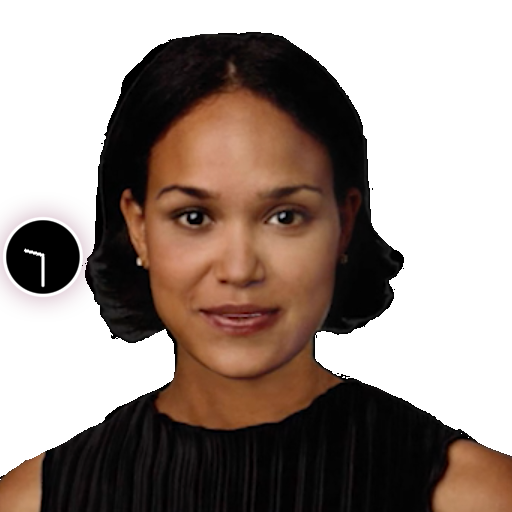 Actroid: Ashley from Oddcasts (2019)
 Ashley is “a virtual nurse for human patients. Her appearance and voice were developed by ODDCAST, a provider of text-to-speech software.
[...] The possibility of discrimination on the basis of simulated femininity has long been part of the code of female impersonators. Alexa has a plethora of responses should she face harassment.” In her installation OFFREAL, Malin Kuht gives the virtual assistants their say.
- Malin Kuth: OFFREAL (2019)
🕤🎚🎙
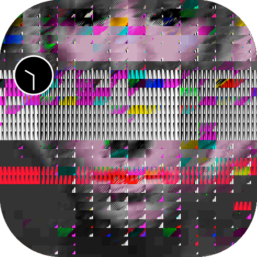 A Ghost for De-Calibration (2019)
 Soon after the release of a Vernacular of File Formats (2010), a sequence of nonconsensual, non-attributed instances of exploitation appeared: my face became an embellishment for cheap internet trinkets such as mugs and sweaters and application buttons proprietary glitch softwares. The image, exploited by artists and creators alike, started to lose its connection to the source—to me—and instead became the portrait of no one in particular, a specter, similar to a Shirley test image, though in this case, a Shirley for de-calibration. Last May (2019) I was asked to lend the image to Vogue (the US fashion magazine). I took this as an opportunity to reclaim the image in the only way I could imagine possible - by renaming the portrait formally known as “Blinx (from a Vernacular or File Formats)” to “A Ghost for De-calibration”. With this small, probably to most invisible action, I wish to take a stand against the discourse of color test cards and promote the consideration and creation of alternative cards and resolutions.
- De-Calibration Card
🕥🌀📏🏴☠️
 365 Perfect decalibration (2019-2020)
 365 perfect is “the best FREE virtual makeup app, period. It’s like having a glam squad in your pocket!”
The options in the app include virtual photo make-up, which has filters such as ‘delete blemishes’, or ‘brighten and soften skin’. It can also deepen the smile, put lipstick or even lip tatoos, enlarge the eyes and make the face slimmer, lift the cheeks, enhance the nose, or resize the lips. And lets not forget to whiten the teeth, add eyelashes, eye liner and eyebrows and finally change the hairstyle.
This sticker is created by using the app to make myself perfect. not once, not twice, but hundreds of times over, more perfection one year along.
If everyday I could get just one shade lighter, slimmer cheeks or bigger eyes... how perfect would I become?
By re-saving my newly beautified face every iteration, the artifacts of a re-compressed JPEG and the absurdity of our beautifying standards are amplified.
- 365 Perfect
🕦✅💚🦠
Downloadable as pdf here
Menkman, Rosa. Beyond Resolution (i.R.D.: 2020).
ISBN: 978-90-828273-0-9
Published on the occaision of my solo show at SJSU art galleries (3th of March - May 15th 2020): Shadow Knowledge
Menkman, Rosa. Beyond Resolution (i.R.D.: 2020).
ISBN: 978-90-828273-0-9
Published on the occaision of my solo show at SJSU art galleries (3th of March - May 15th 2020): Shadow Knowledge